Transform your data. Elevate your BI.
Unleash the full power of Qlik Sense and Qlik Cloud.
Vizlib is now part of insightsoftware, – a leading provider of reporting, analytics and enterprise performance management software. Read the press release.
See for yourself why over 500K+ users are using insightsoftware


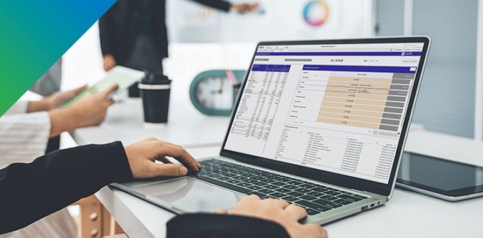
How do you get more out of your Qlik investment?
More than just visualizations
Elevate your Qlik investment with advanced solutions like Self-Service, Write-back, Finance, Gantt, and app customization.
Seamless transition into Qlik Cloud
Elevate your Qlik Cloud analytics experience. Access 40+ user-friendly visualizations for Qlik Sense, with no-code integration and Qlik Cloud compatibility.
Improved collaboration experience
Work seamlessly with your team using interactive write-back features. Edit data within your dashboards, leave comments, add notes, and share insights effortlessly through exports or embedded analytics.
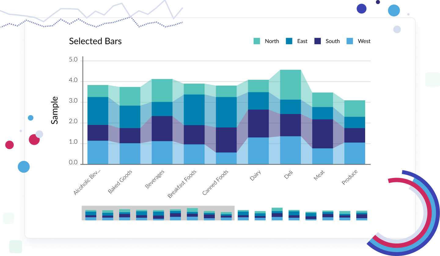
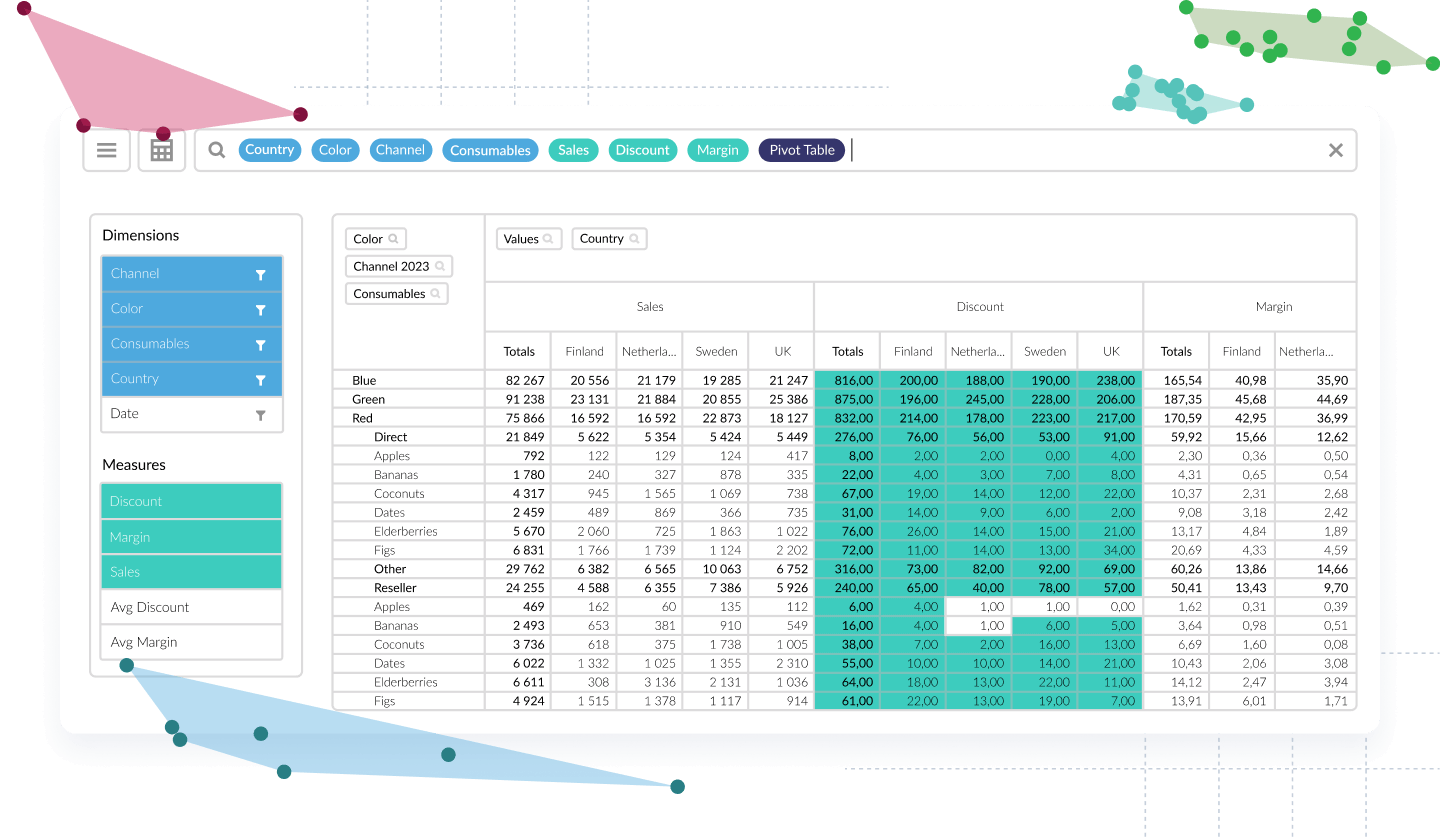
Vizlib Library
Build better dashboards with Qlik Sense.
Vizlib Library delivers an incredibly intuitive user experience for everyone, not just developers. Teams save countless development hours by empowering users to transform data into storytelling and deliver data-driven business solutions.
With Vizlib Library, you get:
- Vizlib Templates that you can design, save, and share with your teams
- Advanced Analytics that let you run forecasts
- Vizlib Actions that let you create a guided analytics experience
- Vizlib Viztips that let you insert customized charts to create an intuitive drill-down experience
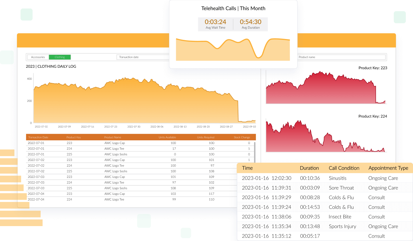
Vizlib Self-Service
Empower users with next-level independent data exploration.
Vizlib Self-Service ensures all types of users can explore data independently, discover meaningful insights faster, and make data-driven decisions with confidence.
With Vizlib Self-Service, you get:
- Vizlib Analytic Search that makes data exploration simple and intuitive
- Customizable Preset Themes that let you produce stunning reports that integrate seamlessly with your brand or interface
- Visualization inside Custom Reports that lets you convert data discoveries into visualizations for meaningful insights
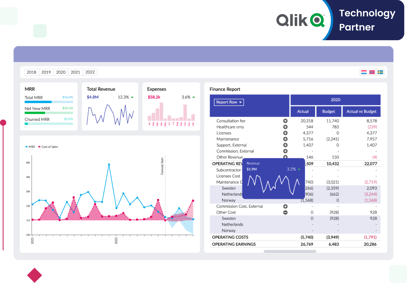
Vizlib Finance
A single source of truth for modern financial reporting.
Unleash the full potential of your financial data and make more informed decisions with Vizlib Finance. With this feature, you get:
- Streamlined budgeting and forecasting, ensuring precise financial planning
- Interactive financial reports that enable intuitive exploration and understanding
- In-depth financial analysis tools for comprehensive insights
- A user-friendly interface for effortless navigation and immediate proficiency
- Real-time data updates, ensuring you're always working with the latest information

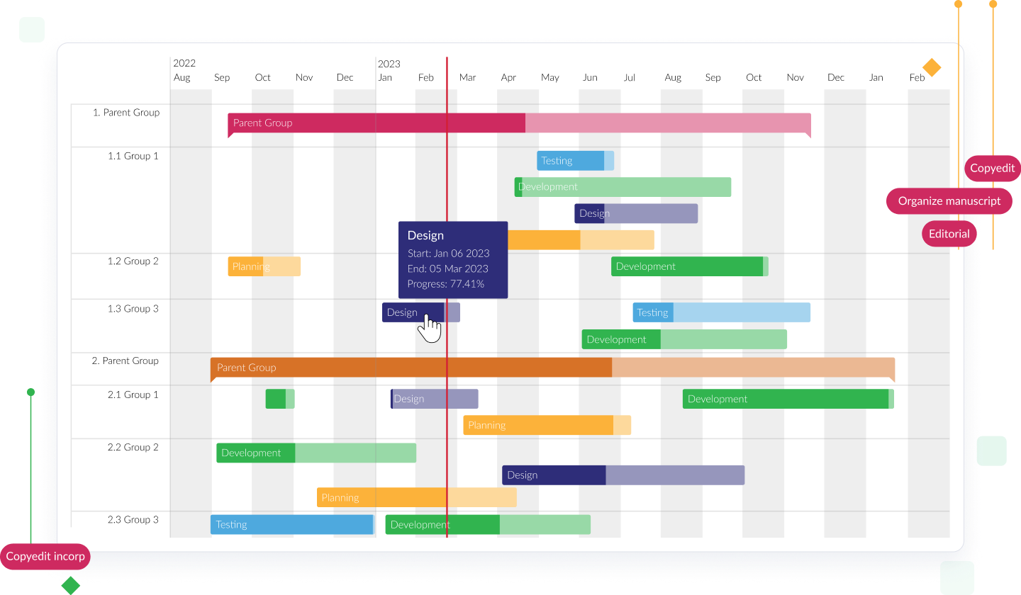
Vizlib Gantt
Add more flow to your planning in Qlik Sense.
Vizlib Gantt in Qlik Sense enhances your project management with intuitive planning, visualization, and control. It offers:
- Visual Project Tracking: Easily view critical milestones for monitoring progress
- Dynamic Task and Project Reports: Understand dependencies and priorities effectively
- Resource Allocation: Swiftly manage resource allocation for smooth operations
- Clear Visualizations: Identify trends, bottlenecks, and optimize workflows
- Custom Milestones and Filters: Prioritize and track tasks and workflows efficiently
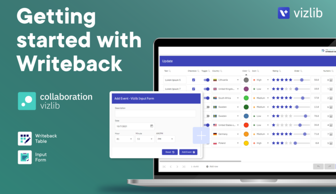
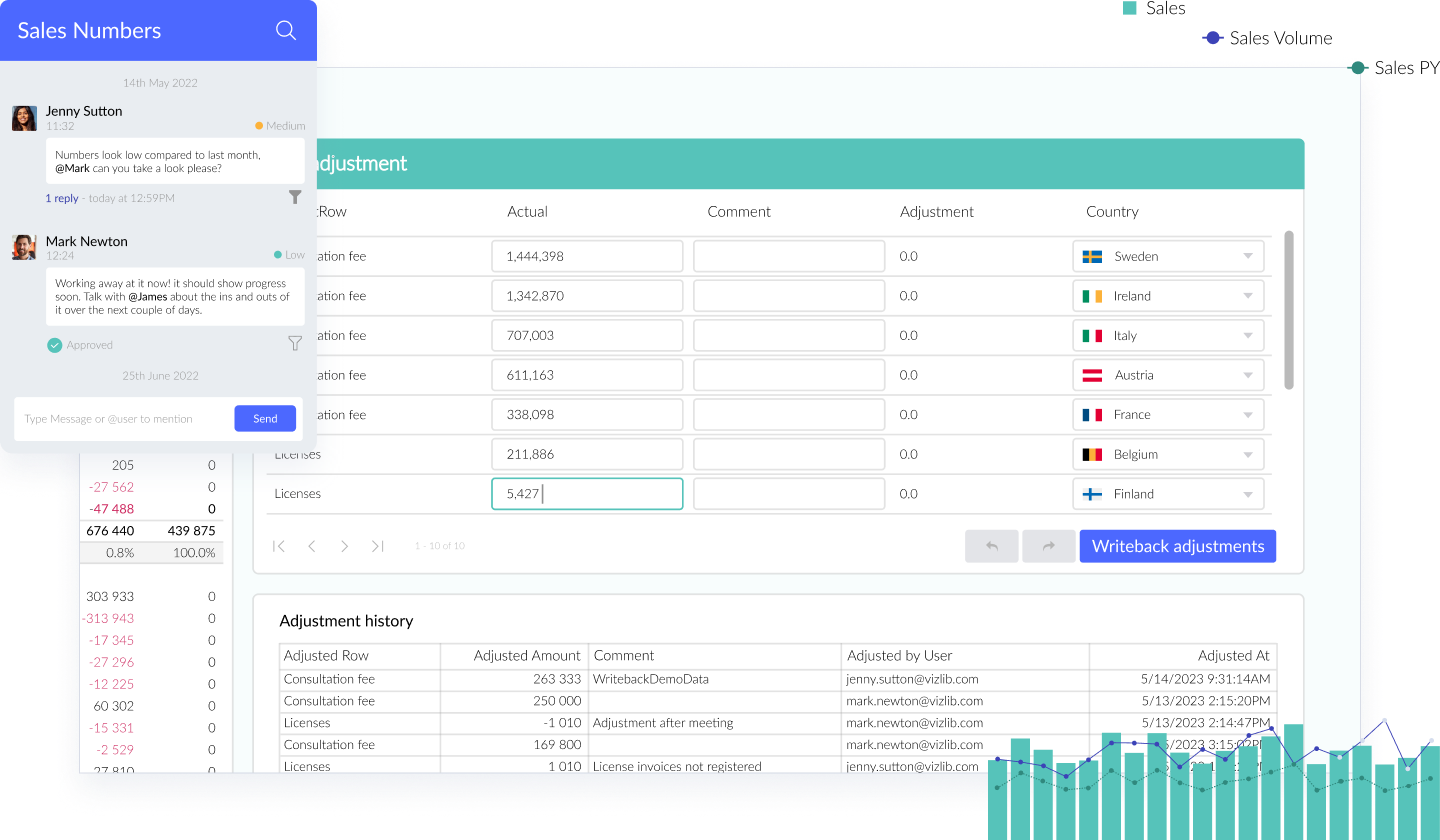
Vizlib Collaboration
Go beyond just reporting in Qlik Sense.
Unlock Qlik Sense’s potential with Vizlib Collaboration. This robust tool empowers your data-driven journey, enabling real-time team discussions, data editing, and workflow management. Key features include:
- Data Write-back: Edit, update, and comment on data directly in your dashboards
- Input Form: Capture user input and add data in Qlik Sense apps
- Server Integration: Transform data interaction and capture in your organization
- Teamwork: Foster collective intelligence by uniting teams and data
Vizlib Live!
Infuse direct queries into Qlik Sense.
Unlock the potential of Qlik Sense with Vizlib Live!, a powerful tool offering direct query insights from your Data Cloud to your In-Memory data. Here’s what you get:
- Seamlessly combine In-Memory data with live insights from your Data Cloud
- Effortlessly access and explore your data from sources like Snowflake, Google BigQuery, Amazon Redshift, and Postgres in near real-time
- Continue using Qlik Sense's associative logic while gaining access to a rich set of visualizations for unmatched customization

Un/Solved: How Vizlib Finance Enables Resilient, Collaborative Go-To-Market Strategies
Explore the changing role of Finance in shaping organizational strategies
Discover how an effective Finance team can drive strategy and decision-making across your business, and dive into the changing role of finance in shaping organizational strategies, especially during uncertain and rapidly changing times.
Business Transformation is a Click Away. Get Started with a Tailored Estimate!
Related Resources