Vizlib Activity Gauge: Popular use cases and examples in Qlik Sense

Activity Gauge Extension for Qlik Sense: What is an Activity Gauge?
An Activity Gauge is a powerful extension for displaying a progression of data. As a visualisation tool, it is used to indicate where your data point falls over a particular range. This extension is similar to the Pie chart but with a needle or dial, which represents the estimated measurement.
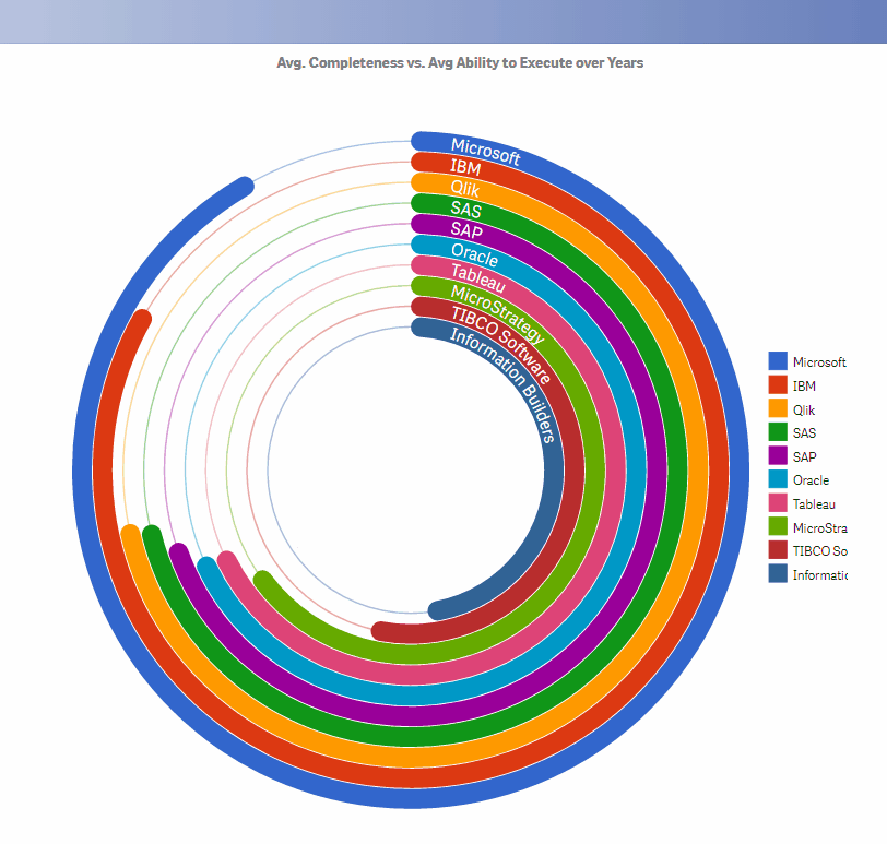
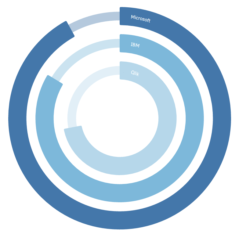
As an analytics tool, it allows the user to compare multiple quantitative measures or one quantitative measure split by categories. Data analysts use it to explore the relative performance of categories for a direct visual comparison in radial bars.
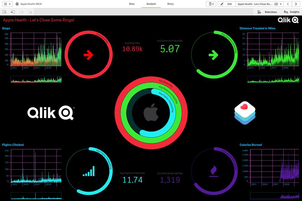
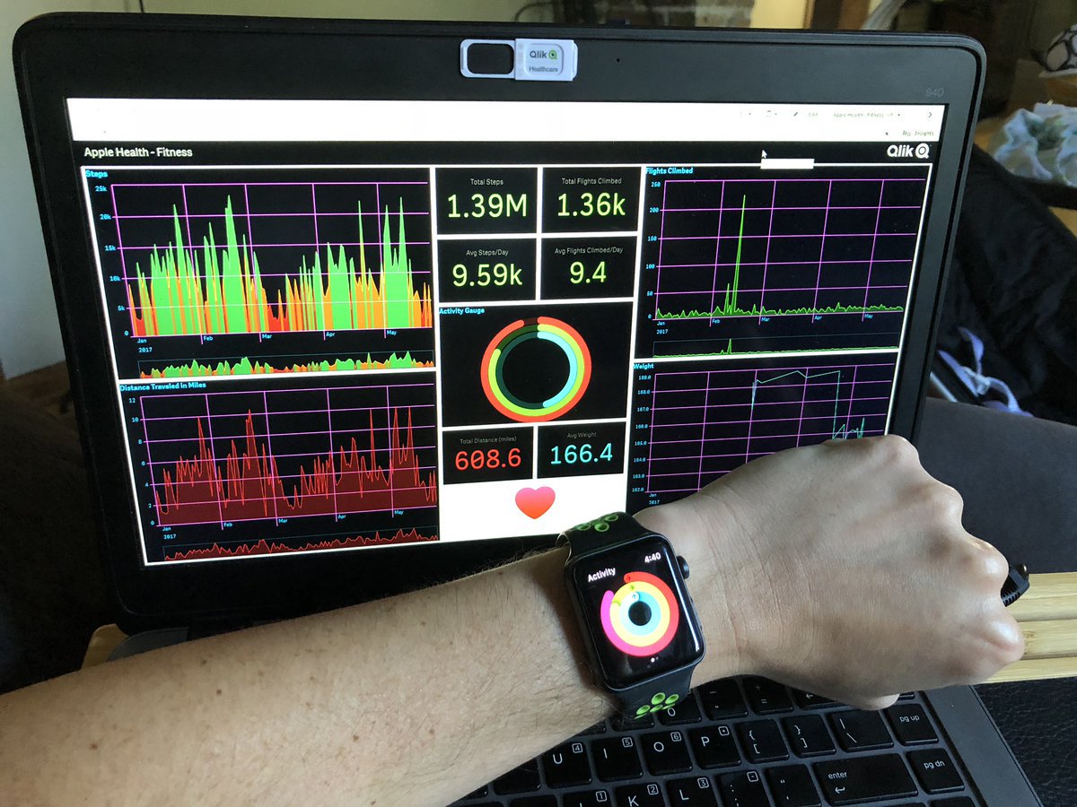
Activity Gauges are also popping up outside of the business intelligence space. Apple’s latest watch includes a gauge for tracking progress on your daily physical activity goals and the resultant calories you’re hopefully burning!
How do managers use the Activity Gauge in different industries?
In Healthcare, the Activity Gauge helps measure overall patient satisfaction levels from 0 to 100% or to track an average waiting time.
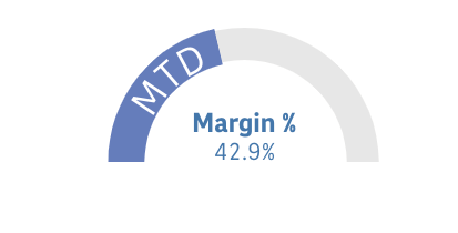
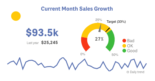
Practitioners working in the Finance industry use this extension to track daily sales, inventory or payable outstanding. Or on P&L dashboards to visualise the indicators of gross profit margin, operating profit margin and net profit margin.
The Activity Gauge also features in the Retail sector for visualising sales targets and targets met.
On Manufacturing dashboards, it is used to display the production volume by top machine as well as to reflect downtime.
In High tech organisations, the Activity Gauge helps to track the progress of key processes like the overall progress rate, development stage, waiting time by testing, average loading time or average occupancy rate.
Energy and Utility companies use this extension to monitor the contribution of renewable energy by households, industry, transport or trade and service.
The Activity Gauge in Public Sector institutes can show an average absenteeism rate or how close a non-profit organisation is to reach a fundraising goal.
Researchers working in the Consumer Products industry use the Activity Gauge to determine values such as customer satisfaction, retention rates, net promoter score, lead-to-opportunity ratio or opportunity-to-win ratio.
What is the Vizlib Activity Gauge for Qlik Sense?
Vizlib Activity Gauge is a data visualisation tool for tracking the progress of business goals. The easy-to-use Qlik Sense extension gives you full control over designing and styling your Activity Gauge to suit the metrics you’re analysing.
Vizlib Activity Gauge provides managers with interactive features like:
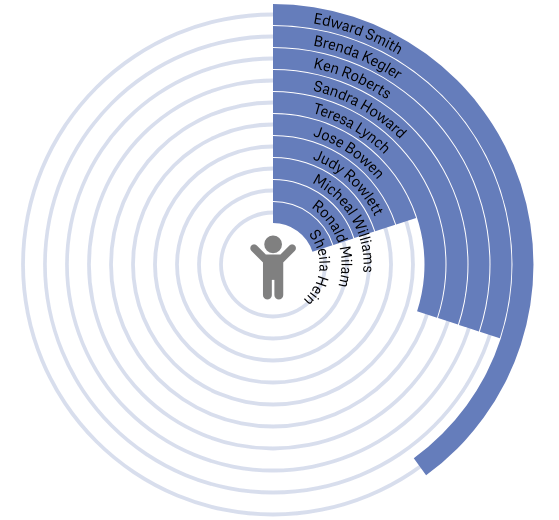
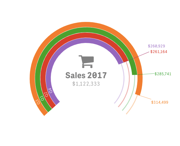
- A broad scope of metrics for analysis: You can include up to 10 different metrics for a high-level view of your data.
- Full customisability: Customise the gauge to suit your data story by adapting the arc width, corner rounding and arc distance. Choose from circular or radial display modes or adapt the needle style to communicate your message clearly.
- Personalised appearance: Add text, icons or images to craft a branded gauge.
Vizlib Activity Gauge can help you visualise the performance of processes and resources and promote a culture of achievement in your business. And, you can even add it as a layer in the KPI Designer extension to view KPI performance at a glance!
Add an Activity Gauge to your visualisation to track a single measure and instantly see if it’s really ‘moving the needle’!
You could even pair up your Apple watch App with the Vizlib Activity Gauge:
You can learn more about the Vizlib Activity Gauge here.
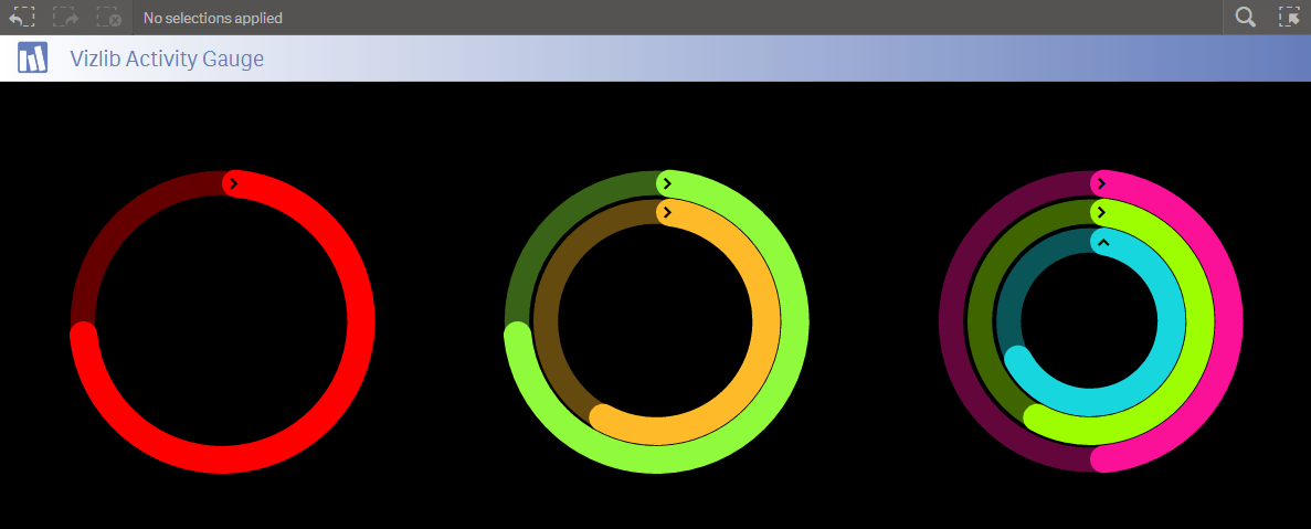
Here are a few examples of the Vizlib Activity Gauge: