
Vizlib Button for Qlik Sense: How do buttons improve the user experience?
In the digital age, we want everything to happen easier and faster. That includes the software we use. Software programmes are designed to save us time and simplify our jobs. Or at least that’s the idea.
In the BI field, the design and functionality of a dashboard should facilitate quick and easy navigation and data exploration. Users expect a smooth process from inputting data to extracting valuable insights.
Some developers may remember the shift from text-based operating systems to the use of icons to run a programme. (It was seriously cool at the time, like Nirvana!) This evolution aligned software development with a key human need – visual communication.
Typically, we understand and learn far quicker when information is portrayed in a visual medium. And in the context of analytics, this translates to visual analytics.
Visual analytics, the method of exploring and analysing data visually, speeds up the end-user’s time to insights. And when developers simplify and standardise their visual dashboard elements, it becomes less daunting for end-users to navigate around the dashboard and extract valuable insights, without relying on high-level data professionals.
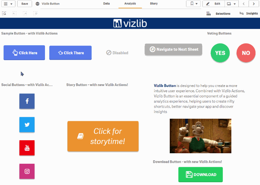
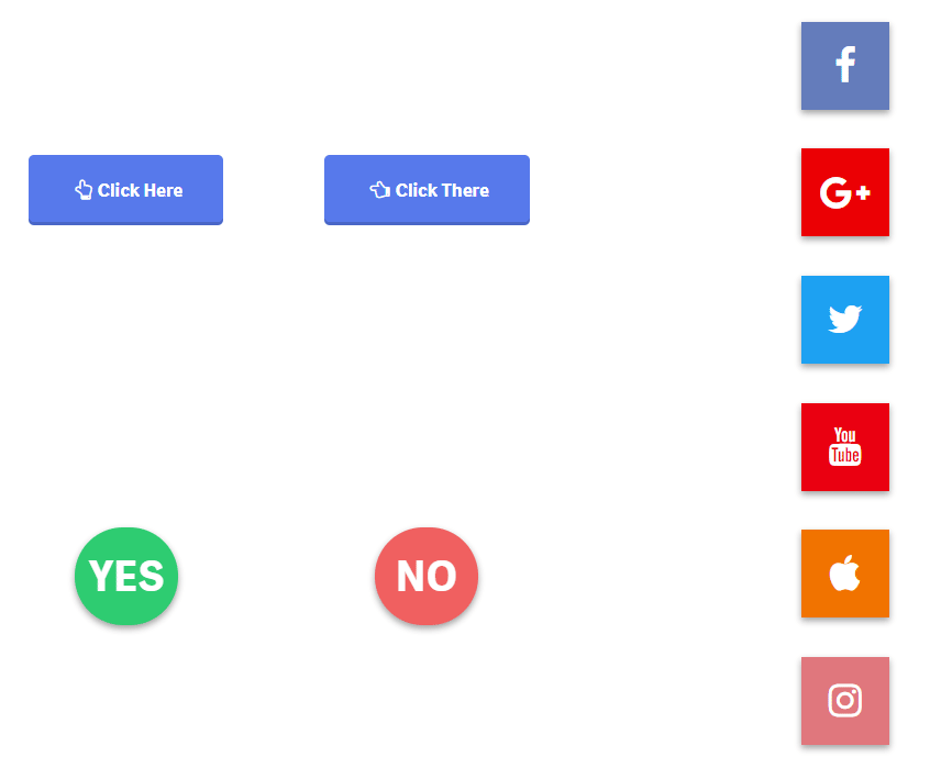
One practical example of visual analytics is the use of buttons. Buttons help guide the end-user through their data analysis journey smoothly.
What is Vizlib Button?
Vizlib Button is a value-added capability for Qlik Sense that helps you create a more intuitive user experience. When you combine this capability with Vizlib Actions, you establish a guided analytics experience, which empowers users to create efficient shortcuts, navigate your app better and discover insights with ease.
Set up your users with Vizlib Button benefits like:
- Simplified app navigation: Vizlib Button groups relevant routine actions together for easy navigation.
- A guided analytics experience: To steer your users down specific data exploration journeys.
- Improved app engagement: More users feel comfortable to explore and analyse data through stylised, user-friendly buttons.
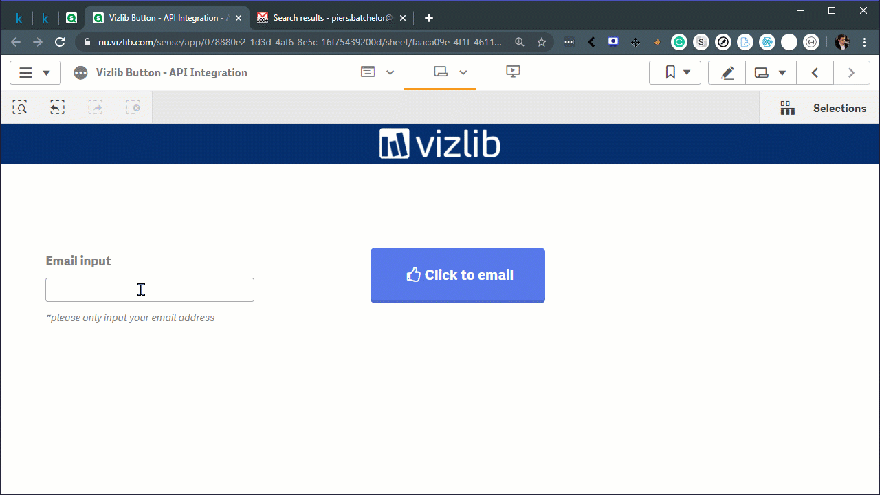
Vizlib Button API
API Integration is part of Vizlib Actions in the Vizlib Button. You can trigger any workflow with the Vizlib Button API Integration! You can even link it to a live weather feed from your location!
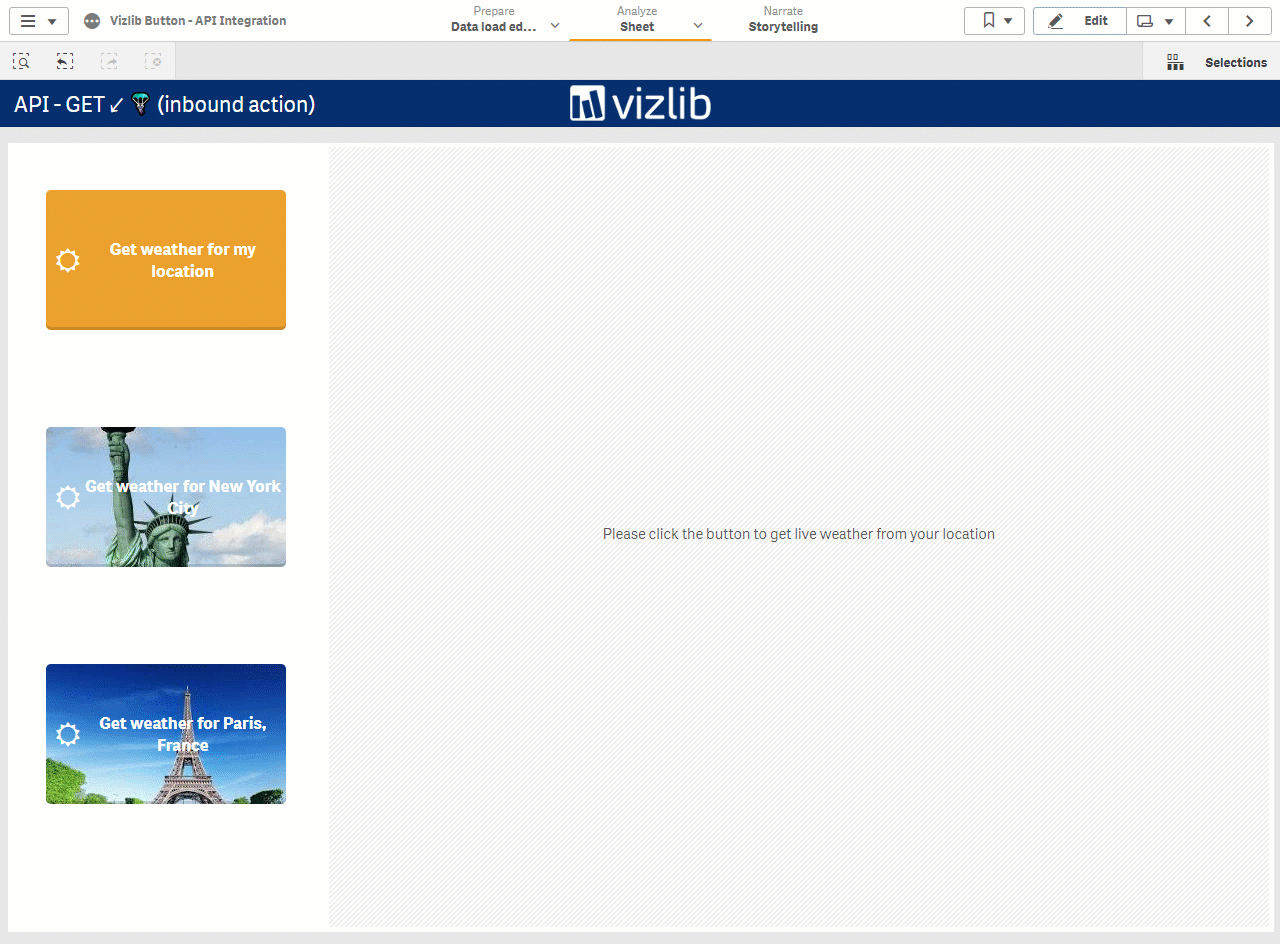
Vizlib Button API
Vizlib Button API
Buttons help to connect data users with their analytics goals. They streamline the user experience and enable more users to explore and use data to benefit their role and the business.
Learn more about improving dashboard UX in Qlik Sense in the full Vizlib Button documentation.
And here is the Vizlib Button in action. ?
2020 © Vizlib Ltd. – All rights reserved.