Vizlib Combo Chart: What is a Combo Chart?

Combo Chart Extension for Qlik Sense: What is a Combo Chart?
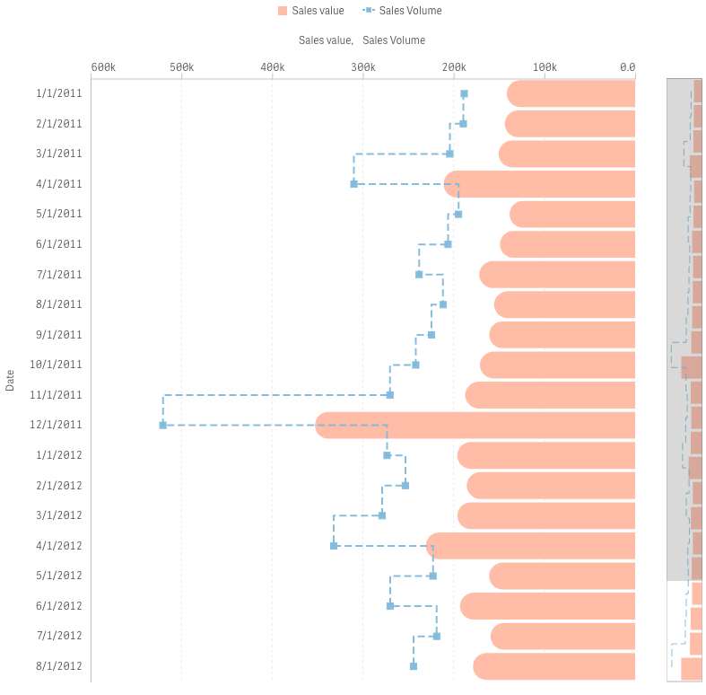
A Combo chart is a visualisation that combines the features of two charts like a Line chart and Bar chart. It allows you to show the values of one category as a line and another category as a bar. In the Combo chart, the data is divided into parts called series – the same function that colour serves in other chart types. Each series is represented by bars or a line.
You can use a Combo chart to plot multiple data sets on one graph. It’s a great way to prove or disprove a trend or identify outliers as it allows you to compare two variables that have different magnitudes and scales of measurement. You can easily compare measure values that are otherwise difficult to combine like projected sales vs. actual sales.
The chart highlights the differences in data with the visual combination of two different chart types. Your audience will understand this simple visualisation at a glance and make pertinent decisions from the data.
If you’re short of space on your dashboard, the Combo chart is a good choice as it can also save space.
The main advantage of the Combo chart is that you can display multiple measures with different scales. Whereas, one disadvantage is that you can only display one dimension at a time.
How do business intelligence leaders use the Combo chart?
The most common business use for a Combo chart is in sales. A sales manager or data analyst can combine a sales Bar chart with the margin values displayed on a Line chart. To take the analysis a step further, they could also add in a third measure like gross sales as an additional bar.
The Combo chart is a vital tool for any sales department as it quickly conveys targets versus the actual position of individual members of the sales team in relation to the target. Managers can employ this chart type to identify those who are excelling and acknowledge their results and pinpoint those that are falling short of the prescribed targets to provide additional support. Combo charts can compactly display revenue and the number of deals closed by sales associates.
Besides sales, the Combo chart is also favoured in specific industries like:
- The Finance sector: Combo charts measure metrics like billable hours vs. revenue collected.
- In Manufacturing. Executives can measure the number of units sold over a specific period and the total revenue with a Combo chart.
- Communications specialists, like telecom carriers, use Combo charts to visualise both the number of new customers and the penetration (as a percentage) within geographies.
What is the Vizlib Combo Chart?
Vizlib Combo Chart extension for Qlik Sense is a chart that enables you to quickly spot trends in your data. The extension affords you the flexibility to create highly-customised Combo charts and compare different data sets. The user-friendly functionality will fast-track your Combo chart creation and capture your audience’s attention!
How can the Vizlib Combo Chart improve data analytics?
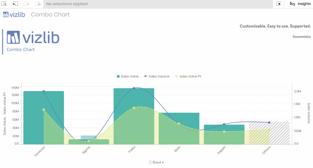
Traditional Combo charts limit you to using one dimension only to represent your data. Vizlib Combo Chart supports either one dimension with multiple metrics or two dimensions with one metric! You can extract relevant insights at a glance for easy analysis and strategic decision making.
The Combo Chart extension is a key tool for visualising business insights and includes features like:
- Dynamic data handling. In addition to selecting two dimensions, you can also add dynamics or metrics dynamically or by using alternative dimensions. You’ll be able to adapt your Combo chart to a particular audience and steer the insights and decisions they take.
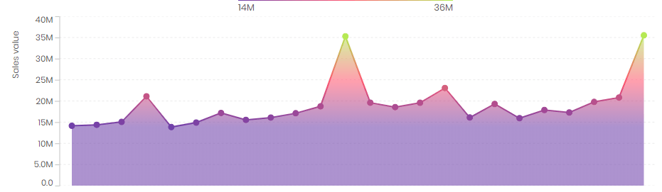
- Adding a benchmark to your data. This feature allows you to create another bar layer behind the existing bars for benchmarking progress on the metrics. Benchmarking adds context to your data and enables the audience to easily grasp the main data message. The benchmark bar can guide their thinking and shape the right insights.
- Adding a reference line. You can create a reference line for the x or y axis and allow your audience to compare and measure the data values displayed against a target or specific measure at a glance. The Reference Lines feature can make your visualisation more ‘digestible’.
- Highly-customisable features. Choose from multiple options to personalise your Combo chart like using icons or symbols to visualise your data points. This will also add context to your chart and help to capture your audience’s attention. And, it’ll help to streamline and simplify your message.
Vizlib Combo Chart is just the combination you need to create simple, impactful visualisations and promote a culture of data literacy in your business.
Learn more about the Vizlib Combo Chart here.
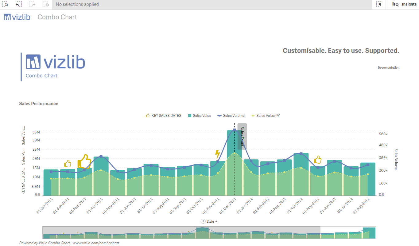
Here’s an example of a Vizlib Combo Chart in action!