Vizlib Gantt: What is a Gantt Chart and how to create one in Qlik Sense?
Vizlib Gantt for Qlik Sense: The benefits of visual planning
A Gantt chart is a project management tool that displays tasks or activities against time. It is a vital tool for planning, scheduling and managing projects.
The chart’s vertical axis represents the list of project activities, and the horizontal axis represents the time scale, in the form of a Bar chart. Each activity is represented by a horizontal bar. And the length and position of each bar reflect the start, duration and end date of the activity.
This visualisation tool provides project managers with a bird’s eye view of their project. Rather like a city building game, it’s a tool to create and control worlds (cue maniacal laughter) – or in this case, a project. It allows managers to plan the order of each task consecutively until the tasks culminate in project completion. They can view what each task is, track individual task progress, and manage completion dates and interdependencies at a glance. Since projects do occasionally run over the scheduled time, the Gantt chart allows execs to easily manage their resources and interlinking project tasks. It is particularly useful for managing a large project team with multiple stakeholders.
Gantt charts provide greater clarity and understanding of what needs to be done and when. As a result, they improve team communication and collaboration, even with a remote team. All the team members can easily see what’s required of them so they can take ownership of their tasks. Providing an awareness of all team member roles, the Gantt promotes transparency and improves the levels of trust in a team. And, as the project progresses, everyone has access to the latest project schedule. It’s a powerful visualisation tool that keeps the project and all its resources moving forward!
The first Gantt chart was created in the 1890s by a Polish engineer, Karol Adamiecki who wanted to improve management techniques in a steel factory. Later the concept was taken up and revised by an American engineer, Henry Gantt. His iteration became popular in western countries, resulting in the management tool being named after him. Back in those days, the charts were hand-drawn, which made it particularly difficult and time-consuming to manage project changes.
Luckily, today’s Gantt charts can be set up and modified easily to reflect real-time changes and progress, thanks to modern software. Yet Gantt charts are not the only contemporary project management tool.
Gantt vs Kanban
Perhaps you’re not sure what the best tool is to manage your project. A Gantt chart or maybe a Kanban board? Kanban, a Japanese term meaning signboard, is also effective in project management. Kanban boards are used mostly in production or development processes to streamline production. They help with detailed tracking of individual performance and highlight any barriers or challenges to task completion. A Kanban board typically has three columns: Requested, In progress and Done. Individual tasks are written on cards and placed in the relevant column on the board.
The strength of Kanban boards lies in managing individual tasks, whereas the Gantt chart is better suited to visualising multiple tasks and full projects on timelines. Yet, by combining these tools, execs get the best of both worlds and can ensure truly agile project management.
How do managers leverage Gantt charts in different industries?
In the Communication sector, managers organising a conference need to schedule speaking slots, meetings and sessions. Also, marketers use Gantt charts to visualise their current marketing campaigns, who’s working on what and whether there are any timeline conflicts.
Execs in Consulting services need to define project scope, key events and critical deliverables to get the customer’s sign-off.
In the Finance sector, practitioners use this chart to facilitate new product development or as a tool for building an effective contact centre.
Ecommerce business leaders may want to examine grouped customer activities over time to identify conversion optimisation opportunities.
In Construction, project managers create construction schedules with a clear start-to-finish overview of all critical deliverables and milestones with Gantt charts.
Within Manufacturing, managers want to visualise the fulfilment process flows to easily spot risks, such as shipment delays.
In Pharma and Life Sciences, researchers need to examine drug development timelines and visualise all stages from trials and studies to toxicology checkpoints.
Healthcare practitioners map out the patient journey and visualise their care history, covering events like appointments, admissions and emergency visits with Gantt charts.
In the High Tech field, managers need to compare subscription terms at a glance and visualise recurring revenue patterns.
Within Hospitality, execs use Gantt charts to visualise seasonal trends, booking patterns and length of stay combined with income.
In the Public Sector, educationalists and students use Gantt charts to plan and manage their research and academic documents.
What is Vizlib Gantt for Qlik Sense?
Vizlib Gantt Chart is an intuitive project planning timeline extension for Qlik Sense. It gives you the superpowers to keep your projects on track, stay within budget, optimise resources and forecast accurately.
Your projects can flow seamlessly with the latest Vizlib Gantt Chart features such as:
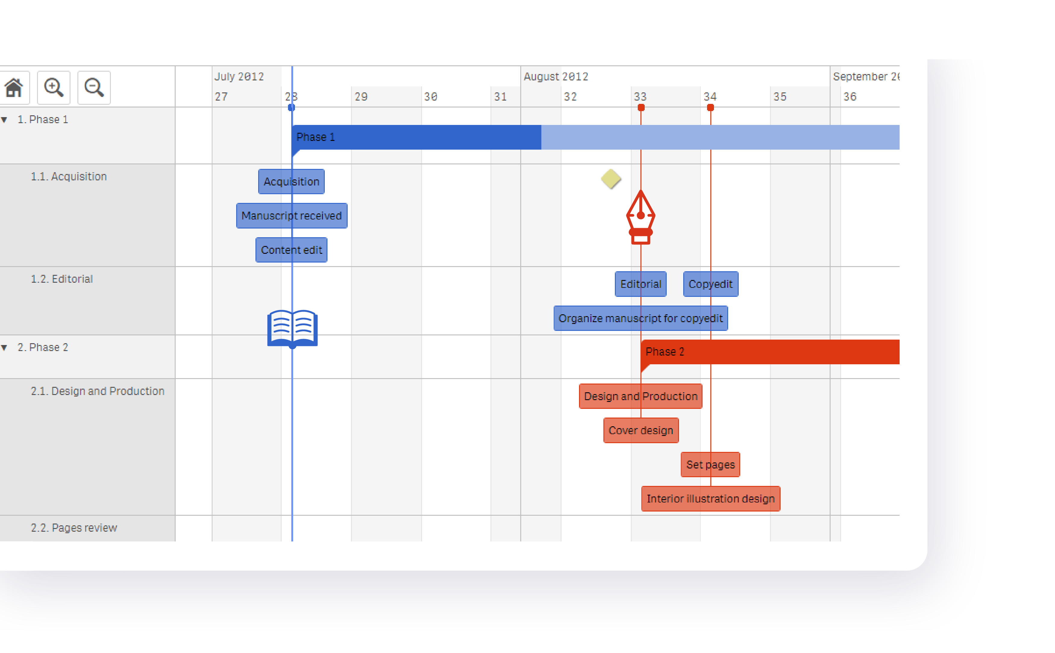
- Highlighting significant areas: With dynamic Custom Periods that change with your tasks.
- Highlighting key project milestones: With icons, symbols or images to identify familiar tasks or workstreams.
- Managing your resources: Manage your resources even more effectively by highlighting holiday periods where no work can be done!
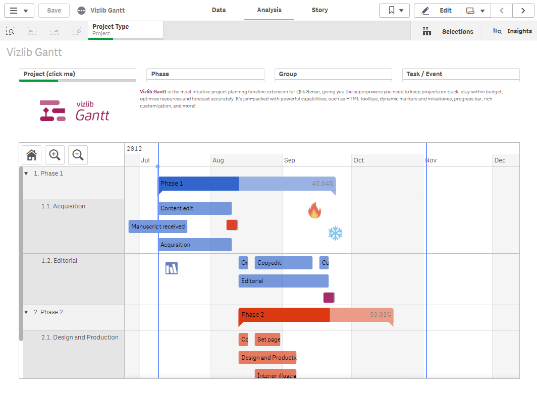
- Getting to insights faster: Easily declutter large projects by visualising the progress of various project groups in one view or grouping tasks by location or resource.
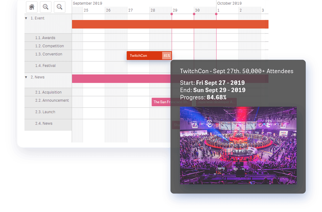
- Enriching projects with more context: Use HTML tooltips with embeddable images and links to provide contextual information on hover and create an intuitive drill-down experience.
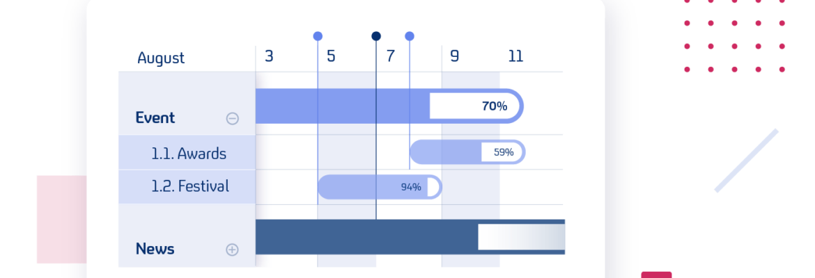
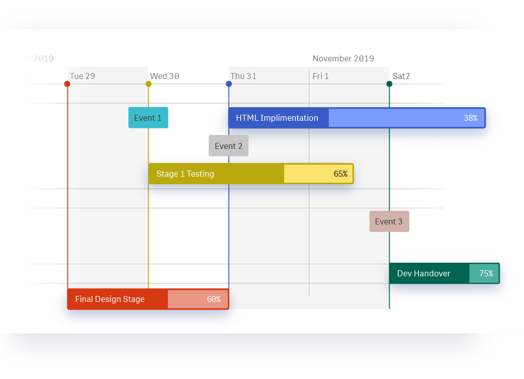
- Knowing where you stand: Check your or your team’s progress against deadlines at any time! Track the completion status of tasks to know precisely how much work has been done and how much remains.
- Quickly understanding your task flow: Use task hierarchies to get an instant understanding of what tasks should be prioritised to finish projects on time, and to visualise the optimal project workflow.
Gantt charts display the route your project should take to succeed and help you pave the way.
Vizlib Gantt Chart will give you a high-level timeline overview of any complex task. Learn more about Vizlib Gantt Chart here.
And, here are a few examples of Vizlib Gantt Chart in action.


2020 © Vizlib Ltd. – All rights reserved.