Vizlib Grid Chart: Adding more context to your Qlik Sense apps

Every business uses data to improve how they operate. Being able to spot trends or patterns in your data, makes this job a lot easier.
So let’s look at how a Grid chart can help organisatons uncover more meaningful insights.
A Grid chart is similar to a Scatter chart or Heatmap. The difference comes in with how the user plots dimension values. In this case, it’s on the axes.
These charts help users spot trends over time, like seasonal sales patterns, or among different data sets. The Grid chart also opens up data analysis to less technical users as data is represented in simple visuals that reduce dashboard clutter and steer users to the right insights.
What is Vizlib Grid Chart?
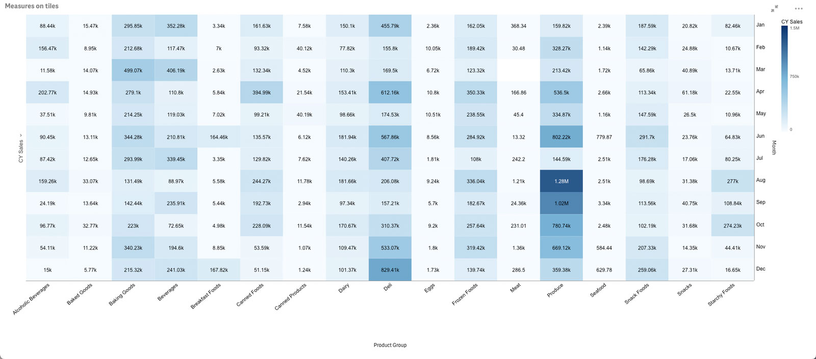
Vizlib Grid Chart for Qlik Sense, provides an easy-to-use visual representation of your data. It is the next-generation upgrade to the popular Vizlib Heatmap *, which helped users analyse large or complex data sets as colours.
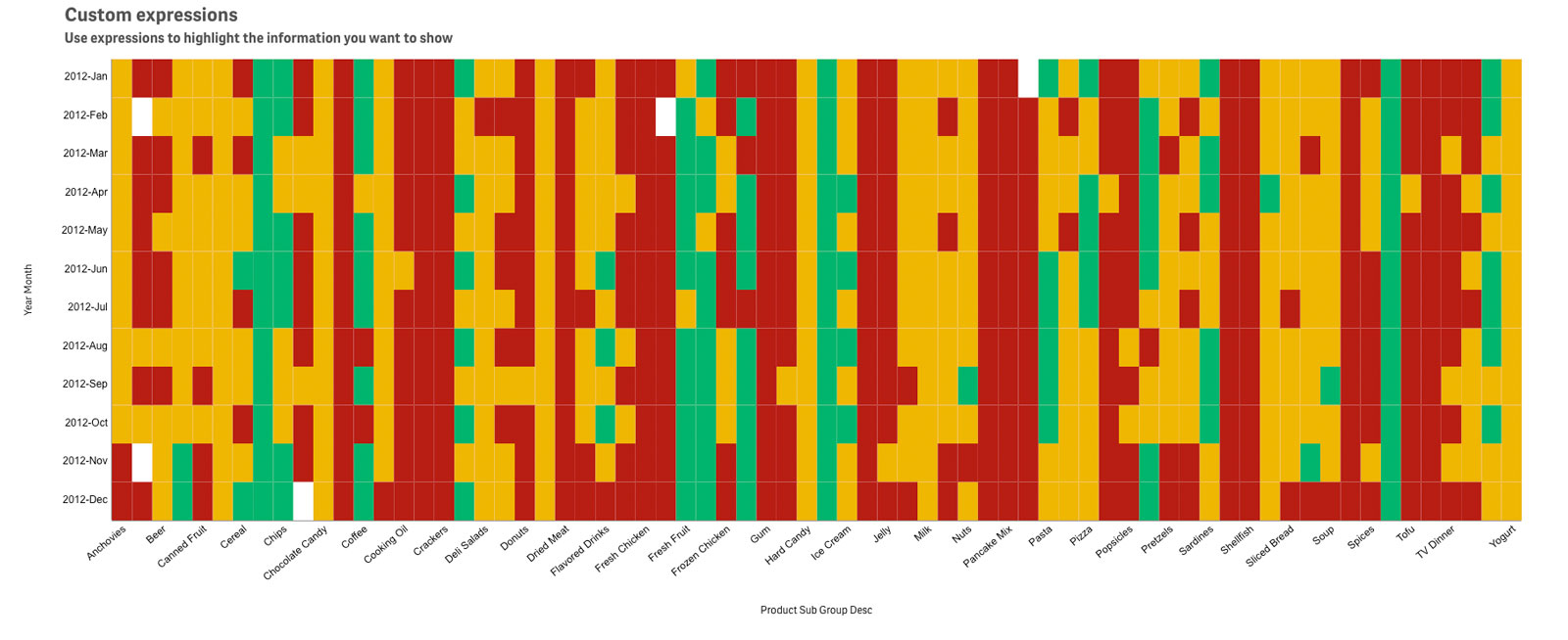
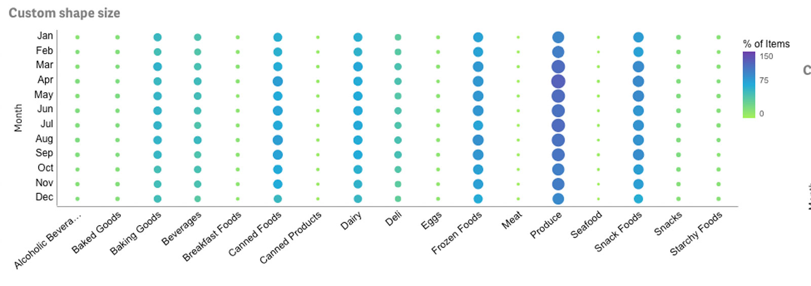
Users can visualise their data as either a Grid chart or Heatmap with another layer of context by adding a second KPI to the chart. Each individual value of your data is displayed as an increase or decrease in colour intensity so that businesses can understand insights at a glance. The colour intensity representation of the data makes it easier to digest than numbers.
Using the Vizlib Grid Chart allows users to gain new insights into patterns in the data, along with the impact and significance of each data point.
With Vizlib Grid Chart, you can:
- Use alternative measures and dimensions to drill through your data and display the most critical insights
- Utilise rich design options to gather all the insights from the chart in an easy-to-read manner
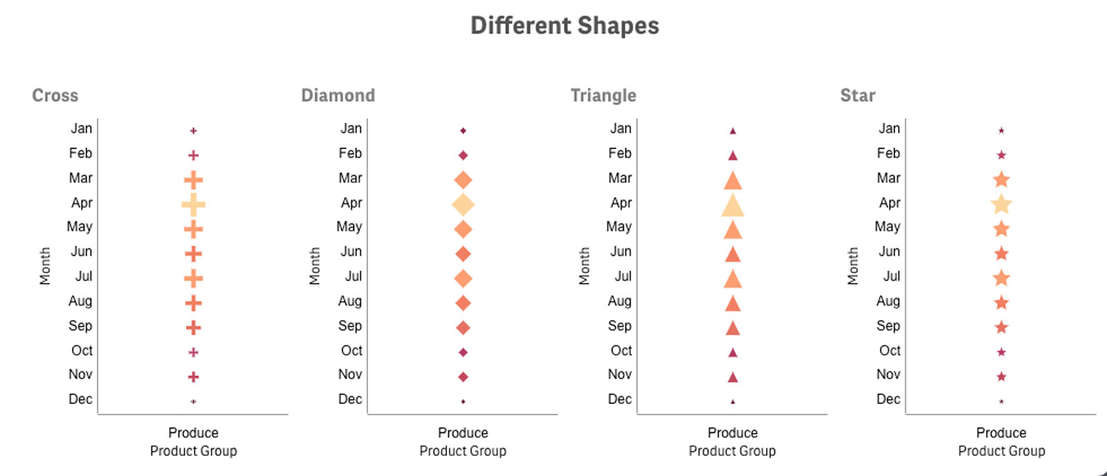
- Choose between displaying the data as a Heatmap (one measure) or as a Grid chart (two measures)
What are the common Grid Chart use cases in Qlik Sense?
With business info represented through simple, understandable visuals in a Grid chart, all users can leverage historical data to assist their decision-making.
The Grid Chart is an essential tool when identifying patterns in data. It is used across various industries and departments from Finance and Technology to Media and Transport. In HR for example, leaders can visualise a dataset with employee start and finish times, along with breaks, to understand when to increase the number of staff and appropriately manage their resources.
As an improvement on Heatmap, Vizlib Grid Chart enables users to include a second measure, that helps them:
- Focus on the events that truly matter
- Reduce the visual noise so viewers only see what is important
* The Vizlib Grid Chart will eventually replace the Vizlib Heatmap extension.