Vizlib KPI Designer: What is a KPI and how to create a KPI dashboard in Qlik Sense?
KPI Extension for Qlik Sense: What is a KPI Object?
 A KPI Object is a crucial visualisation object on a dashboard. It’s an important tool for visualising the performance of strategic business goals. Setting and tracking goals are a surefire way to achieve business success. Businesses measure their progress towards their objectives with business metrics, which track and help leaders evaluate how each activity or process is performing. But a business consists of more than activities and processes—we can’t forget about the people! Metrics are also a measure of how individuals are performing in their roles.
Though executives keep track of business metrics, their main focus is on whether the company is achieving critical business objectives. These are measured with Key Performance Indicators (KPIs).
A KPI is a measurable business metric that evaluates how effectively a company is achieving critical business objectives. KPIs can be used at all levels across an organisation to measure and evaluate success at reaching strategic goals and targets. High-level KPIs will usually focus on a company’s overall performance, while low-level KPIs aim to track progress on a department or employee level.
Overall, they show decision-makers what’s working and what is hindering them in achieving their strategic business goals.
The best way to evaluate your KPIs at a glance is on a dashboard. Dashboards provide you with the right insights at the right time to manage, lead and inspire success!
How are decision-makers using KPI dashboards?
Typical KPIs by function
Since each department has its own goals, they’ll measure different KPIs. And their KPIs will be displayed on different types of dashboards like an Operational or Executive dashboard.
Marketing may have KPIs to track campaign performance or web traffic, for instance, whereas the sales department tracks KPIs or metrics like sales targets, revenue growth, or revenue per sales rep.
Executives keep track of high-level KPIs like customer acquisition cost, sales revenue vs. target or net profit margin, to drive overall business growth.
Typical KPIs by industry
Besides the KPIs for different functions, they also differ from industry to industry.
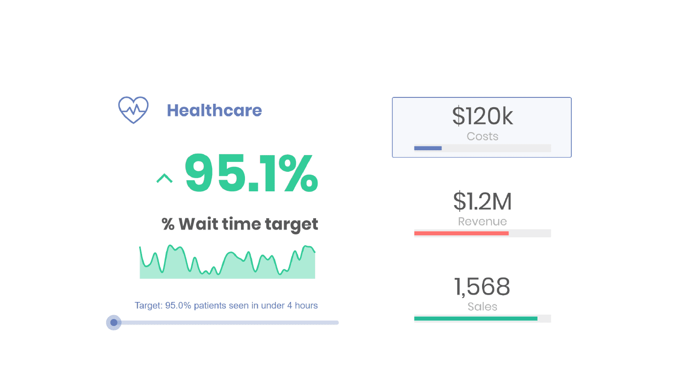
In the Healthcare industry, KPIs track critical metrics like patient waiting time, average hospital stay or the cost of treatment.
In the Finance industry, KPIs may include Earnings before Interest and Taxes (EBIT), liquidity ratio or net cash flow. These and other vital finance KPIs monitor the company’s financial performance.
Retail KPIs help retailers identify consumer patterns and anything that affects their supply chain. KPIs could include average transaction size, customer retention or total volume of sales.
Manufacturing companies use metrics to ensure their production process is shipshape! They may track production volume, asset turnover or production downtime through their KPIs.
The rapid developments in AI, machine learning and analytics keep technology companies on their toes to lead the frontier. Their KPIs track metrics such as Mean Time to Recover (MTTR), expenses or ticket resolution time.
Energy and Utilities companies monitor KPIs like energy production distribution, power cuts and average duration or consumption by sector.
In the Communication sector, businesses need to measure how well they’re keeping in touch with customers and potential customers. These KPIs, like cost-per-lead, inbound marketing ROI, lead-to-customer ratio, keep them connected to their customers and contribute to business growth.
Public sector organisations like educational institutions and governments acquire a lot of data. They track KPIs to measure key metrics like expenditure or student demographics.
In the Life Sciences industry, there is always major competition. Companies use KPIs like direct sales, market demand or wholesaler outflow to optimise costs and process efficiency.
And, in the Consumer Products industry, KPIs are linked to their products. They measure metrics like out-of-stock rate, average time-to-sell or supply chain costs, for instance.
What is the Vizlib KPI Designer for Qlik Sense?
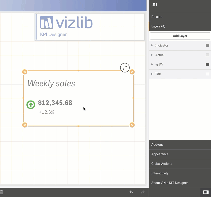
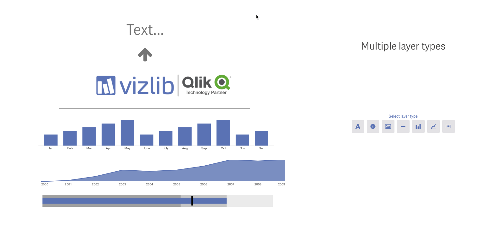
Vizlib KPI Designer is a Qlik Sense extension that helps you visualise KPI performance. The extension allows you to create the exact KPI Objects you need. And they’re created in layers.
Vizlib KPI Designer introduces this revolutionary layering concept. It gives you the freedom to fashion your ideal KPI Objects with the precision of designer tools. Executives across industries use the Vizlib KPI Designer to create pixel-perfect KPI dashboards.
Vizlib KPI Designer features
- Ten custom layers to create your KPI Objects
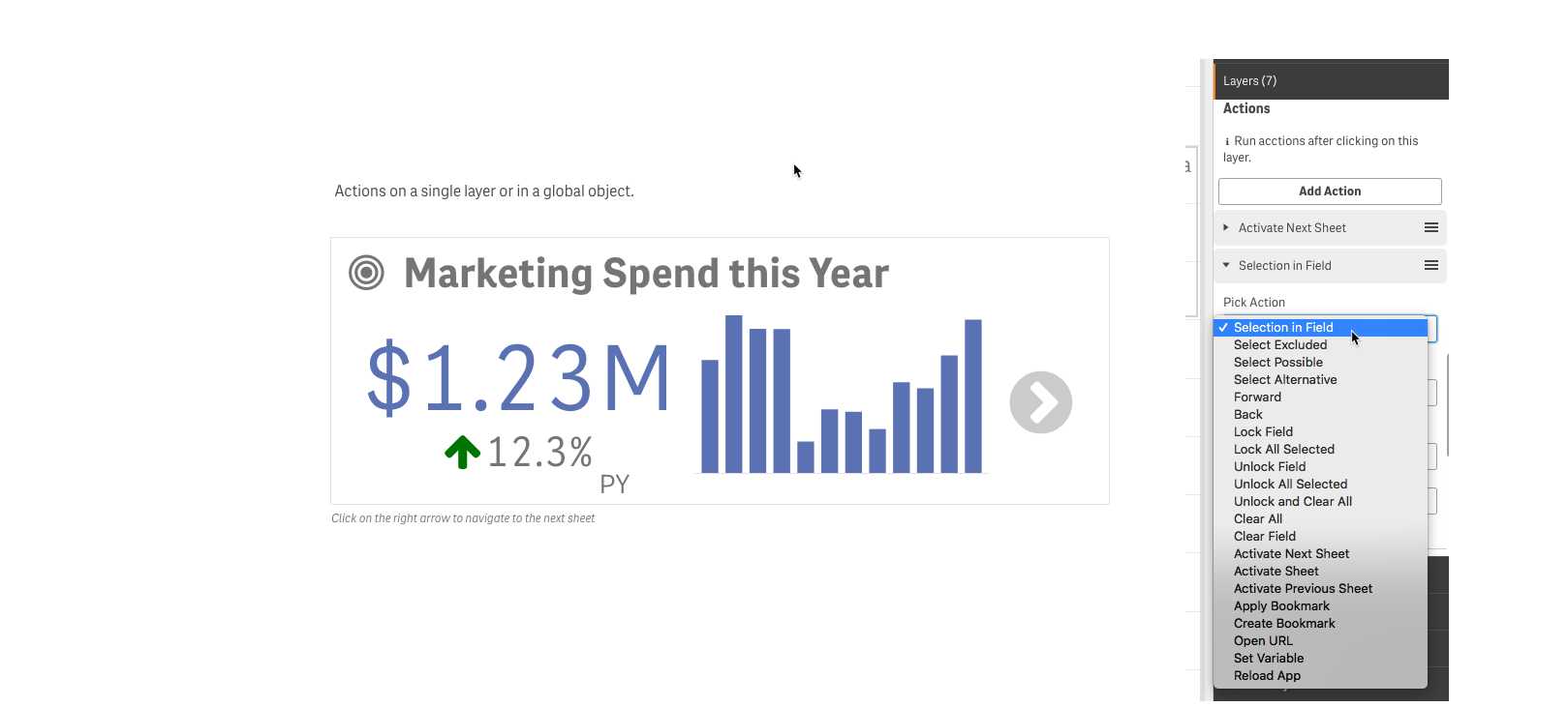
- Support for multiple actions on a layer level or as a global setting
- Rich customisation and formatting options
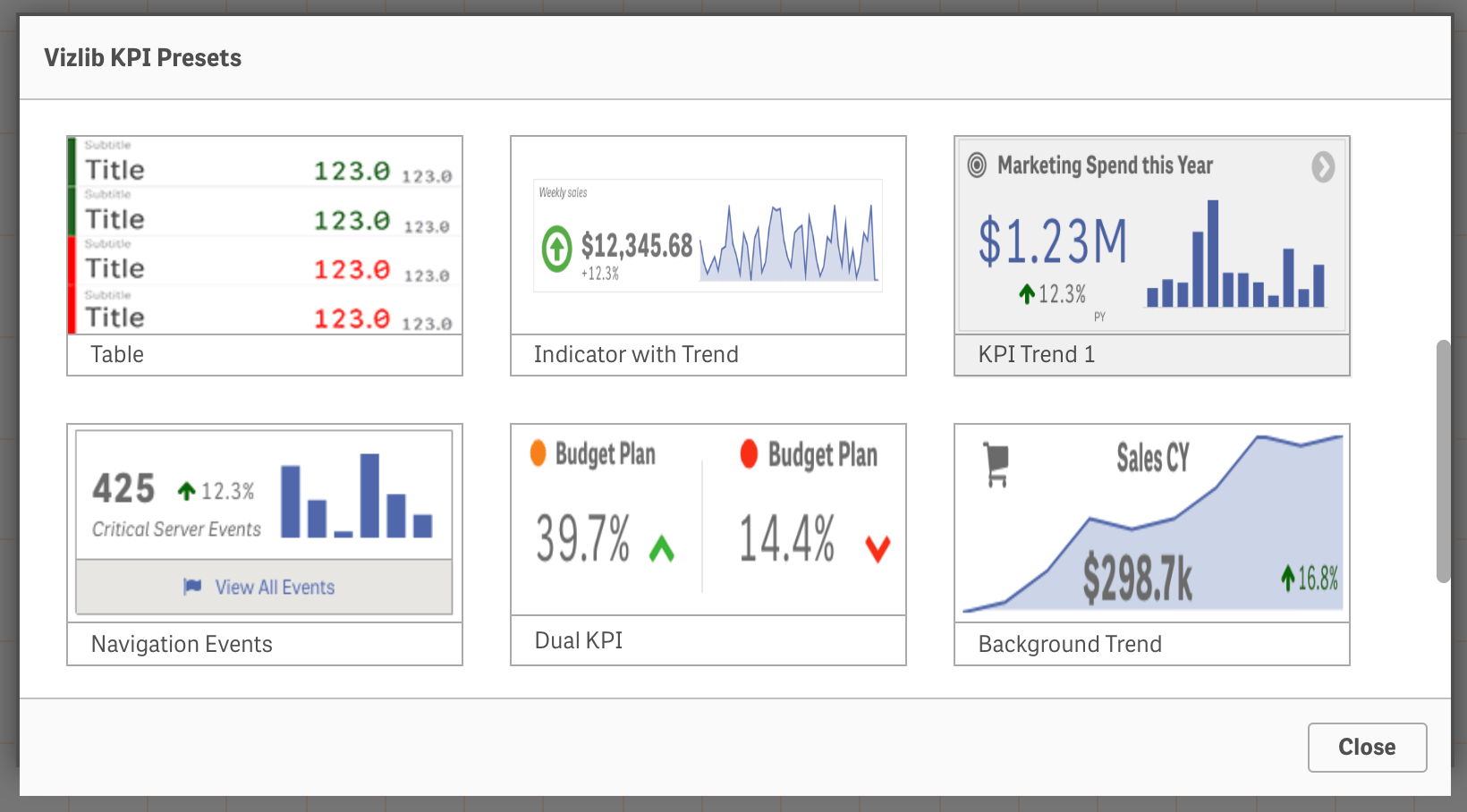
- Presets to fast-track the design process
- Pixel-perfect positioning of layers and responsive design
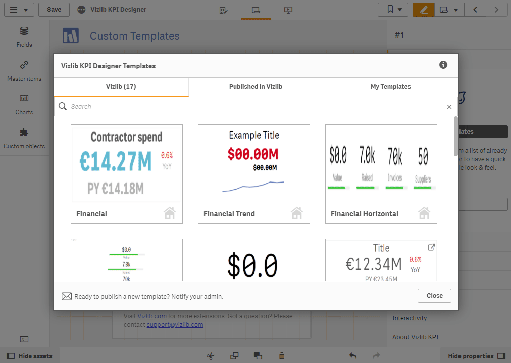
Vizlib Templates for the Vizlib KPI Designer
Vizlib Templates is a capability that can help your data users create, save and share custom KPI designs quickly. The new feature speeds up the development process as you can select and apply previously designed and saved pixel-perfect templates. Since you can share approved template designs with your team, it also enables your company to generate a consistent, professional look across all your Qlik Sense apps. You can find out more in the full documentation here.
How to use the Vizlib KPI Designer Layers
Here are a few tips to create highly-customised KPIs with the Vizlib KPI Designer:
- Position objects wherever you need them on the canvas
- Adjust the highly-responsive layers to the size of other dashboard objects
Use the Snapping feature to easily align and position objects and layers.
- Add a Line Chart or Bar Chart layer to enrich your KPIs with trend or time-series data.
- Use the Line layer to separate your KPI Objects and organise your dashboard for quick visual understanding.
- Bring your KPIs to life by adding a Bullet Chart layer to show the targets vs. current performance on each KPI target!
- Or add a Gauge Chart layer to track a single measure and instantly see if it’s really ‘moving the needle’!
- Show or hide a layer to display the relevant data story to the right viewer.
- Also remember, you can apply Actions to your entire KPI Object or on an individual layer level making it easier for dashboard consumers to drill-down into data, navigate to relevant sheets or take the most appropriate next steps.
- Lastly, save time by using the Preset options to create designer KPI Objects in a flash!
You should have the freedom to design pixel-perfect KPI Objects exactly how you want them. And it shouldn’t be hard work. KPI dashboards can help you visualise your business performance today and help you achieve your strategic targets, goals and dreams for tomorrow!
Find out more on the Vizlib KPI Designer here.
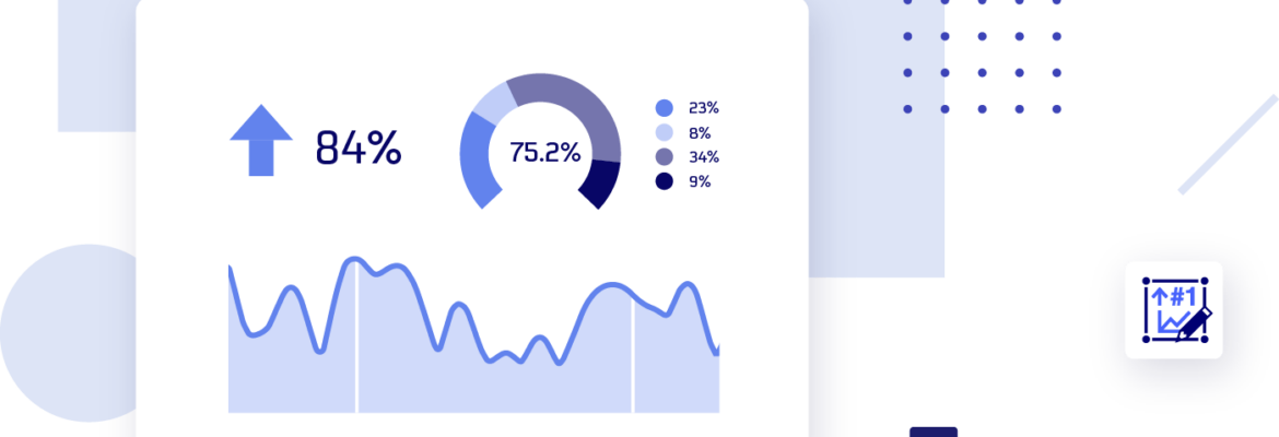
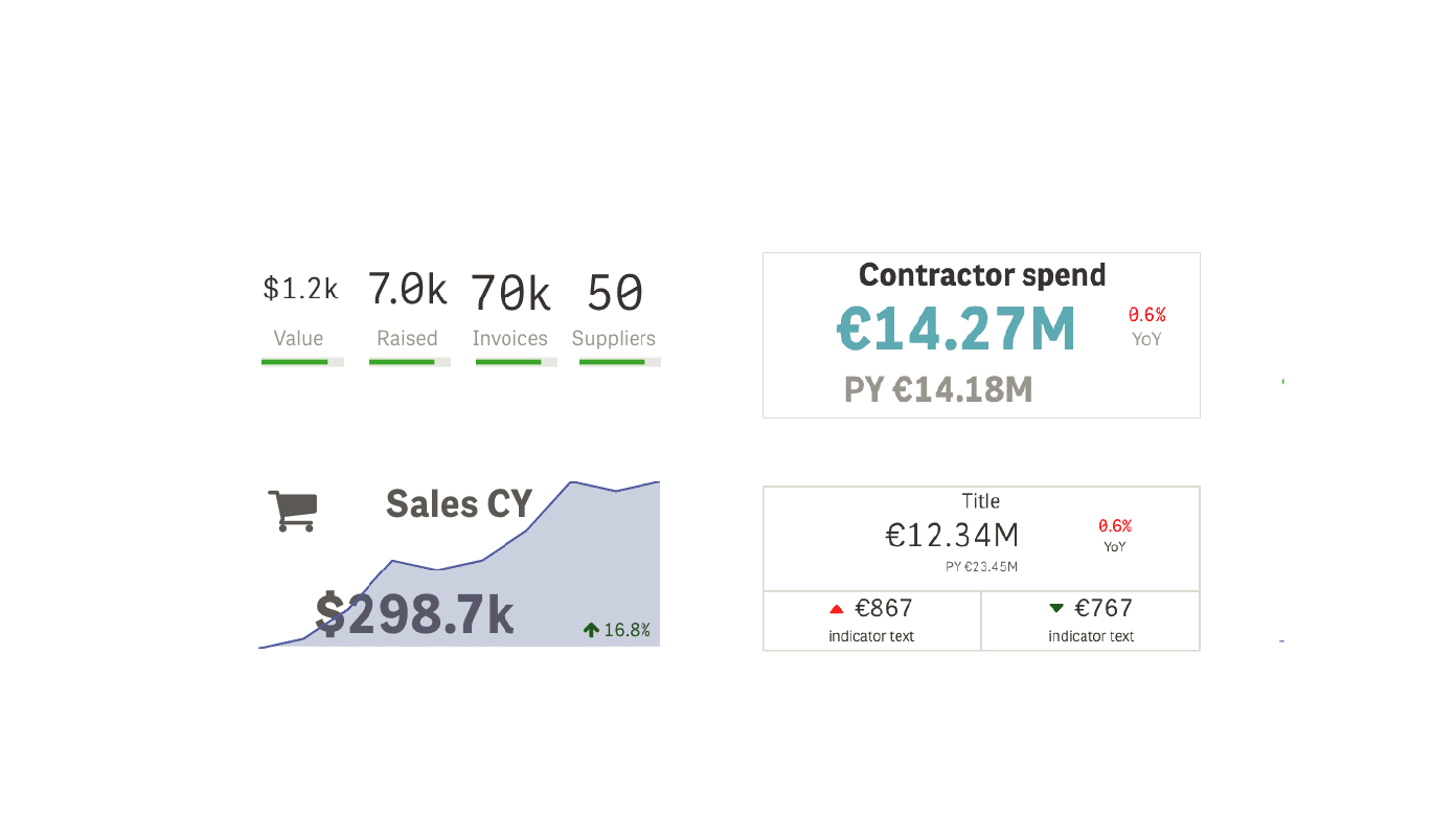
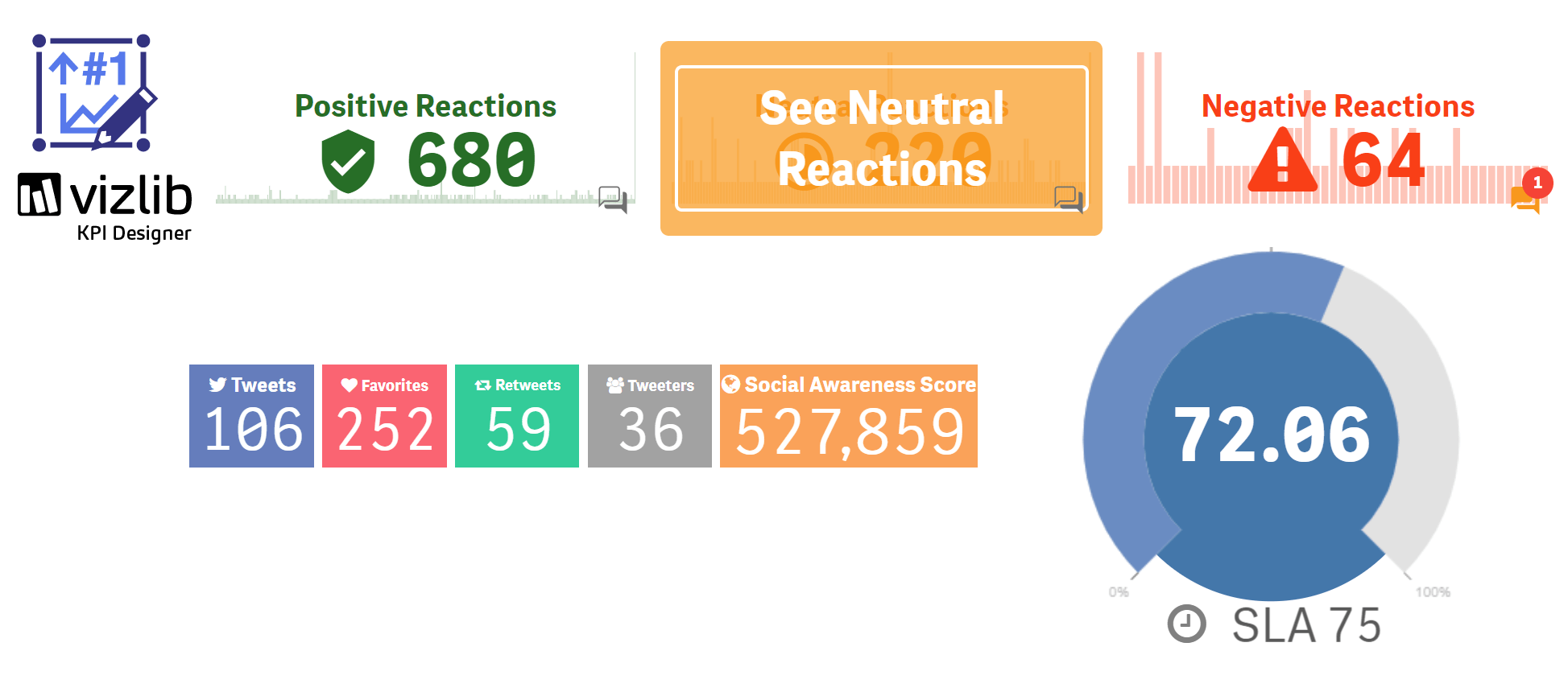
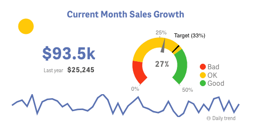
Here are a few examples of customised KPI Objects created with the Vizlib KPI Designer:
2020 © Vizlib Ltd. – All rights reserved.