Vizlib Line Chart: What is a Line Chart and how to use it in Qlik Sense?
Line Chart Extension for Qlik Sense: What is a Line Chart?
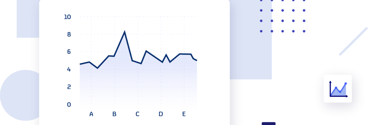
A Line chart is a graph displaying information as a series of data points connected by line segments. It shows the trend of a measure or a variable over time, essentially, how the data changes over time.
Though the Line chart is a basic data visualisation tool, it is important and widely used for:
- Visualising overall trends in data changes
- Recognising the key performance or noteworthy data points in the form of spikes or dips on a graph
- Comparing the performance of multiple categories over the same period
Every leader needs to track how their business processes change over time to drive efficiency and save costs. As a result, the Line chart remains a hero in data visualisation!
Fun fact: The Line Graph was invented in the late 1700s by William Playfair, a Scottish engineer and political economist. Playfair served as a secret agent (ironically) during the war with France.
How are business leaders using Line charts across industries?
Line charts demonstrate data trends clearly and concisely. This makes it easy for decision-makers to analyse information quickly and draw business insights when they need them.
In the Healthcare industry, line graphs could take the form of control charts. They are vital for measuring how a process changes over time. Healthcare professionals may also use Line charts to track patient satisfaction levels.
Taking a glimpse into the Finance sector, line graphs display metrics like working capital ratio, return on equity or debt-equity ratio.
Customer metrics are fundamental in Retail. Line charts help retailers monitor the total number of customers visiting their store or keep a close eye on how their stock is moving.
The Manufacturing sector focuses on maximising production levels. Line charts are a great way to measure production volume. They’re also key in managing product quality by tracking the number of defect products or to optimise costs by reflecting maintenance costs over time.
Tracking cost savings is vital in the Energy and Utilities sector. Line charts can help companies measure and visualise metrics like total consumption or total sales over time.
The success of Communication companies hinges on their customers. Their executives often use Line charts to measure the level of customer satisfaction through their Net Promoter Score. Line charts also help them visualise costs like cost- per-lead-over-time.
In the Tech sector, Line charts can show decision-makers uptime vs. downtime within service delivery or track costs like spend vs. budget.
Public sector institutes, like governments, measure economic metrics such as national debt levels or government spending with Line charts. In schools, they may use Line charts to track enrollment figures over time.
In Life Sciences, accurate scientific information is their lifeblood. These institutes display crucial data with Line charts, like costs-over-time, for developing life-saving drugs.
Companies that produce and sell Consumer Products use Line charts to monitor trends over time like sales or metrics on their specific products. They also use Line charts to evaluate data relationships like sales and distribution to gain data-driven insights.
What is the Vizlib Line Chart for Qlik Sense?
The Vizlib Line Chart is a fully customisable Multi-Line chart, adding an array of user-friendly design elements and detail-oriented features to the native Qlik Sense Object.
Data storytellers benefit from the extension’s features including:
- Rich formatting options
- Full interactivity support, and
- The ability to turn native functionality off
How to use the Vizlib Line Chart features
Here are a few tips to create highly-customised Line charts with the Vizlib Line Chart:
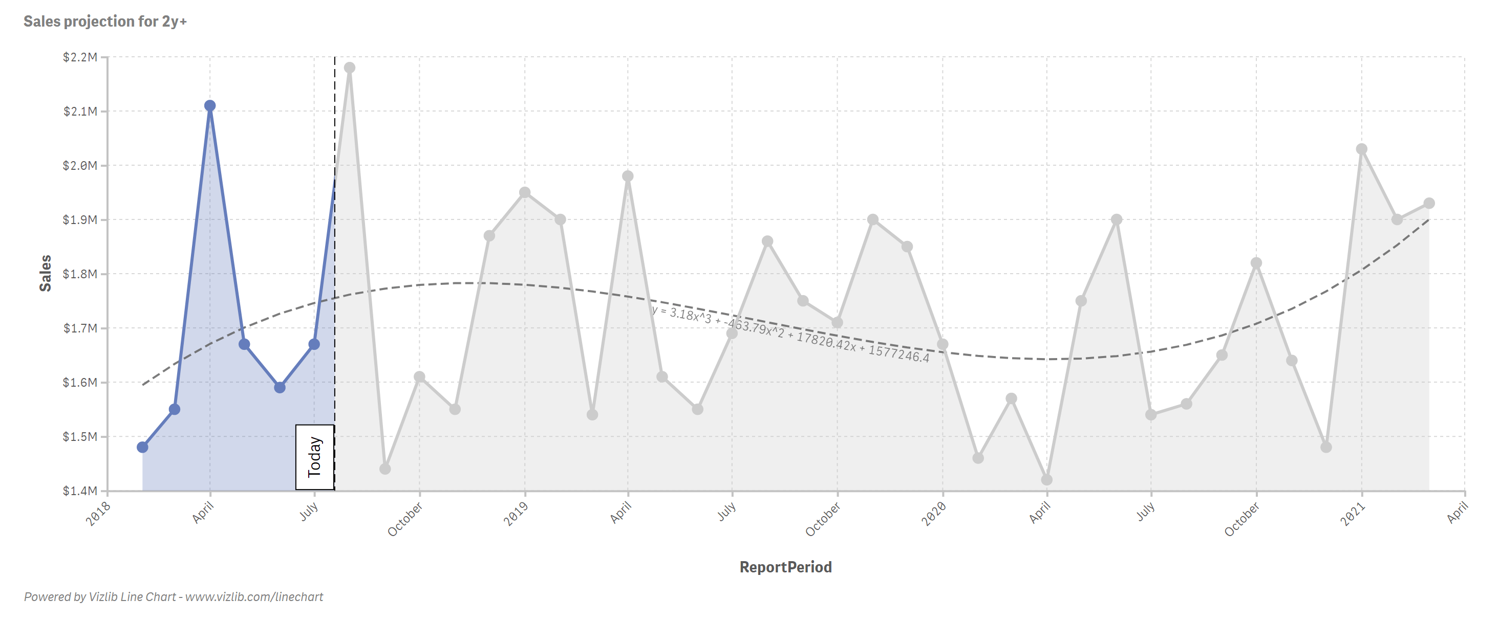
- Use the extension’s advanced analytics for forecasting. Forecasting is a technique used to predict future trends using historical data inputs to make informed estimates. This feature is essential for effective sales planning.
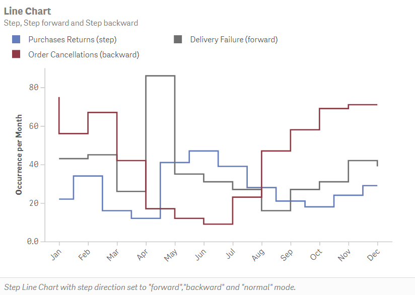
- Another feature of the Vizlib Line Chart is scrolling. This allows users to view numerous data points spanning multiple years without the data overlapping, ensuring the extension is easy to use.
- You can use the extension’s custom colour palettes to change the background colour and adjust your dashboard view to suit a particular industry.
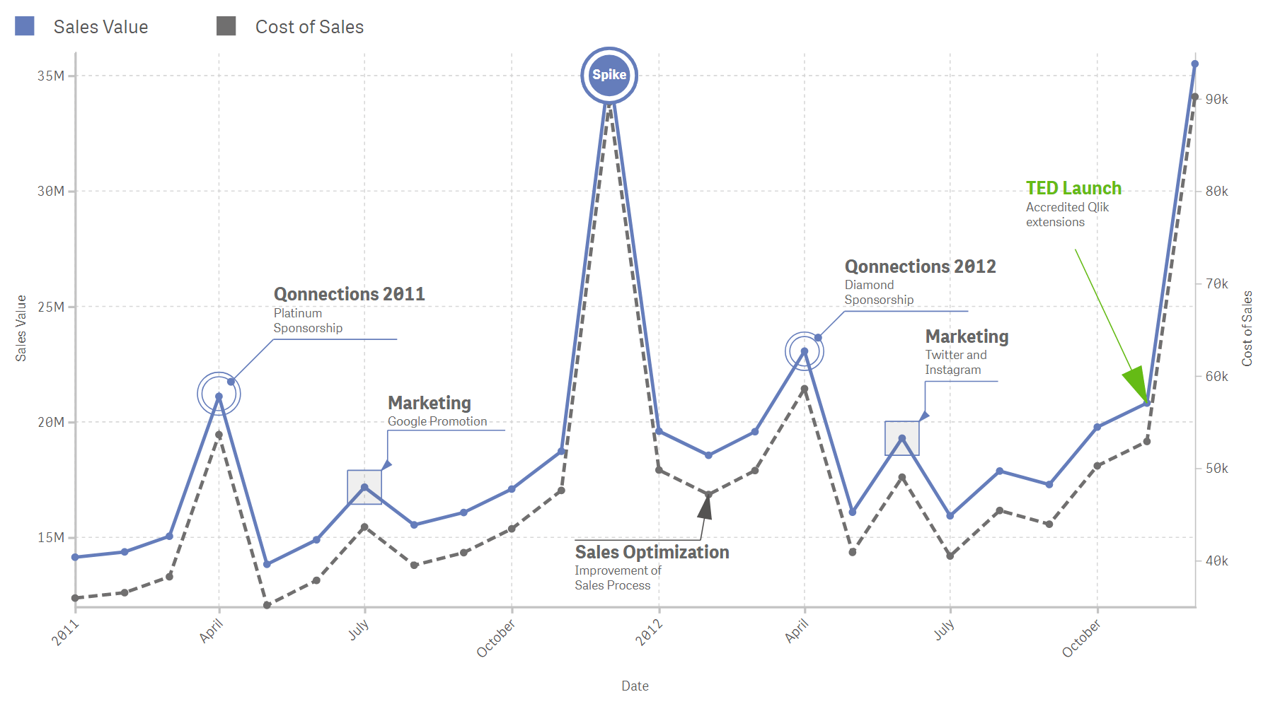
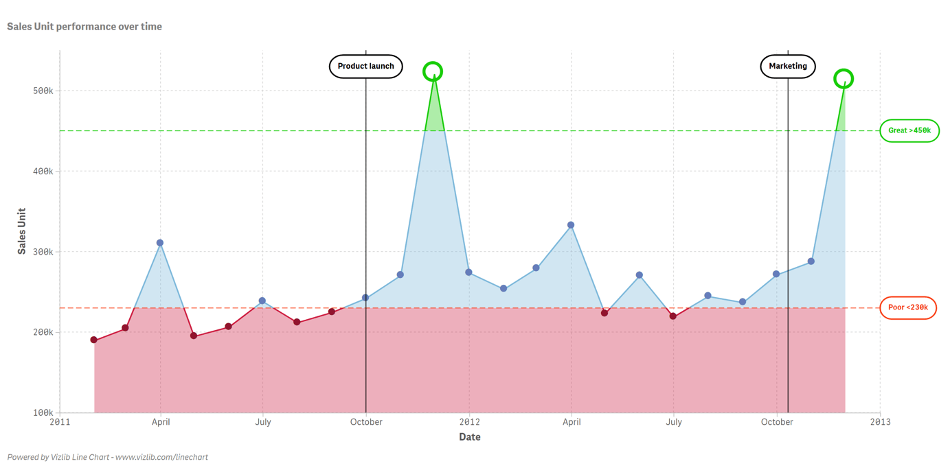
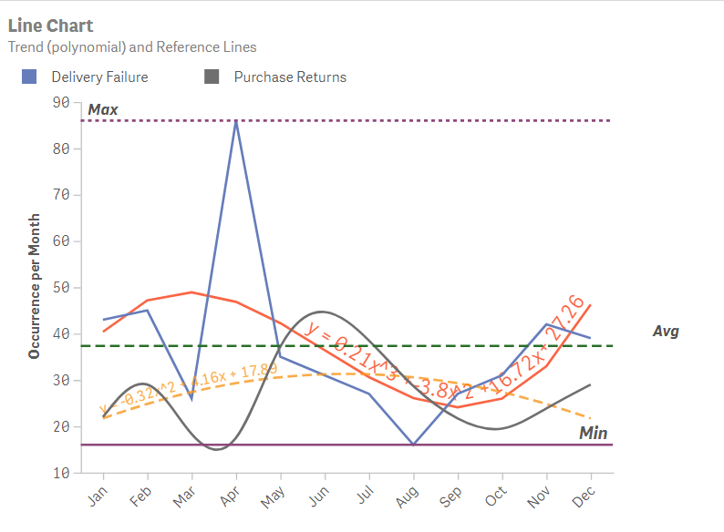
- If you need to emphasise particular data values for a meeting or presentation – choose the Area Representation style. You can even add a reference line to focus the viewer’s attention on how a particular metric measures against the reference and guide their interpretation.
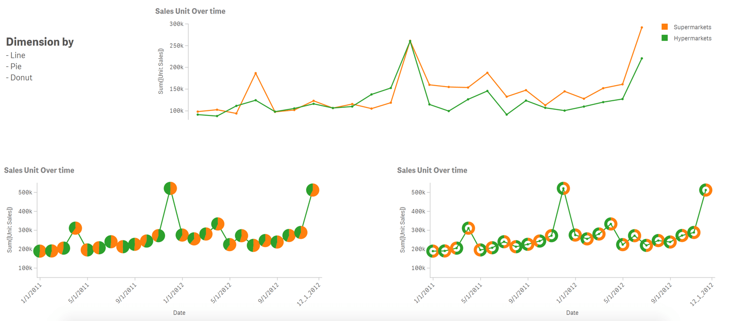
- Another useful tip to create compelling visuals is to drill down into the data by splitting the totals in the Pie and Donut Mini-Charts. It’s a great way to compare the performance of different sales units in the organisation.
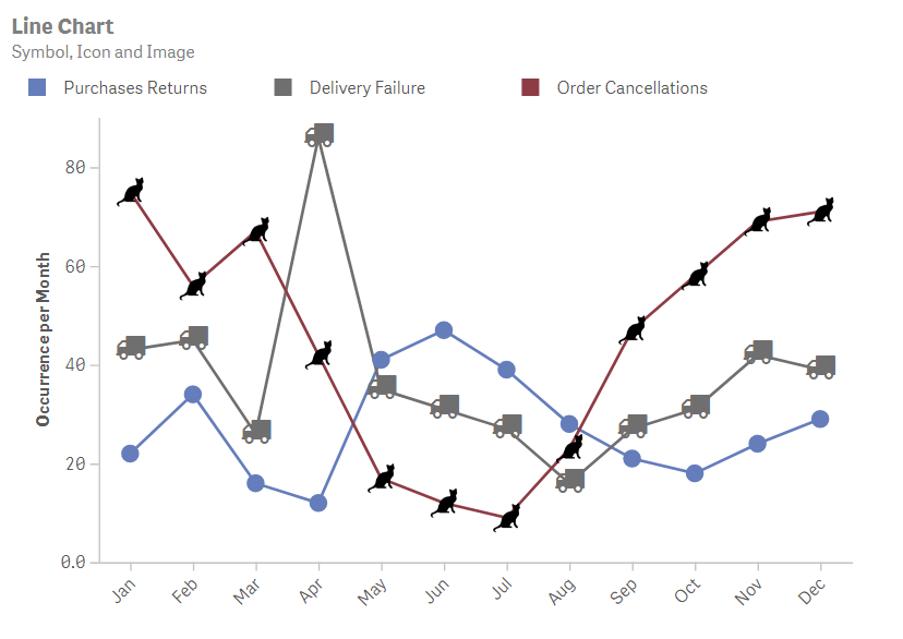
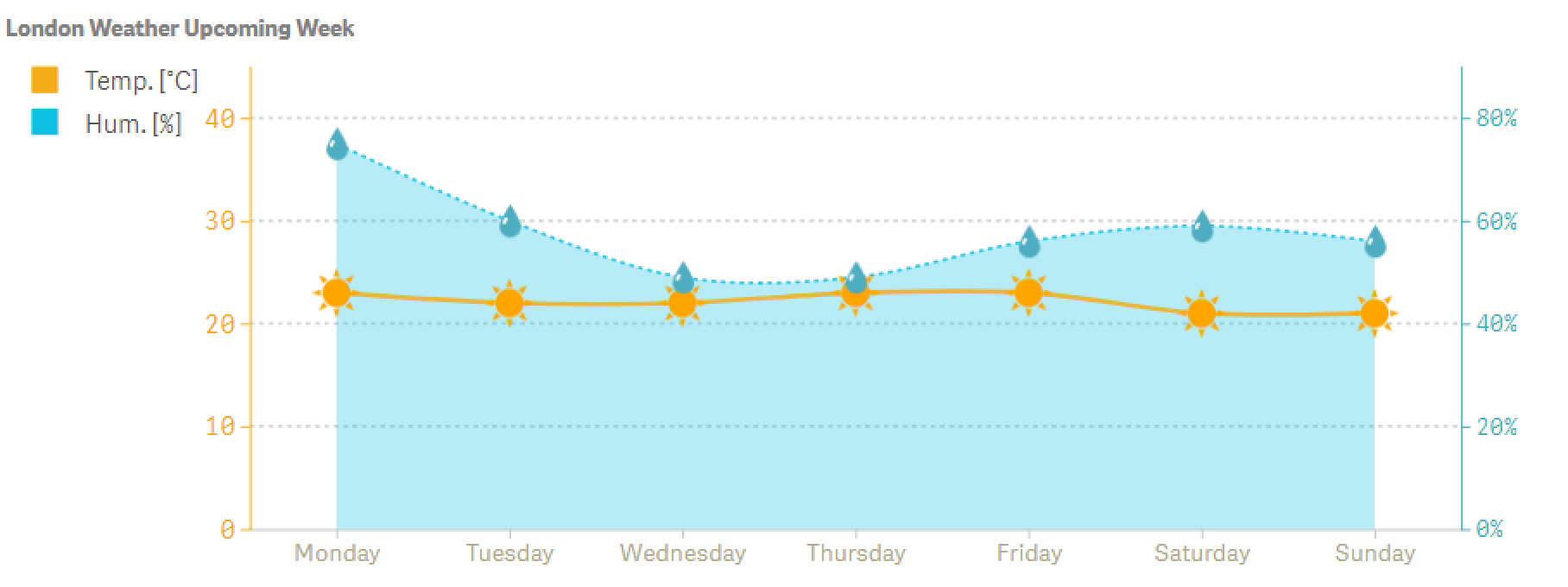
- The Vizlib Line Chart extension allows you to separate multiple data sets for sales or marketing statistics, for instance, by using icons, images and symbols. You’ll ensure the main insights in the data aren’t lost when displaying multiple data lines.
- Use the annotations feature to provide additional descriptive information on a particular object and get the data story across quicker.
- Trend Lines are useful for creating a smooth visual comparison or determining the potential trend on your Vizlib dashboard.
- When you use the Interactivity options, like the hover tooltip, the smart user experience (UX) design allows users to easily view key data as they hover over a data point.
You have the freedom to design your Line chart the way you want to with the Vizlib Line Chart extension. Let this data visualisation object communicate the trends that drive valuable insights.
Learn more on the Vizlib Line Chart here.
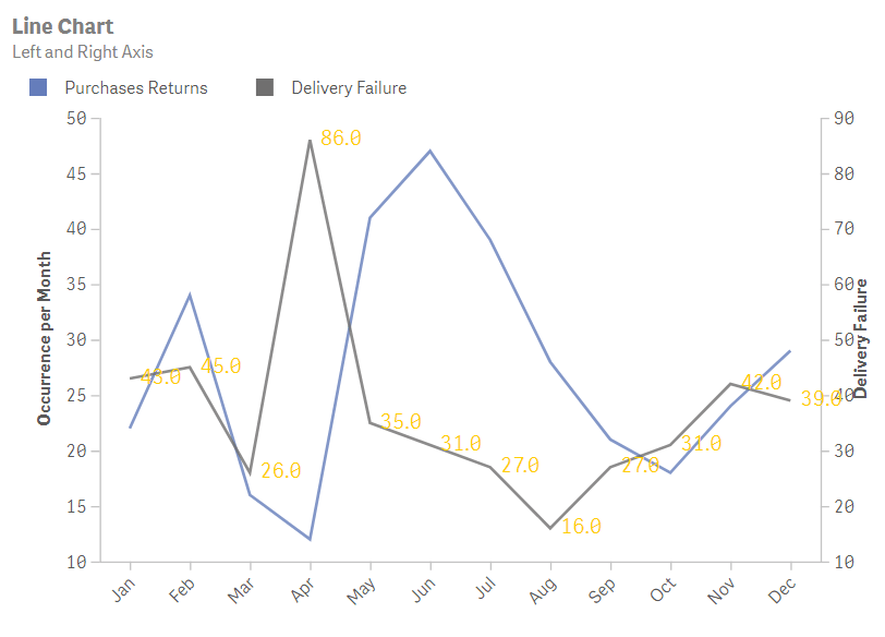
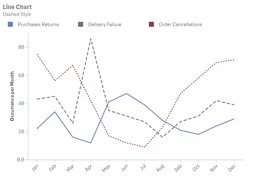
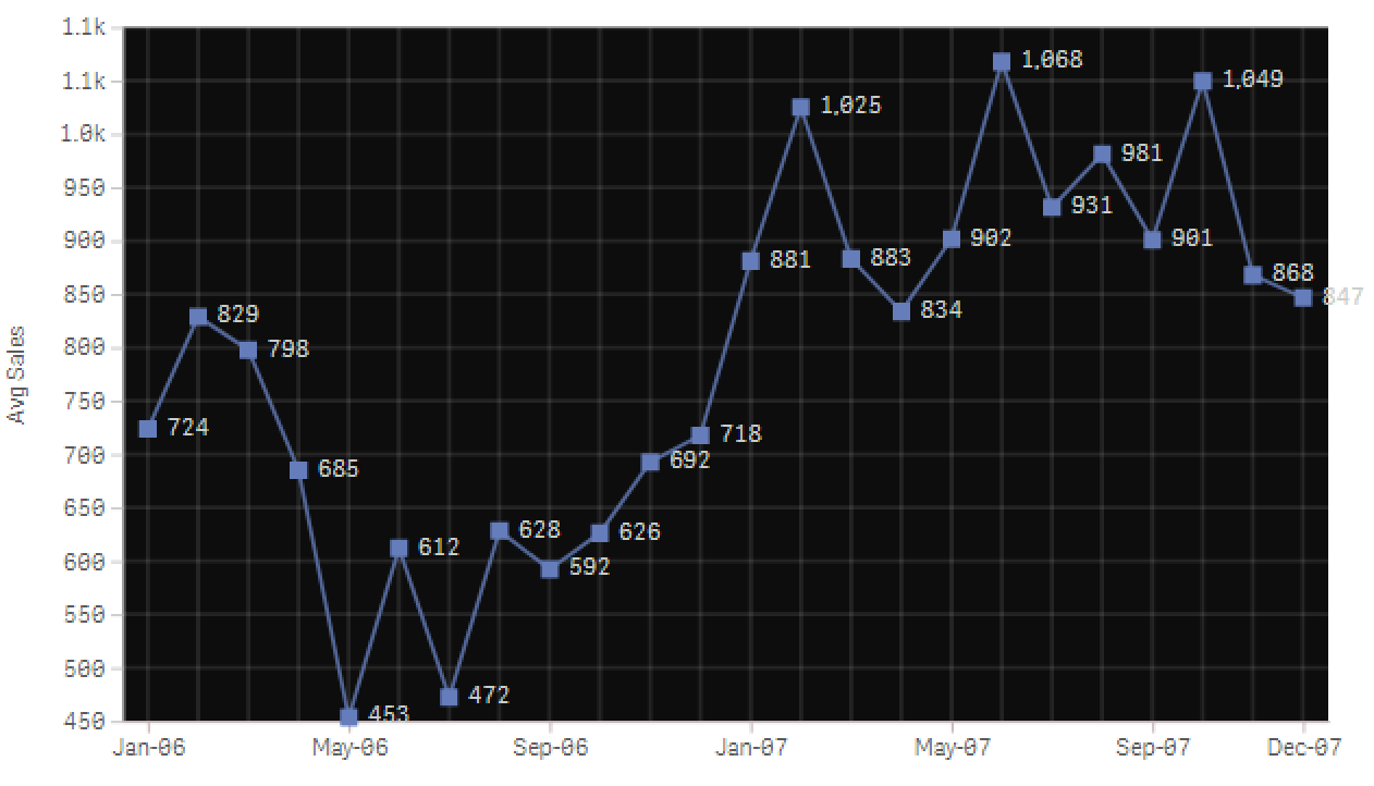
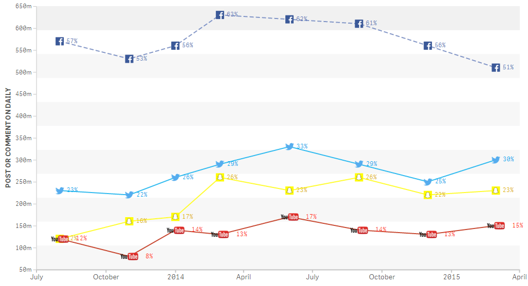
Here are a few examples of customised Line charts created with the Vizlib Line Chart:

Advanced Analytics: Forecasting within the Vizlib Line Chart
Video Player
2020 © Vizlib Ltd. – All rights reserved.