Vizlib Line Object: How to use line objects to organize your Qlik Sense dashboards

Vizlib Line Object for Qlik Sense: What is a Line Object?
A Line Object is a design tool for organising and separating parts of a dashboard. It helps you structure the dashboard neatly and segments visual data into bite-size chunks.
Since it guides the eye to a specific part of the dashboard, the viewer will tend to cluster the objects they see in that segment together as a group. The Line Object allows the audience to decode the visual data quicker.
In everyday life, lines are all around you – the lines of your desk, the edges of a piece of paper, the lines of a building or your favourite striped shirt or skirt. And they’re equally ubiquitous in data visualisation.
How do industry leaders use Line Objects?
In Healthcare they allow scientists to examine complex, multi-variable data sets. They can compare vast quantities of information on a dashboard with the added structure of a Line Object.
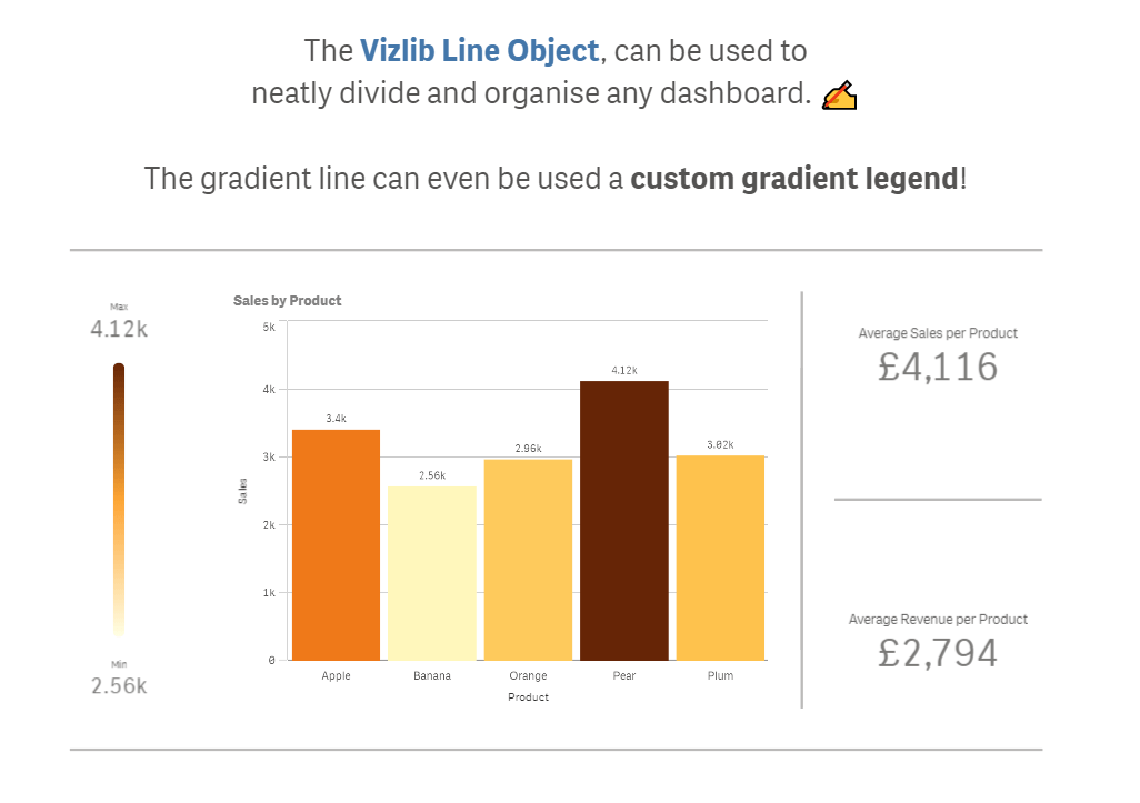
Finance sector Line Objects help executives organise their dashboards more efficiently by dividing the numbers that show the average sales per product and revenue per products.
Retail managers use them in charts to highlight and clearly reflect the result of common food defects and what percentage of the whole each represents.
Within Manufacturing, Line Objects help by establishing lines between several objects on dashboards like two Bar charts demonstrating the production volumes per category and country.
High tech companies use Line Objects to separate dashboard content or to highlight the most important set of factors on a visualisation.
In Energy and Utilities, the gradient Line Object can even be used as a custom gradient legend for a visualisation.
Communication sector managers use Line Objects to add more visual context. They use relevant colours on the dashboard to demonstrate the number of Key Performance Indicators of different social networks and to make the numbers more eye-catching.
Public sector institutes illustrate variables in a simple manner with connection lines between different segments on a visualisation.
Business leaders in Consumer Products use Line Objects to highlight any outlier points and unexpected gaps on their dashboards.
What is the Vizlib Line Object?
Vizlib Line Object is a highly-customisable design extension for Qlik Sense. It enables dataviz designers to structure their visualisation and make the data story easier to understand at a glance.
Use these Vizlib Line Object features to make your data story neat and clear:
- Easy to adapt to the style and format you choose. Adjust it to suit your changing visualisation needs.
- Flexible positioning and orientation. You can place the Line Object where and how you want it to organise your visualisation logically.
- Control the interactivity. This feature enables you to decide what level of interaction users have with the Line Object.
You’ll do far more than toe the line with your visualisations when you use the Vizlib Line Object.
Learn more about the Vizlib Line Object here.
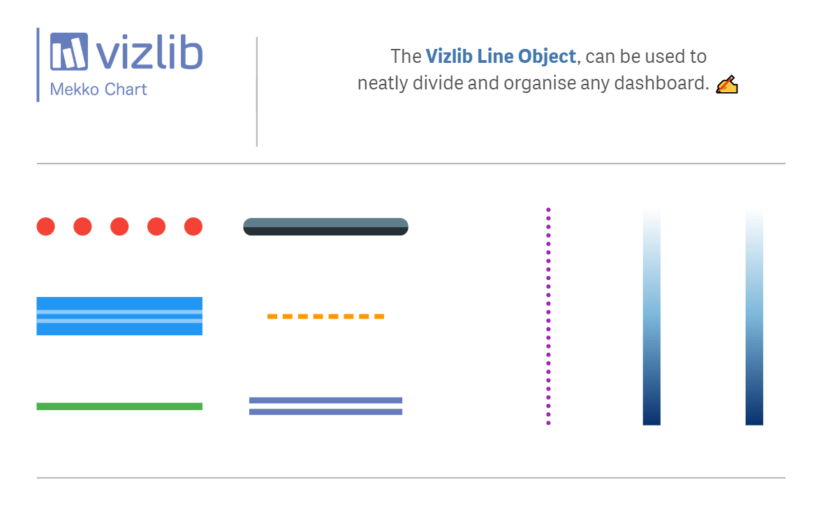
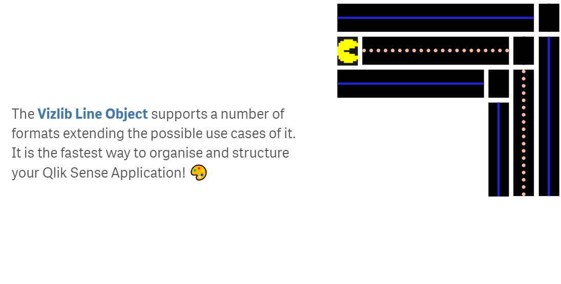
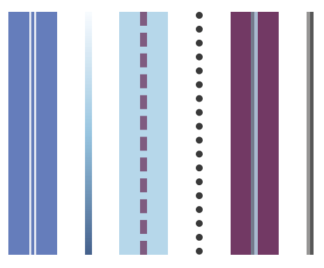
And here are some examples of the Vizlib Line Object.
2020 © Vizlib Ltd. – All rights reserved.