Vizlib Mekko Chart: What’s a Mekko chart and how to use one in Qlik Sense?

Vizlib Mekko Chart for Qlik Sense: The business benefits of a Mekko Chart
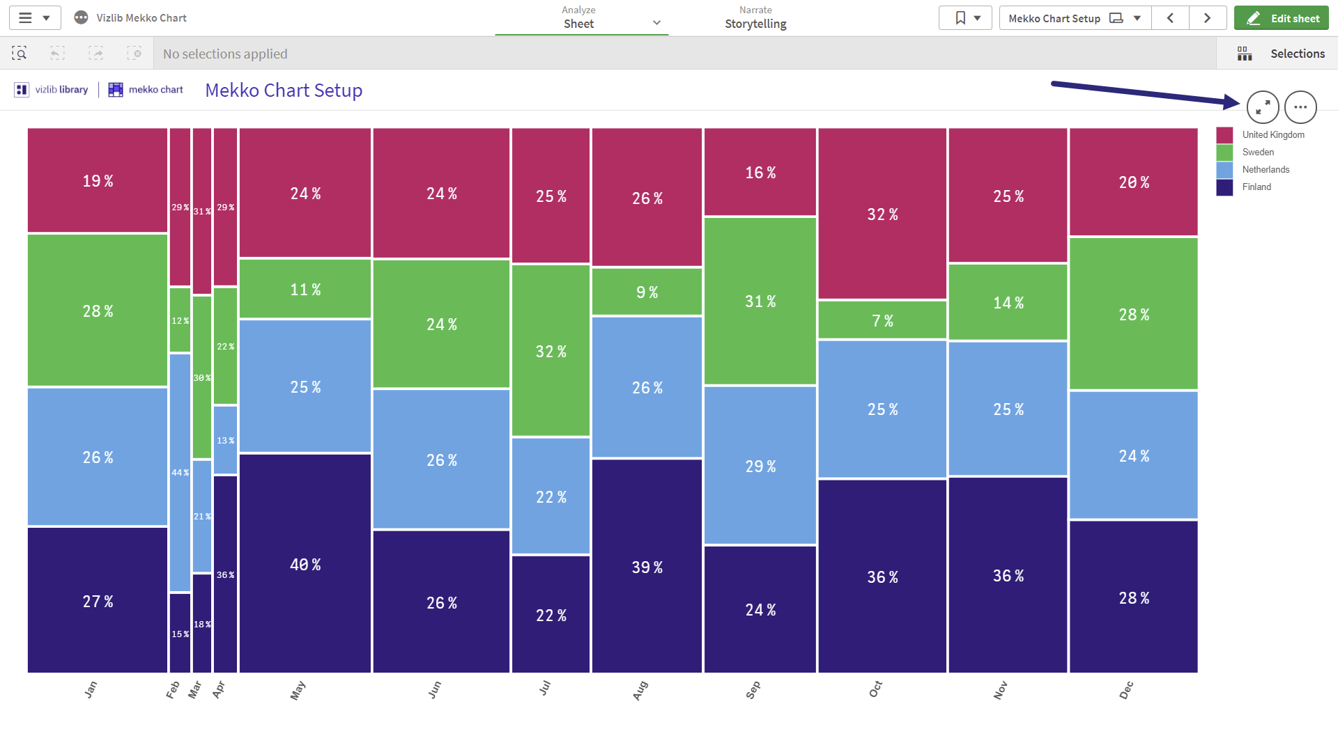
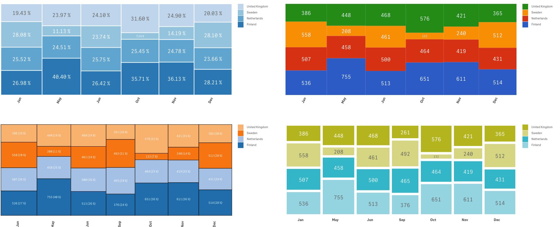
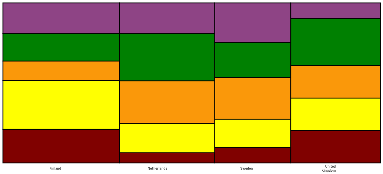
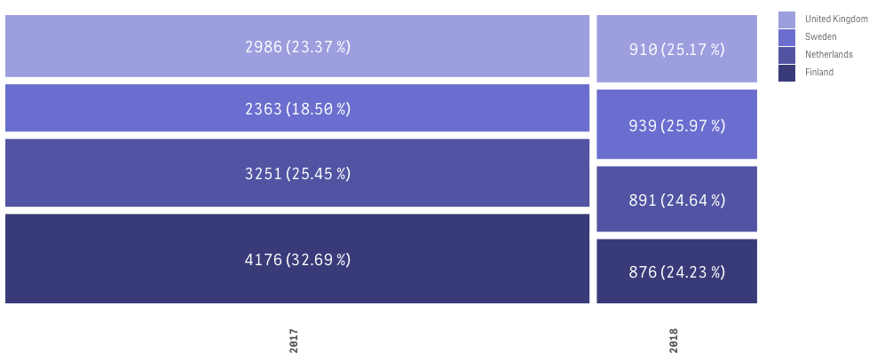
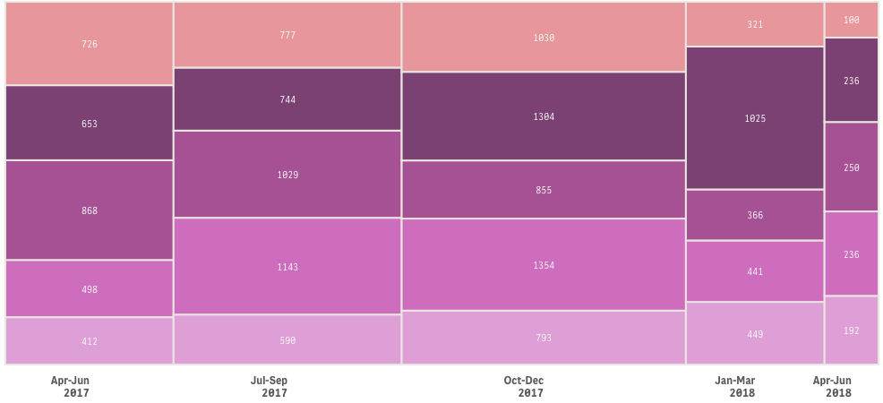
A Mekko or Marimekko chart is a two-dimensional stacked chart. It has varying segment heights, like a regular stacked chart, plus varying column widths. This chart type segments a company or industry by product, segment or customer. And the visual layout facilitates an easy grasp of the relationship of each segment to the total. The audience can hone in on the largest segments at a glance.
Unlike other dataviz charts, both the horizontal and vertical axis can be value axes that represent a numerical scale of your chart values. This can potentially enable the use of a percentage scale.
Since each bar in the chart can have different segments, the Mekko chart serves well for gaining insight into the market. Execs can quickly spot growth and acquisition opportunities with this visualisation type.
Business leaders could also use this dataviz tool to analyse sales by product by product line or sales by competitor by region, for instance.
How are business intelligence leaders using Mekko charts across industries?
In the Healthcare sector, practitioners could use Mekko charts to map the US healthcare spend by category or to perhaps illustrate healthcare expenditure by two variables like service and payor.
Finance practitioners create due diligence profiles with Mekko charts or utilise them to map the market for investment opportunities or track budget breakdowns.
Managers in the Retail space leverage this dataviz tool for a high-level view of sales by customer, product, region or competitor.
Manufacturing companies enable comparisons between geographic production and consumption with Mekko charts. The industry may also analyse craft beer production by production volume and number of breweries.
In the High Tech space, analysts may display their user geographic mix or perhaps chart the number of women in selected tech companies.
The Energy and Utility sector could reflect energy consumption by country or renewable energy jobs with Mekko charts.
In Communications, Mekko charts are popular for analysing digital marketing elements like revenue by channel or popularity ranking.
Analysts in the Public Sector may use these charts to show a food cost analysis, to determine government spend by mission, or perhaps wealth by region.
Life Science practitioners may choose to examine the worldwide air conditioning capacity, an aeroplane demand projection or perhaps a traffic map in a Mekko chart.
Consumer Product companies benefit from Mekko charts that reflect the market or those that display customer purchase drivers or product profitability.
What is the Vizlib Mekko Chart for Qlik Sense?
Vizlib Mekko Chart is an easy-to-use chart extension to expand your Qlik Sense capability. Business leaders can quickly assess the part-to-whole relationships across two variables. Or visualise categorical data over a pair of variables to facilitate smart decision making.
Execs benefit from Vizlib Mekko Chart features such as:
- Analysis at a glance: Get the insights you need on part-to-whole data relationships for agile decision making.
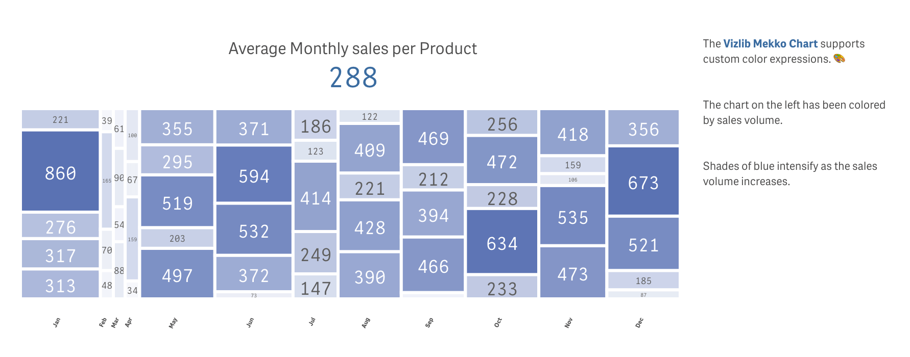
- Customisation: Customise your Vizlib Mekko Chart with the colour, font or border style that suits your data visualisation and connects with your audience.
Mekko charts are a great tool to visualise the relationship between variables and leap into any promising opportunities revealed by the data.
You can learn more about the Vizlib Mekko Chart here. And take a look at a few Vizlib Mekko Chart examples below.