Vizlib Pie Chart: When is it okay to use a Pie Chart in Qlik Sense?

Pie Chart Extension for Qlik Sense: What is a Pie Chart?

A Pie chart is a type of chart which displays information in a circular graph. It’s called “pie” because it’s divided into pieces, like the slices of a pie! While the whole volume of the Pie chart is equal to 100%, each portion or slice represents a fraction of the whole. Each slice also represents a different data category and the size of the slice is proportional to the quantity of data it represents.
What do you think about when you hear the word pie? Perhaps a delicious apple pie or pumpkin pie! Many people have a favourite when it comes to pie. And, if you work with data, Pie charts might be on your list of favourite visualisations! Though they’re certainly not as tasty as a freshly-baked pie, Pie charts do make data more digestible!
Pie charts demonstrate the numerical proportions of a data set in an easy-to-understand visual. And they’re really helpful when it comes to:
- Visualising how many data elements are included in the total. And the portions are shown in different colours too, for easy differentiation.
- Comparing the sizes of different pieces with each other. You can clearly see the largest to the smallest portions of the metric.
- Understanding the part-to-whole ratio to analyse the metric at a glance.
What are the Pie chart’s limitations?
Pie charts have their strengths, but they also have a few limitations you should be aware of.
- Comparing segments which vary only slightly in size is tricky.
- Determining the value of each portion without labels can take a long time for your audience.
- Showing change over time may require many pie charts and could complicate the visualisation.
- Unsuitable for large quantities of data. As the number of values shown increases, the size of each portion becomes smaller, making it difficult to view.
How do managers use the Pie chart in different industries?
Pie charts are a common visualisation in various industries around the world. Here are some examples.
On a Healthcare dashboard, Pie charts can help to visualise the comparison of the costs of various medical procedures clearly.
In the Finance world, CFOs use the Pie chart to build a clear visual comparison of each year’s results or to compare various budget allocations. It’s also helpful for visualising and managing payment collections.
Within the Retail industry, Pie charts are useful in sales to compare the number of different fruits sold with total weight.
Leaders who head up Manufacturing companies can analyse the lost units by cause and compare productivity by different machines.
Technology companies can use Pie charts to track the type of reported bugs, to compare the result of common issues and what percentage of the whole each represents. Pie charts also help to compare the popularity of products based on the number of users.
Energy and Utility companies analyse the portion of different energy sources used during the month with the Pie chart.
Within the Communication sector, companies use the Pie chart to improve marketing effectiveness by defining popular segments.
Public sector Pie charts show a different distribution of data sets. Budget Pie charts are one of the most popular. At school, Pie chart applications include showing how much time is allotted per subject. It can also be used to show the ratio of girls to boys in various classes.
The Life Sciences industry may use Pie charts to analyse the current market landscape or to analyse spend in different areas.
And, in Consumer Products organisations, managers rely on Pie charts to compare the size of market segments or the responses to market research questions. Or they can show the success or failure of certain products.
What is the Vizlib Pie Chart for Qlik Sense?
Vizlib Pie Chart is a fully customisable, supported and easy-to-use extension for Qlik Sense. The Vizlib Pie Chart gives the customisation and functionality you need to create easy-to-digest data visualisations.
Create Pie charts quickly and easily with these Vizlib Pie Chart features:
- Smart Legend control, including flexible positioning to help you organise your dashboard better visually.
- Powerfully enhanced tooltip to add additional metrics and KPIs and present them on hover. This will provide more context for your audience and drive home your message quicker.
- Enable metrics and totals to make your data message clear and prompt the right action.
- Choose from a wide range of colour palettes or set your own custom colours to make your chart a branded beauty!
- Transform your pie into a donut! You can also control the donut’s thickness to balance your visualisation and create visual variation.
- Present the second measure as the length of slice to drive home the data message at a glance!
Pie charts are a fantastic addition to your dashboards! And though they’re not as delicious as an apple pie, they’ll show your data story clearly and satisfy your audience!
Discover more on Vizlib Pie Chart here.
Here are a few examples of how we’ve innovated with Pie charts in Vizlib:
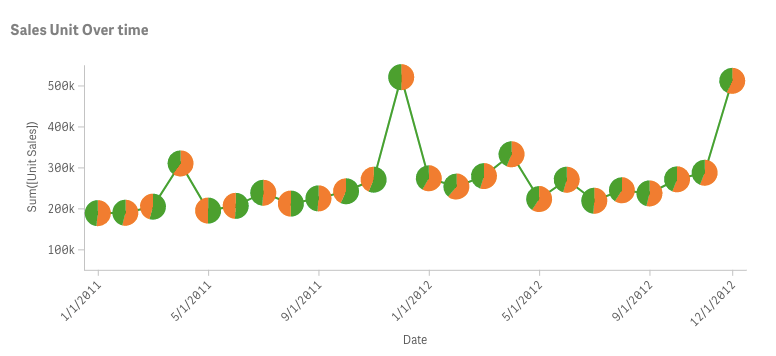
- Use the Pie chart as a mini-chart for Line Chart to split the second dimension and make the visualisation clearer.
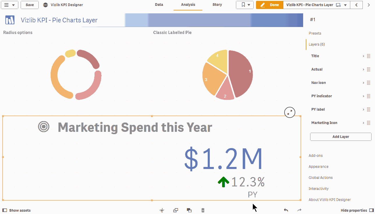
- Or use it as a layer on your KPI object to add more meaning to your story!