Vizlib Sankey Chart: The most common use cases + examples in Qlik Sense

Vizlib Sankey Chart for Qlik Sense: What is a Sankey Chart?
A Sankey chart is a flow diagram for creating and visualising flows between your data. The chart or diagram displays the flow quantity proportionally—the wider the link, the greater the flow quantity. The chart is structured so that these links connect the different nodes or processes. The flows can be combined or split and traced through a series of stages or events to draw out potential business opportunities from the visualisation.
If you need to visualise a complex process and focus on a single resource in that process, Sankey charts are a good choice. They’ll enable insightful decision-making, especially when analysing resources like money, time or energy.
Versatility is another beneficial characteristic of Sankey charts. You can use this visualisation tool to gain a high-level view of your data or drill down into specifics, depending on your data analysis needs.
Much like Tai Chi stimulates the flow of the practitioner’s life energy and brings them clarity, the Sankey chart also simplifies data for the data scientist and uncovers new intelligence. But hopefully does so at a faster pace!
How do data scientists use Sankey charts in the industry?
In Healthcare, Sankey charts are well suited to displaying flows between interconnected processes, like patient flows and clinical relationships or diagnoses made and medications refilled.
Finance practitioners use them to visualise and analyse financial flows, for bank earnings and net profit diagrams or for illustrating anomalies in financial and material flows in organisations.
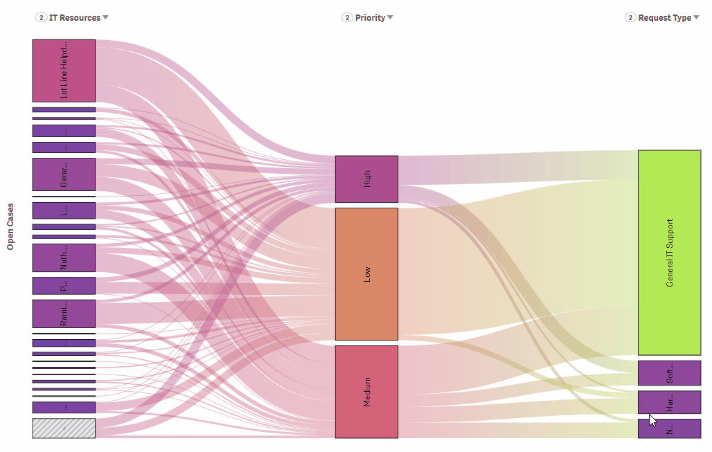
You’ll often find Sankey charts in Retail for analysing the association between different retail departments or for managing order priority flows.
In Manufacturing, they’re helpful for analysing mass flows on a production line with several machines or to display dynamic material flows for products and processes.
High tech companies utilise them for creating ratings like top products for different countries by number of users or for examining the relationship between bugs found, reason for issue and fixing priority.
Energy and Utility companies use Sankey charts to analyse transmission flows, explore the energy mix and consumption or to visualise the fuel, steam and electricity entering manufacturing plants from offsite sources.
In the Communication sector, they demonstrate the relationship flow between customer segments and product categories.
And, in the Public sector, Sankey charts help with the analysis of migration crisis flows, or to show the cost of living and what individuals spend money on.
Life Sciences researchers can draw immediate conclusions on the drug patterns in large data groups with this visualisation tool.
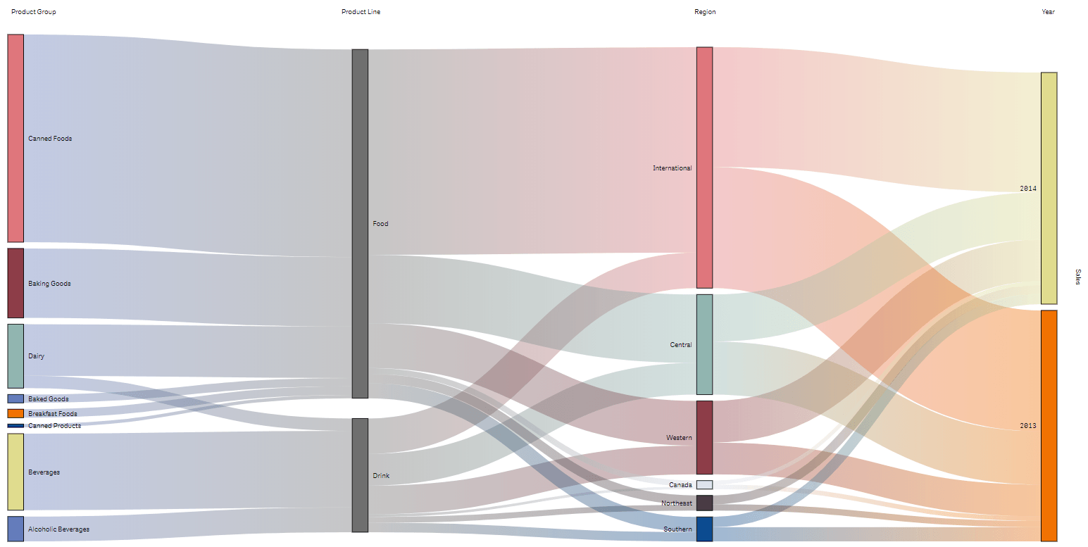
Consumer Products companies use Sankey charts to show how the sum of sales in different segments is distributed across different regions.

What is the Vizlib Sankey Chart for Qlik Sense?
The Vizlib Sankey Chart is an intuitive visualisation tool for analysing the flow of data. It’s an easy to use Qlik Sense extension that helps to steer the data story to the right insights.
Data analysts can benefit from the Vizlib Sankey Chart features like:
- Responsive sizing: Fully responsive for any screen or dashboard size to save you time and dashboard space!
- User-friendly functionality:
- Zoom function: Zoom into specific dimension values for a more detailed look.
- Show/hide conditions to keep the chart size manageable, and also drill-down when you need to for a closer look at specific data.
- Add more than two dimensions to visualise the relationship of the data and get to the cause of data findings.
- Change the sorting order, depending on what data story you want to tell.
- Versatile styling: Style your Vizlib Sankey Chart to a pixel-perfect visualisation.
- Use the show or hide values to keep the visualisation message uncluttered.
- Tweak the node style to show which dimensions have the most attribution to the metric totals and steer your audience to the right conclusions.
- Customise the colours by node or dimension. You can also colour the nodes by gradient to highlight the largest values, a great tool for global comparison of domestic versus international stats.
Sankey charts are all about flow and cause and effect. They’re a critical tool in data science for uncovering insights. And perhaps discovering the secrets of the universe, on the side!
Learn more about the Vizlib Sankey Chart here.
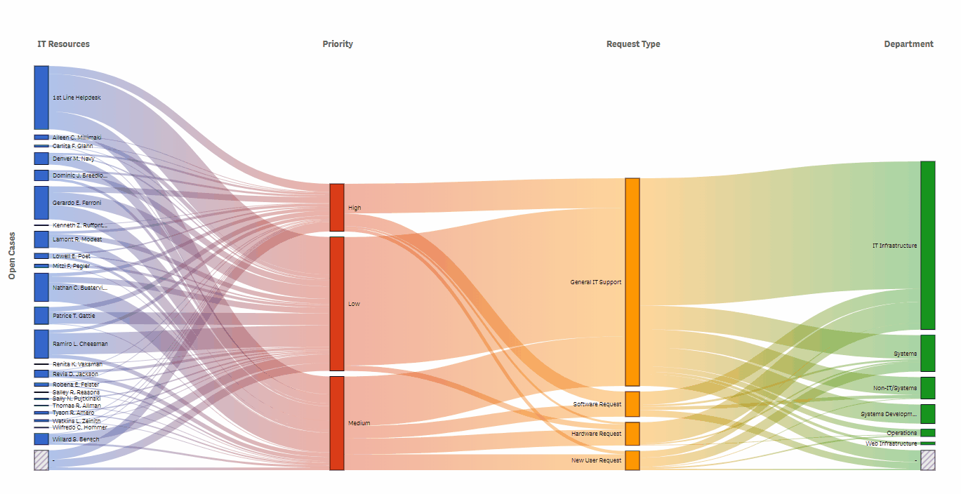
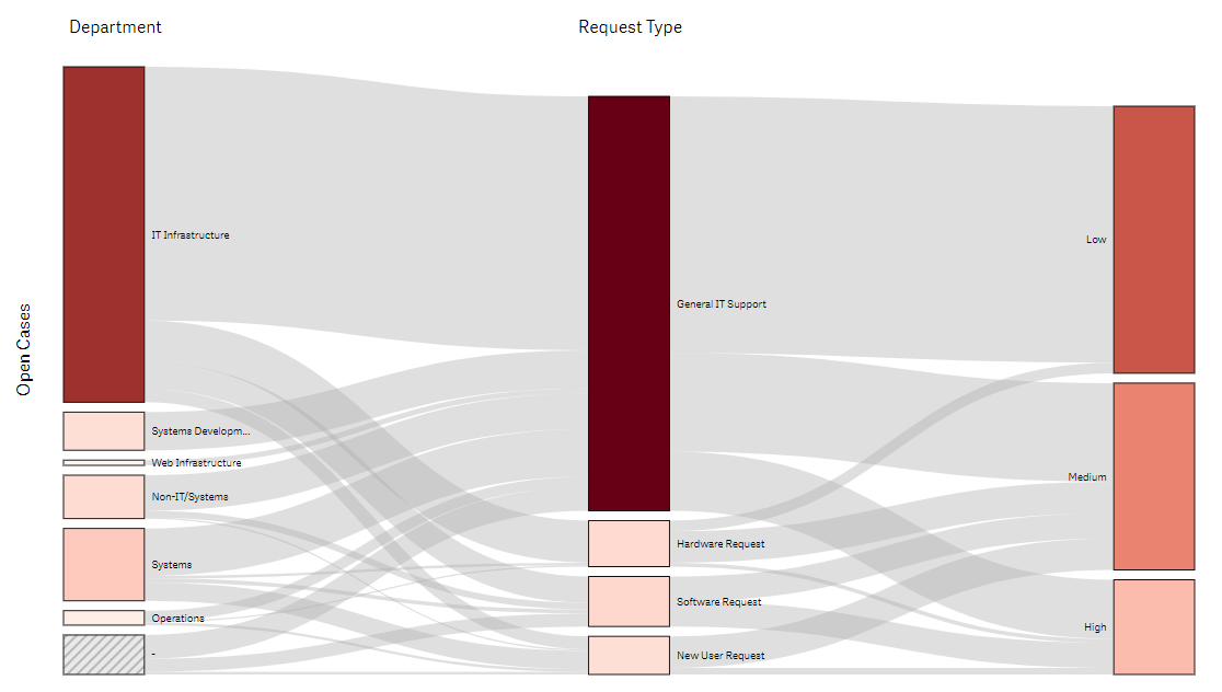
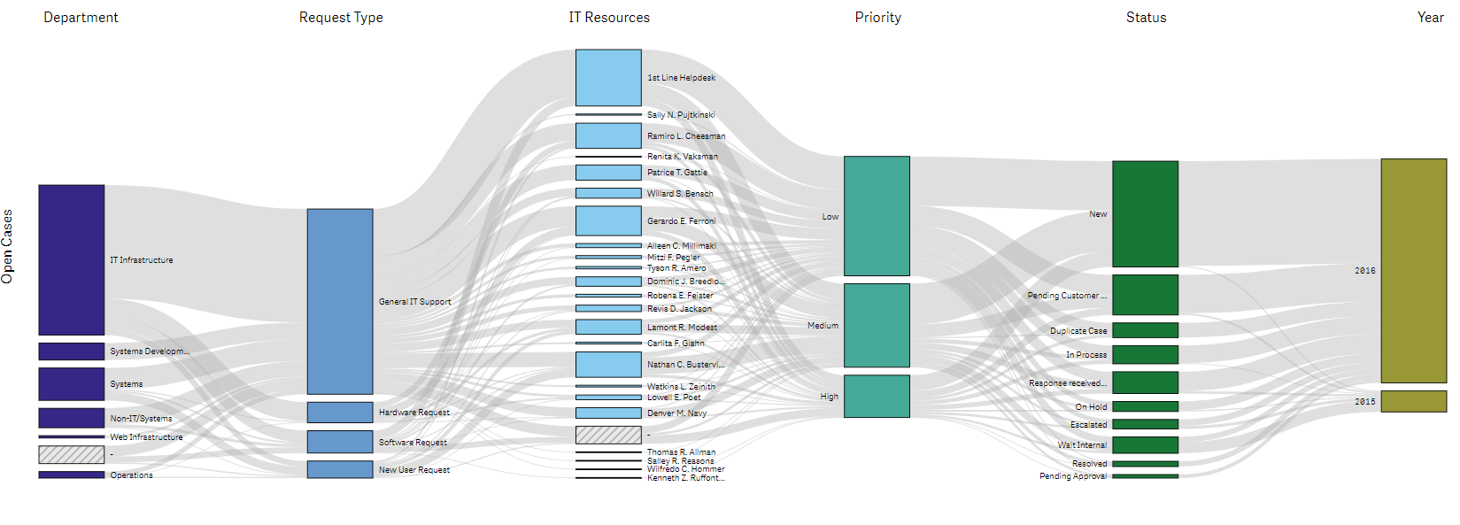
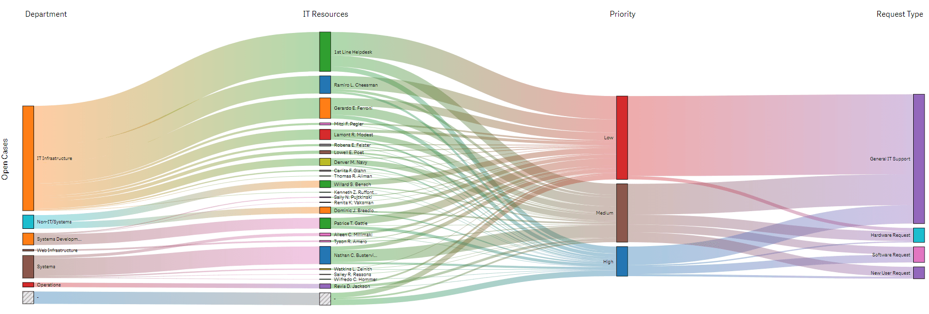
Let’s check out a few examples of the Vizlib Sankey Chart.