Vizlib Scatter Chart: When should you use a Scatter Chart?
Vizlib Scatter Chart for Qlik Sense: What is a Scatter Chart?
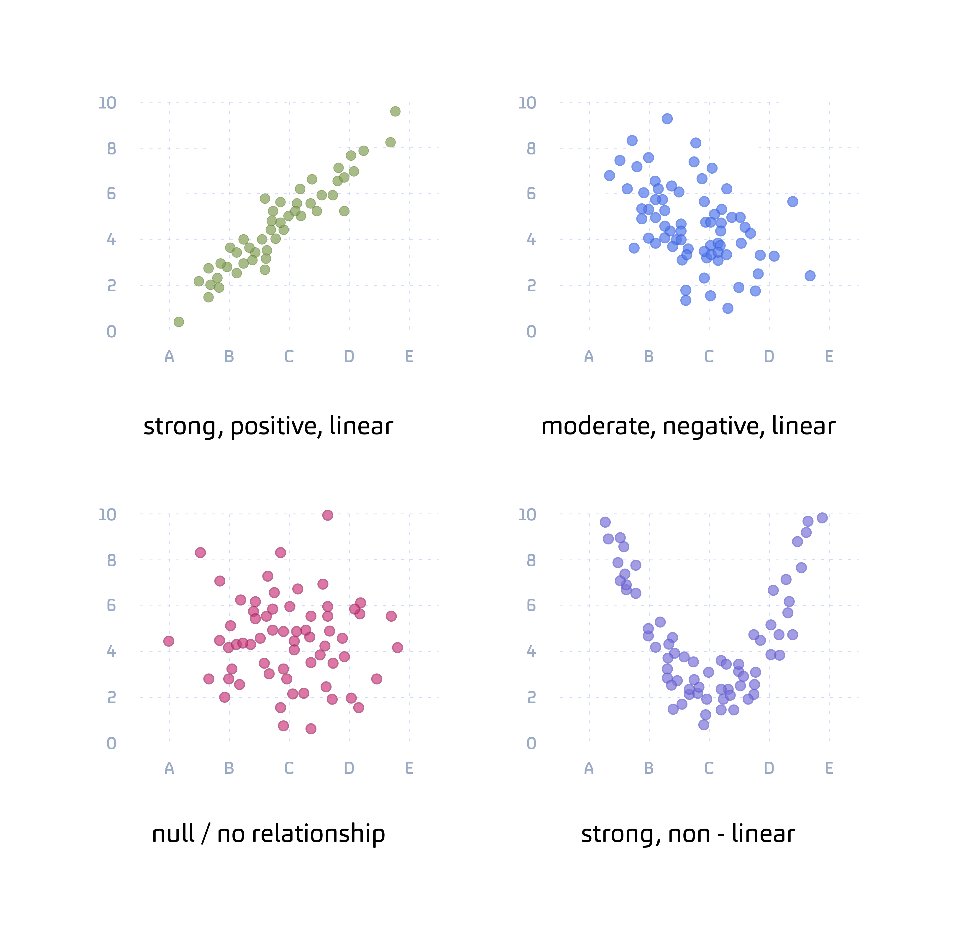
A Scatter chart is a chart that shows the relationship between two quantitative measures. The data points are represented by dots. And the direction and density of the dots indicate the type of relationship between the variables.
Much like a barman at a local pub, one of the main functions of Scatter charts is to analyse relationships, but between data points. If the variables are correlated or equate in some way, the points will fall along a line or curve shape. Or be close to the line or curve. The data patterns make it easy to identify outliers – points that are far off from the primary data clusters.
The more the pattern appears like a straight line or curve, the stronger the correlation. The data patterns can reveal various types of relationships between the points, including:
- Linear: Data points fall along or close to a line
- Non-linear: Data points do not form along a line but may create a curve
- Strong: Data points are close to the line
- Weak: Data points are far off the line
- Positive: As one variable increases, the other one also increases, and
- Negative: As one variable increases, the other decreases
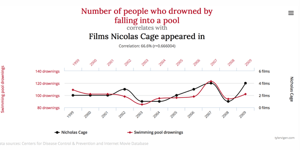
Sometimes the data patterns could lead you to a false interpretation. In statistics, they use the phrase correlation does not imply causation. Though you can see there is a relationship between the data points; you cannot assume that the one variable is the cause of the other. Here’s an example showing how the data points are correlated, but one is certainly not the cause of the other (we hope!).
If you need to get to the cause of a problem, Scatter charts are a formidable cause analysis tool. They are one of the 7 basic tools of quality used to improve the quality and efficiency of processes, along with the Control chart and Pareto chart. So, you’re in good company with the Scatter chart!
How do data analysts use Scatter charts in different industries?
In the Healthcare sector, Scatter charts help with the analysis of complex data sets, like patient cohort management. Analysts might create a graphical representation of medical data consisting of thousands of patients. They also enable a doctor to plot patients’ resting heart rates against their body-mass index figures.
Financial analysts use Scatter charts to show the relationship between risk and return every calendar year. It’s one of the most widely used charts in finance. They also use Scatter charts in network plots to show the relationship between different assets.
In the Retail sector, they’re used to monitor and show the relationship between retail price and mileage.
Manufacturing companies leverage them to compare variables like the number of tomatoes per plant versus the hours of exposure to sunlight.
High tech firms use Scatter charts to compare data sets like the size of their user base and the age groups within each group.
Within Energy and Utilities, Scatter charts represent the number of miles driven by a vehicle on one axis, while the second axis displays the total quantity of gas used.
Analysts in Communications use them to uncover trends they were possibly unaware of, like the efficiency of specific media campaigns.
In the Public sector, researchers can identify and analyse public information like the correlation between life expectancy and household income.
Consumer goods companies use Scatter charts to monitor demand, like a comparison of the selling price to the number of items manufactured.
What is the Vizlib Scatter Chart for Qlik Sense?
Vizlib Scatter Chart is a user-friendly extension for Qlik Sense that allows users to plot and analyse the relationship between two variables.
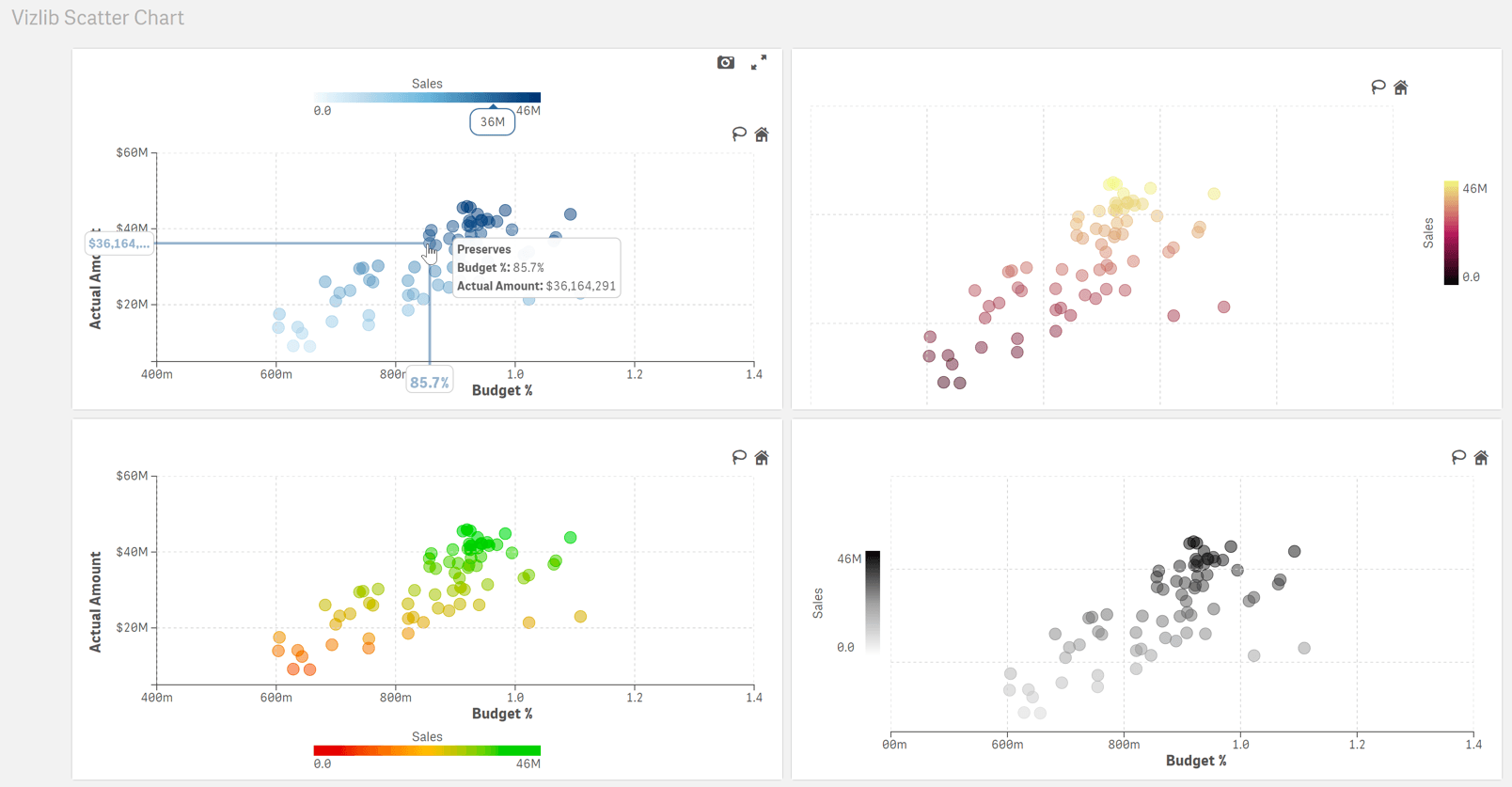
You can use the customisable Vizlib Scatter Chart features to explore your data in-depth and spot patterns quickly.
- Highly interactive: Change the style, layout and objects in the chart to suit your visualisation needs. You even have a Lasso function to make selections easily, saving you time.
- Zoom function: You can zoom in or out of specific data points to analyse granular level insights or have a macro view, for in-depth analysis.
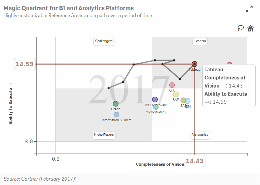
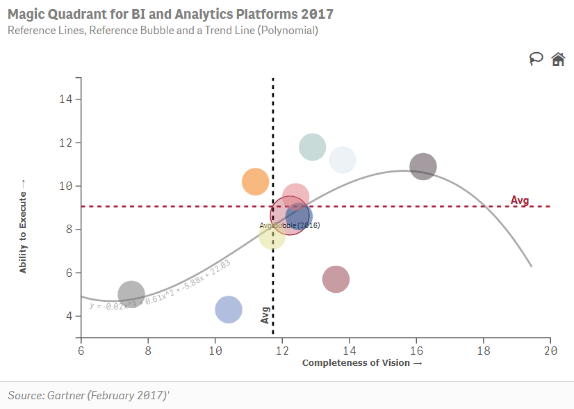
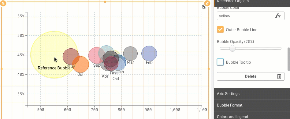
- Highlighting data: Highlight essential data for your audience by using the Reference Bubble or Reference Polygon features. They allow you to focus on a specific area on your chart and streamline data insights.
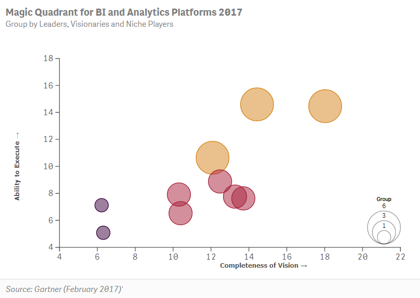
- Clustering feature: For those who enjoy advanced analytics features, use the Clustering feature to cluster data points and recognise patterns in the data easily. It’ll help you to segment and analyse customers or categorise and manage inventory. And you can choose the clustering algorithm that suits your data analysis process: K-Means, DBSCAN or Optics.
Scatter charts are a key visual analytics tool for recognising patterns and analysing data professionally. And with Vizlib’s Scatter Chart, you can create Scatter charts swimmingly, with no coding experience. Let’s hope there isn’t another Nicolas Cage movie being released soon though!
Learn more about Vizlib Scatter Chart here.
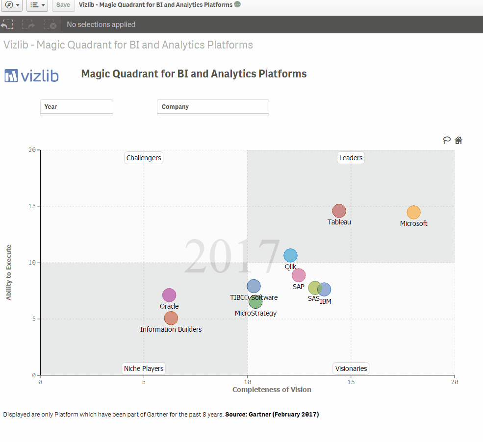
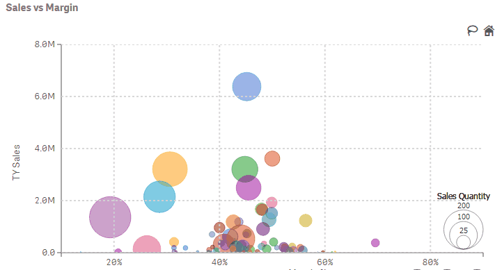
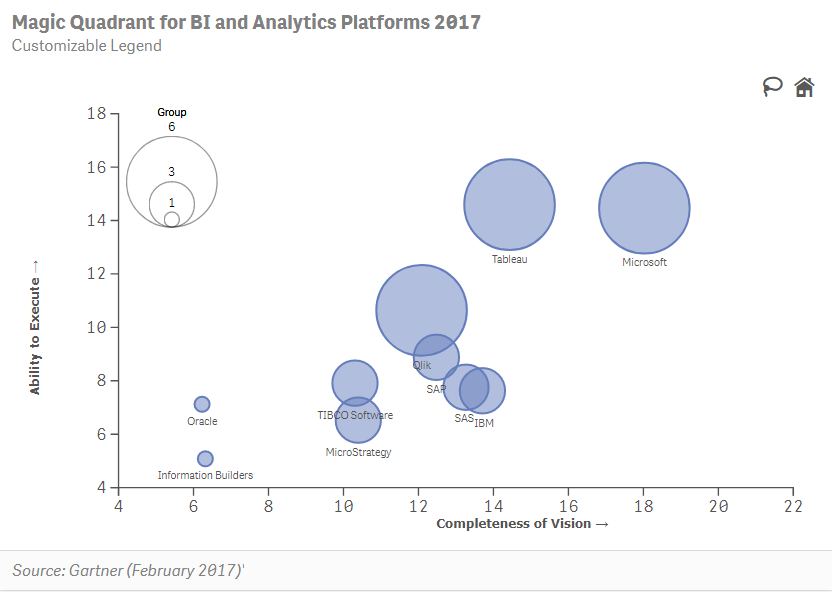
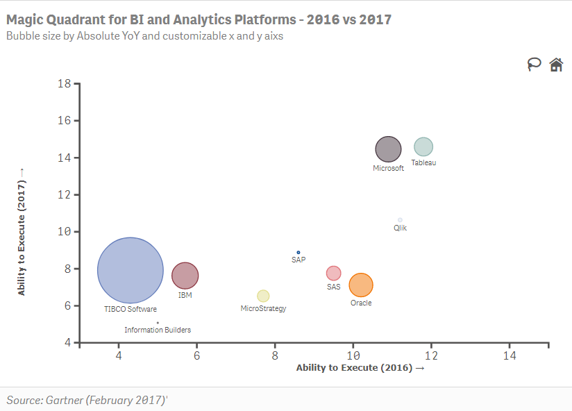
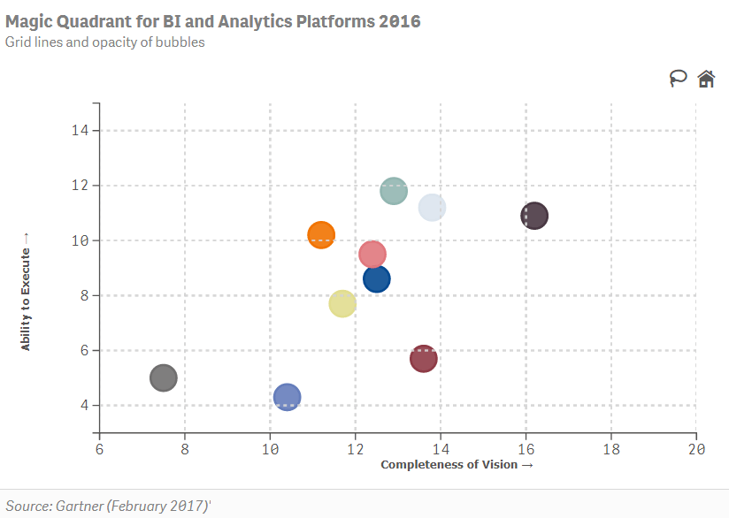
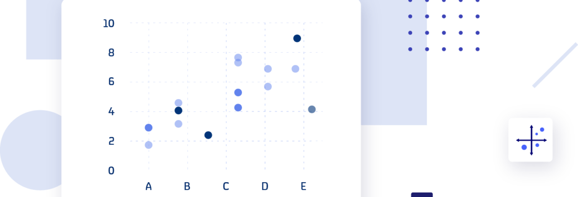
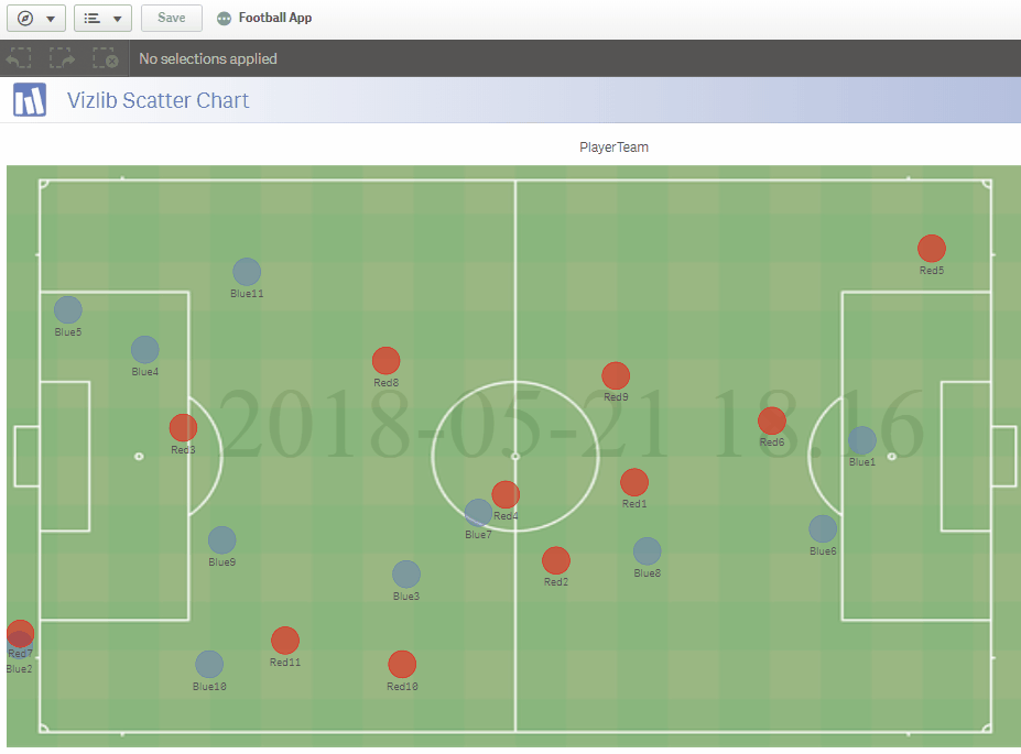
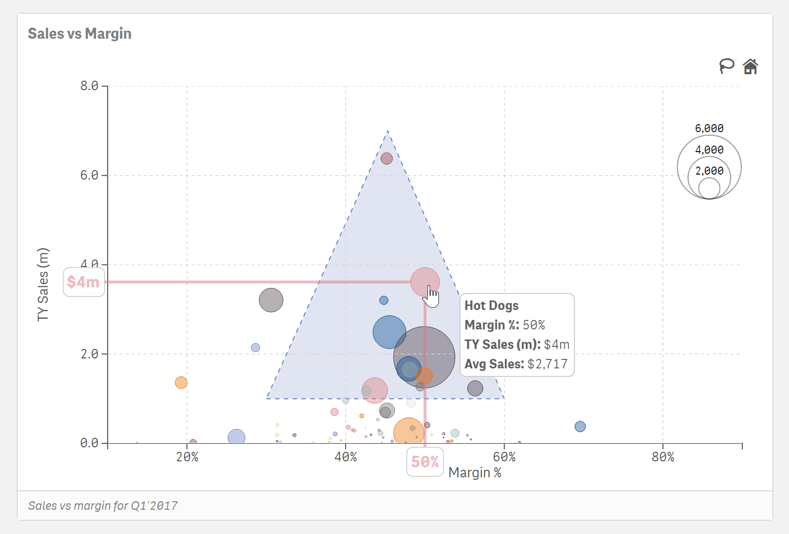
Let’s see a few examples of Vizlib Scatter Chart.