Vizlib Table: How to use Tables in Qlik Sense to solve data problems
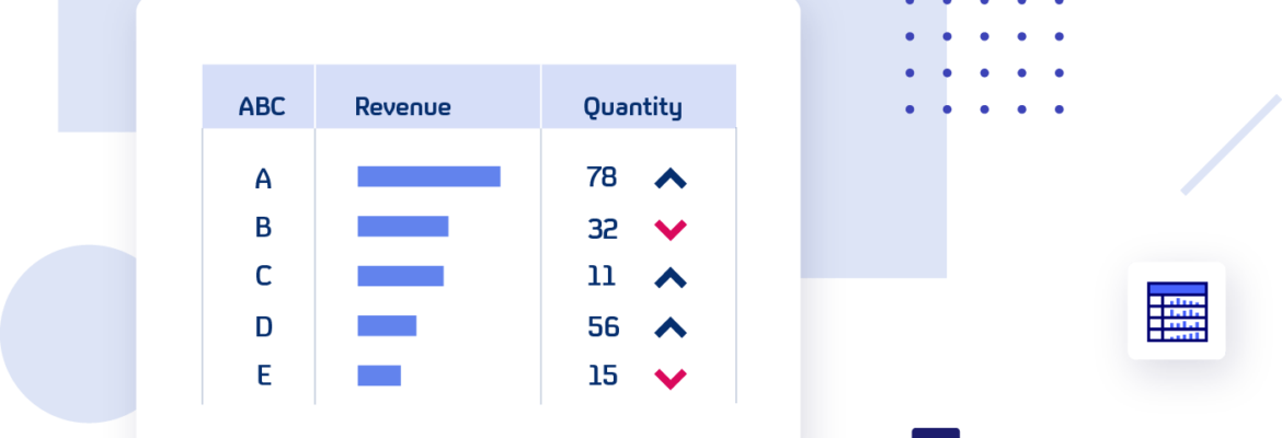
Table Extension for Qlik Sense: What is a Table?
A Table is a visualisation of data in a tabular form. It’s the default visualisation type when you first view a data set. A Table is a basic and transparent way to present data to your audience.
Tables show the data story plainly and allow the user to dig into the figures or values at a granular level. When you have data that needs to be read, rather than understood through a visual context only or data that requires a high degree of attention, tables are the best solution.
They’re particularly effective for identifying the underlying cause in data patterns, like drilling down into healthcare data to analyse the cause of an illness. And, for this function, the Table format is often more effective than a chart.
Choosing the right visualisation for your data sets is important. Charts are often favoured when a Table may suit the narrative better since charts rely on design elements to carry the message across. If your data has numerous dimensions and values, a Table can help your audience evaluate the data quicker than if displayed in a chart.
Dataviz experts may consider the Table a transition tool between raw data and the final product, a detailed data visualisation. But it’s still an effective means to review precise, individual values or view summary information and detailed information in one visualisation, which can be tricky to create in charts.
How do industry leaders benefit from Tables?
Healthcare institutes rely on Tables to manage and organise information like lists of patient details or to keep track of their vital supplies.
Finance executives utilise Tables for simple tasks like profit-and-loss statements or more complex functions like financial modelling.
In Retail, Tables help retail chains track which stores are generating the greatest revenue or to manage inventory levels.
Manufacturing companies require Tables to help them manage their supply chain and staffing effectively.
High Tech businesses track service tickets and SLA features with data Tables.
Public Sector organisations manage their finances and document management in a tabular form. Schools use Tables for their detailed student databases.
Energy and Utilities executives track total reported energy usage per company or create Tables to review new revenue streams.
Communications companies tabulate their product and services offerings and distributor lists.
Tables in Life Sciences institutes are an important tool for managing their extensive research data.
And in the Consumer Products industry, Tables help companies manage information on customers and products.
What is the Vizlib Table?
The Vizlib Table is a versatile Table extension for Qlik Sense. You can tailor the extension to your design needs and transform complex data into digestible visuals.
How do the Vizlib Table features help you get started quickly?
- Easy to use: The Vizlib Table is user-friendly and requires no coding skills to create your ideal Table quickly. The extension is great for ad hoc data analysis and saves you time. And you can navigate the Table easily with tools like the horizontal scroll function or the freeze panes options.
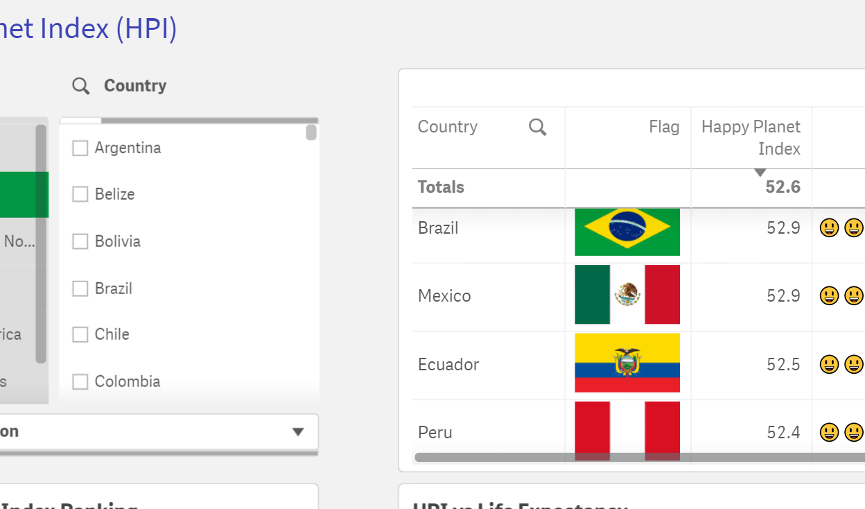
- Personalised components: Easy formatting options allow you to change elements like the Table layout, widen rows, change the background colour or add Tooltips to design the Table that suits your style requirements.
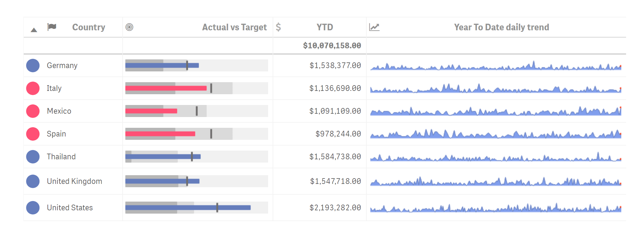
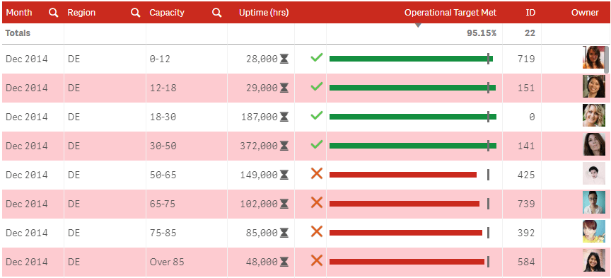
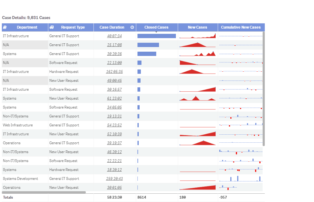
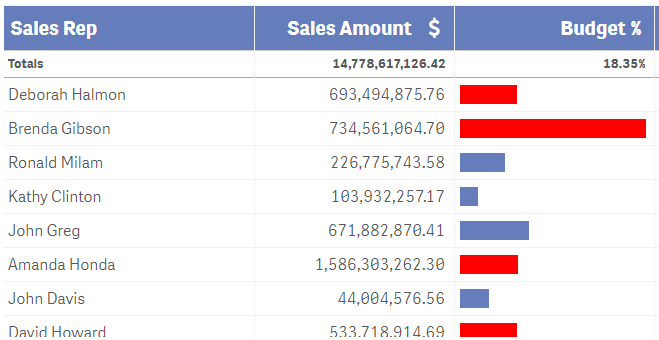
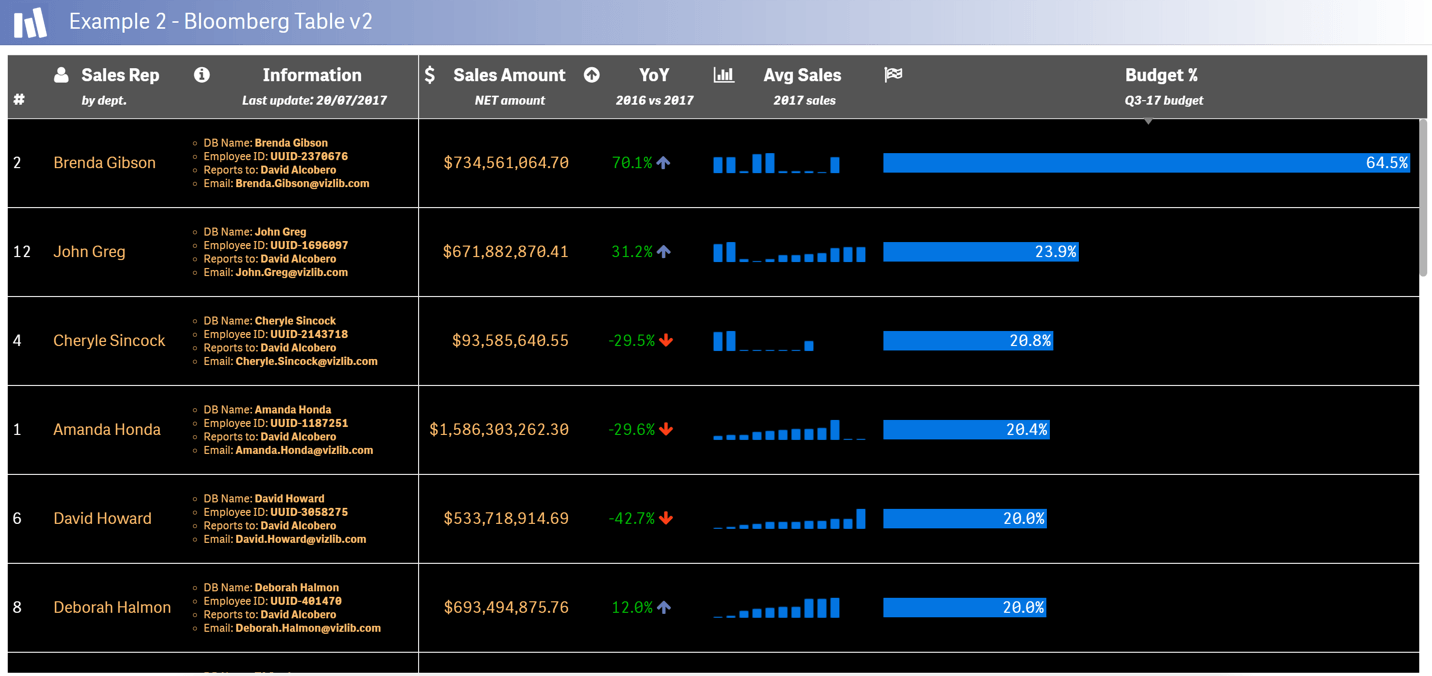
- Improved functionality: You can change how a measure is represented like text in your budget column into another format, like a Bar chart. You’ll be able to immediately see the leading figures and save time since you no longer need to search through all the rows.
- Additional visual context: Add a Minichart to incorporate a time dimension to data sets, like highlighting overall sales per salesperson. This additional visual context drives home the data message quicker to your audience.
- Visual targeting: Turn your measures into a Progress bar or BulletChart to visualise achievement and performance levels at a glance.
Viztips: The power of visual analytics on hover
Viztips is a next-level capability for Vizlib Library that enables you to insert customised, dynamic charts in your tooltips. Include Viztips with Vizlib Table to add additional insights without adding clutter to your visualisation. Your end-users can get granular level data on hover, without being overwhelmed by too much data. Since Viztips consists of two components; your main Vizlib chart and a Vizlib KPI Designer Layer, you can include up to 10 custom layers in your Viztip design!
Data scientists may consider Tables a basic visualisation resource, yet its strength lies in its simple, transparent communication. The Vizlib Table is a fundamental tool for elevating your data story and is ready to take on the world!
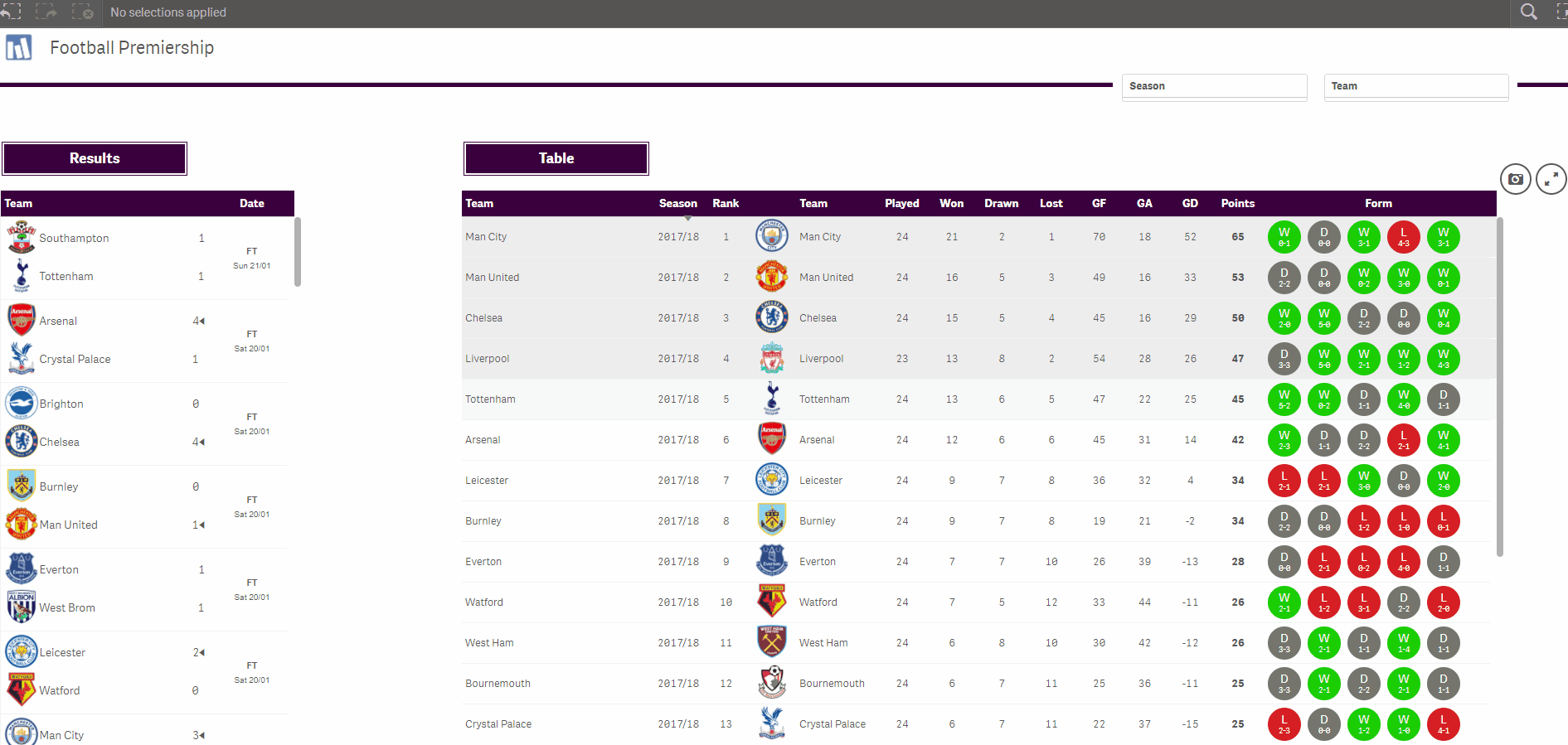
You can learn more about the Vizlib Table here. Here are a few examples of the Vizlib Table.
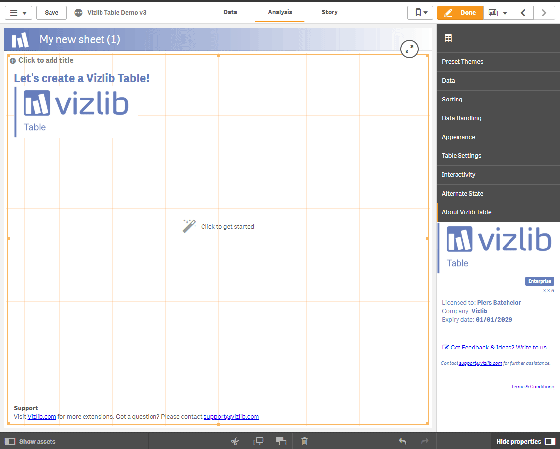
Vizlib Table Wizard
Video Player