Vizlib Venn Diagram: What is a Venn Diagram?
Venn Diagram Extension for Qlik Sense: What is a Venn Diagram?
A Venn diagram is a type of chart used to visualise the overlap between two or more data sets. It typically uses circles or ellipses to illustrate relationships between segments, clearly showing their similarities and differences. Where the shapes overlap, there’s a commonality, and where they don’t, it shows the two sets are lacking common traits.
The Venn diagram is extremely useful as a conceptual tool, though it is frequently misunderstood, as the below example illustrates! ?
Business leaders use it to visually organise information so their audience can quickly grasp the relationship between data sets. It allows them to compare and contrast two or more choices and identify the overlapping elements. The Venn diagram provides the context you need to make strategic business decisions, such as making an investment or purchasing a new product or service.
What is the Venn diagram used for in different industries?
Venn diagrams are widely used in many disciplines, most notably in mathematics, statistics, logic, teaching, linguistics and computer science. Because of its powerful visual effect, the Venn diagram is a popular choice for business reports and presentations. It inspires new ideas and discussions, which can lead to new business opportunities and growth.
In the Healthcare sector, practitioners use Venn diagrams to explore the comorbidities (having more than one disorder) for patients, visualising the common and unique connections between various diseases.
Financial Services executives can plan and strategise financial development by examining the interplay between their vision, mission and targets.
In Retail companies, Venn diagrams can help to visualise and optimise their product mix, promoting better targeting and cross-selling.
Business leaders in Manufacturing can examine the relationship between material types, like metals, ceramics and polymers.
High Tech companies gain valuable insights from Venn diagrams when they compare concepts like quality, speed and cost.
Public Sector institutes may study the relationship between services provided and the underserved, helping them to better serve their constituents.
Energy and Utilities executives could forward their sustainability goals by examining the relationship between the environment, society and the economy.
Communications executives use Venn diagrams to study the correlation between their digital marketing components like their website, social media and email.
Life Sciences practitioners could choose to examine the similarities and differences between clinical practice, diagnostic development and pharmaceutical development.
And, Venn diagrams can help Consumer Products companies to improve their sales by visually examining the relationship between the promotion of sales, discounts and displays.
What are the Venn diagram limitations?
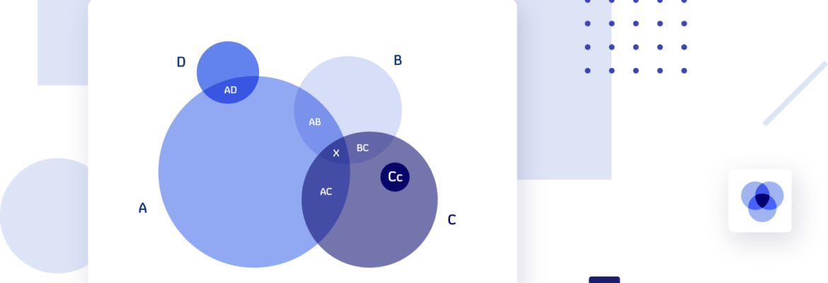
- Inaccuracy: Venn diagrams can be inaccurate when more than three circles are used. It becomes tricky to keep all the pieces in proportion and the diagram ends up as an imprecise depiction of data sets.
- Misrepresentation: Circles are not the best shapes for Venn diagrams that aim to visualise four or more data sets. They fail to represent all the possible intersections of four (or more) sets. Rather choose ellipses.
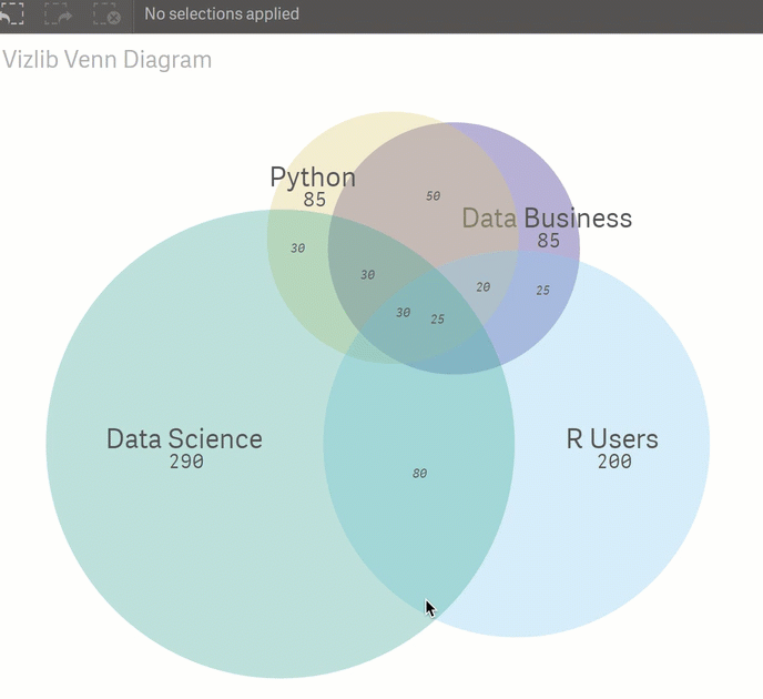
What is the Vizlib Venn Diagram for Qlik Sense?
The Vizlib Venn Diagram is highly customisable and extremely easy to use. With the drag-and-drop functionality, you can create visual representations showing the interrelations of data in just a few clicks.
Create a Venn diagram with unprecedented speed using these Vizlib Venn Diagram features:
- Drag and drop function: You can easily create a Venn diagram by simply dragging and dropping the available dimensions and metrics. You’ll be able to demonstrate your data concepts and their interrelationship immediately to your audience.
- Customisation: Customise the elements of the Venn diagram like the circle’s colour and opacity to suit your brand and particular audience.
- Interactivity control: You have control over how users interact with the Venn diagram. Manage which features they can change to ensure you get the quality visualisations your business needs!
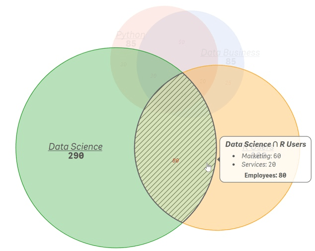
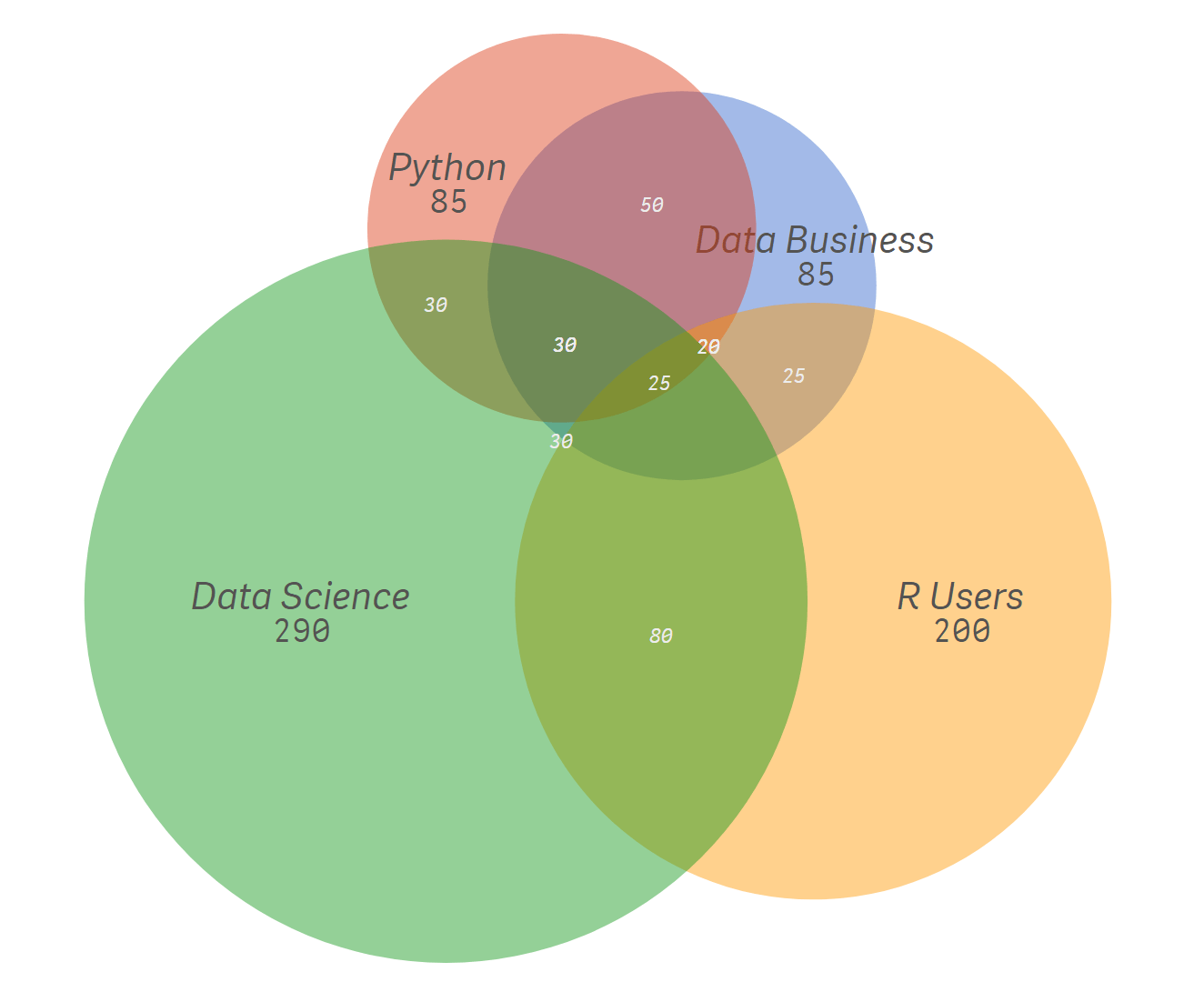
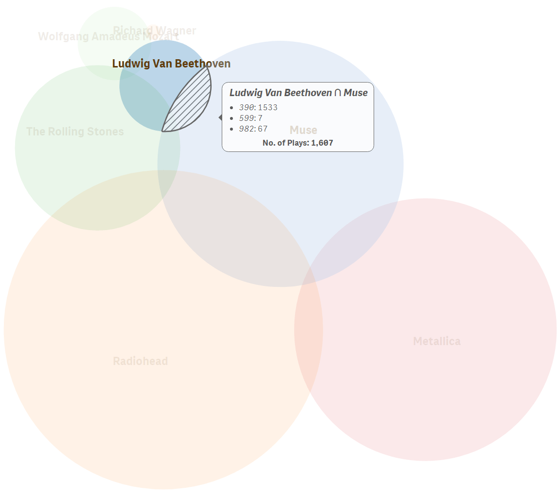
Let’s look at a visual example:
Using data shared by a recruitment agency, we’ve built an interactive Venn diagram to visualise the skill-set of a candidate pool. In a few clicks, you can get a general overview of all the skills and an accurate idea of rare skills vs. abundant skills, highlighting the candidates who are more “sellable”. Users can easily interact with data and navigate the chart for deeper insights.
Venn diagrams help to collate data visually. They enable executives to analyse findings, identify the logical relationships between data sets and make insightful decisions.
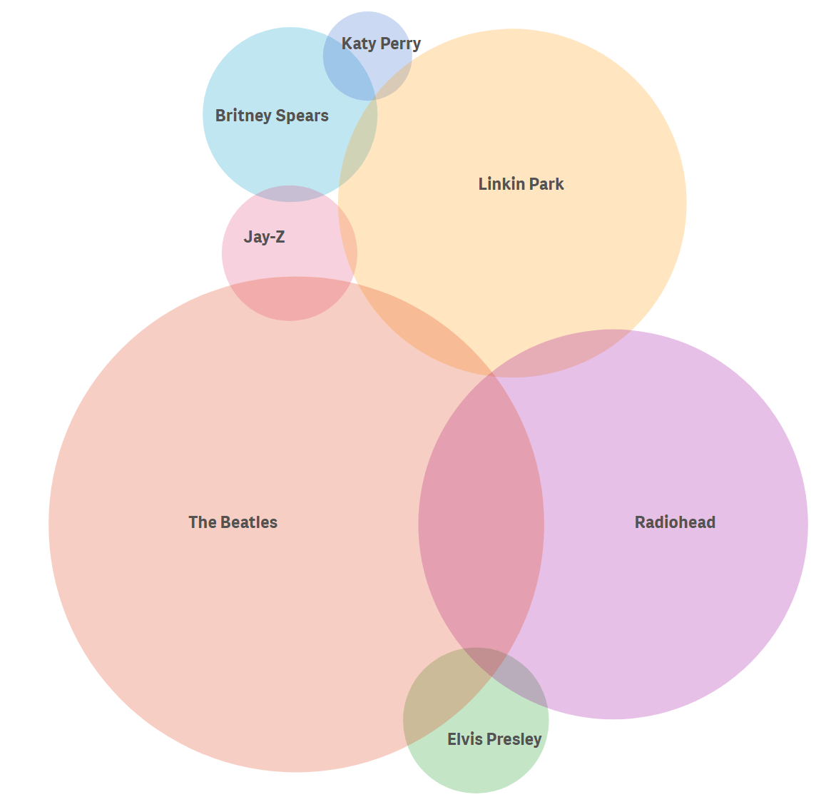
Head over to our community to discover more on the Vizlib Venn Diagram. And see a few more examples of the Venn Diagram below: