Vizlib Waterfall: What is a Waterfall chart and how can it speed up your analysis in Qlik?
Vizlib Waterfall for Qlik Sense: Transforming data to visual insights

Much like climate change is shifting global weather patterns and trends (if you believe in that sort of thing! ?), the same wave of change is evident in data analysis.
Business software needs to adapt to changing industry requirements. And though many companies stick with familiar favourites such as Excel, modern data analytics needs have evolved far beyond that point.
In today’s business world, data users demand instant insights. And the best way to serve up understandable, bite-size data is through visual analytics.
Waterfall charts are a good example of how to show essential data visually.
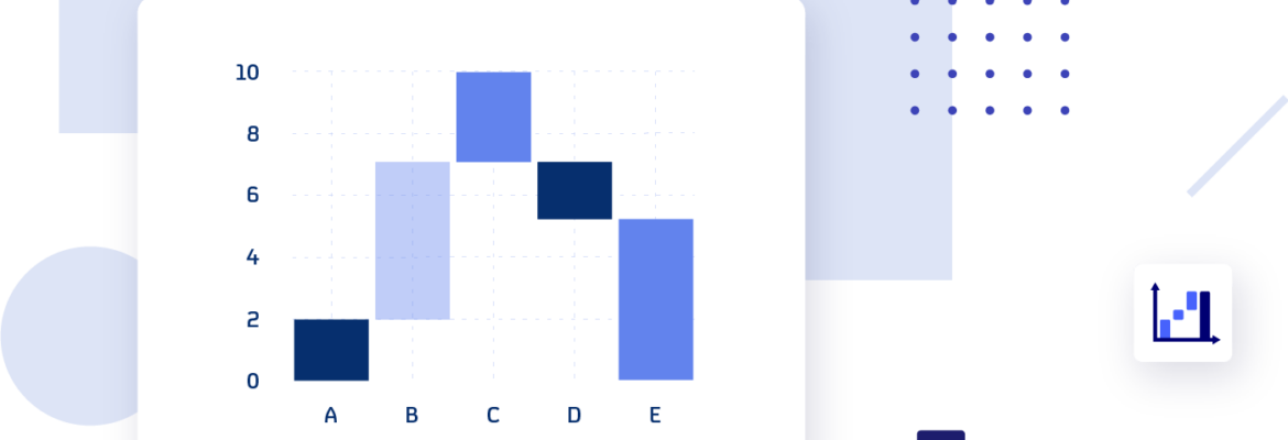
A Waterfall chart is a data visualisation that helps you see what caused a metric to change over time. It displays the initial value of the metric, what changed it and the final value, such as managing inventory over time.
The beginning and end values in the chart are shown as columns, and the data points in between are displayed as free-floating steps or blocks. Because of its simple, visual layout, it’s easier to quickly analyse complex data. So guided analytics users get instant insights into what changed and when.
Many finance teams are familiar with the Waterfall chart, but this dataviz is becoming popular across other departments and industries, including Manufacturing, Healthcare and Banking and Finance.
What are the common Waterfall chart use cases in Qlik Sense?
- Finance
Waterfall charts show how practitioners determine a net value, or can help with managing budgets.
Metrics include:
✔ Revenue or profit flow
✔ Stock price fluctuations
✔ Return on investment
✔ Income statements by P&L line, region, or month
✔ Evaluating enterprise profit
✔ Project spend by phase
✔ Variance to budget
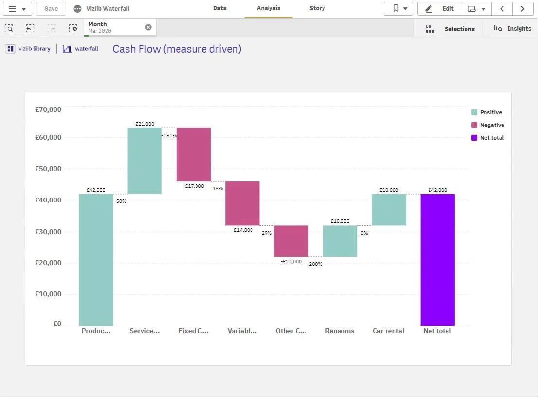
Vizlib Waterfall displaying what adds to and detracts from profit and revenue flow
- Sales and marketing
The sales and marketing teams can visualise what works well and what doesn’t to attract more brand and customer interest or compare earnings by product.
Potential metrics:
✔ Profits per product
✔ Contributions to totals chart by region
✔ Competitor analysis
✔ subscriber or customer or growth by month
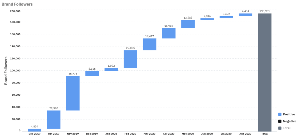
Tracking customer churn or subscribers with Vizlib Waterfall
- Root cause analysis
Waterfall charts are common in executive dashboards to show the cause of something, where things went wrong or where diversions occurred. A great way to show strategic highlights to those looking for immediate insights.
Metrics could include:
✔ Healthcare: patient days by nursing unit
✔ Retail: inventory balances over time
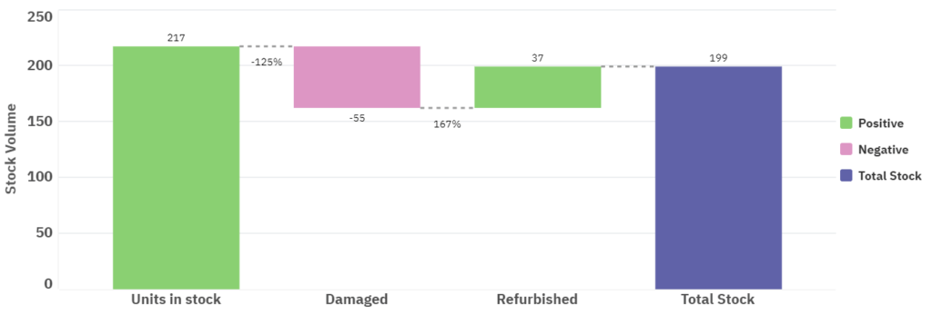
- Managing stock and inventory
The production team can maintain the right stock or inventory levels for profitability by analysing how the levels change over time.
One metric they use often is:
✔ Inventory over time
Managing inventory at a glance with Vizlib Waterfall
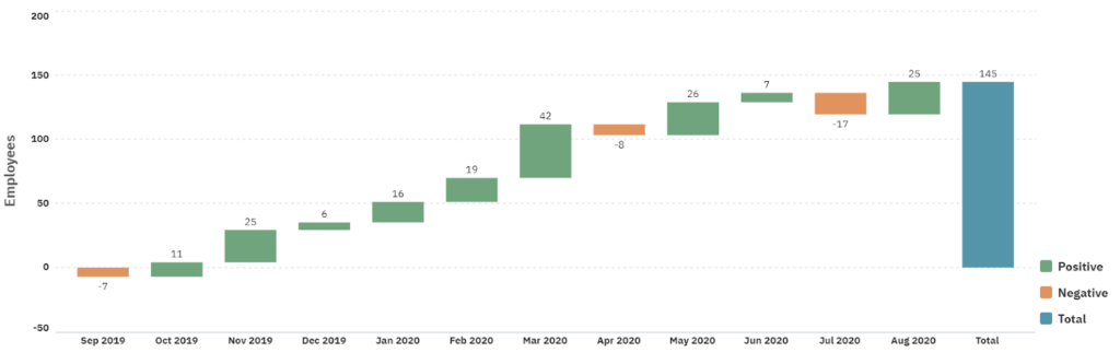
- HR planning
HR managers can analyse how the number of employees changes over time, to optimise the hiring process and make sure the business’ needs are met.
They could measure:
✔ Employee growth over time
Tracking employee growth numbers over time with Vizlib Waterfall
What is Vizlib Waterfall for Qlik Sense?
Vizlib Waterfall is a highly customisable Waterfall chart for Qlik Sense. This dataviz shows immediately what’s pushing up or pulling down a metric. Plus, it can uncover the root cause of your business questions quickly and easily.
Features to look out for:
- High level of customisation: select the colours your business uses for visualisations and reports, add or remove titles, change the thickness of connectors and much more.
- In-depth root cause analysis: you can create a ‘measure-driven’ waterfall using more than one measure. And get clear visual insight into what affected a metric’s total the most.
Empower all users to confidently visualise how totals change over time and support their daily data-driven decisions.
You can learn more about Vizlib Waterfall here.
Vizlib Waterfall examples in Qlik Sense