Best practices for designing and building a great KPI dashboard

KPI dashboards allow businesses to quickly surface key data and glean insights necessary to make critical business decisions.
While most organisations agree on the importance of using their data effectively, few know how to design actionable KPI dashboards. In this article, we cover the golden rules and best practices of creating amazing KPI dashboards.
What exactly are KPI Dashboards?
A KPI dashboard, also known as a business or executive dashboard, was originally modelled on the dashboard of an automobile. If you think about it, automobile dashboards are perfectly calibrated to provide you with a high-level overview of what’s going on under the hood through visual indicators, such as gauges, icons and displays.
When you’re driving, you don’t really have the time or mental capacity to track every process inside your car, but the dashboard gives you an excellent “summary” of the key performance indicators. Quite similarly, when you’re running a business, you don’t have the bandwidth to closely monitor every metric – and frankly, you don’t need to. A KPI dashboard serves the same purpose as an automobile one – to provide insight into the status of your business, department or a specific process at a glance.

Three common types of dashboards
Operational Dashboard
Operational dashboards are built to track the operational side of the business. For instance, a sales dashboard that neatly displays and visualises data around various sales metrics, such as calls made, deals closed, leads qualified or appointments booked, is a great example of an operational dashboard. This type of dashboard almost always requires real-time or near real-time data to provide the most accurate snapshot possible.
Strategic/Executive Dashboard
This type of dashboard will most benefit from wisely-chosen KPIs. Executive dashboards are designed to be the executive team’s window into the organisation’s performance against its strategic targets. In most cases, executive dashboards get a refresh on a periodic basis – that is on a daily, weekly or monthly basis. As a high-level overview of the state of the business, an executive dashboard also looks into the opportunities available to the business in that moment – for example, this could mean including data on the current sales pipeline.
Analytical Dashboard
The analytical dashboard could tackle operational or strategic data. However, the difference here is that it typically provides the user with the drill-down functionality, allowing them to explore available data on the fly in search for more meaningful insights. While an extremely useful functionality, it should be used with some caution. Bear in mind the intended audience – you should only provide this functionality to users that are data literate and will see the added value. It’s never a good idea to cram your dashboard with lots of different data points hoping the end user will pick out what they need – they won’t.

You can effortlessly navigate between different dashboards using our Sheet Menu extension
Business metrics vs KPIs: what’s the difference?
Although people often think that metrics and KPIs are one and the same thing, there are a few important factors that set these two types of visualizations apart.
OK, so what’s a business metric?
A business metric is a quantifiable measure that’s used to track, monitor and assess the status and effectiveness of a specific business process. Different metrics should be employed to fit the needs of different audiences. These key audiences can be investors, the executive board, customers, middle-managers and different types of employees. You wouldn’t necessarily use the same metrics for every process or area within a business.
While displaying the right business metrics to the right stakeholders is critical, it’s just as important to make sure users have enough context to fully understand the data and act appropriately. For the best effect, it’s always recommended to compare business metrics to established industry benchmarks or business objectives.
Examples of business metrics: Customer loyalty by retention, churn rate, sales revenue, size of gross margin, productivity ratios, SEO traffic, social sentiment, overhead costs, monthly profit and loss, online conversions, customer lifetime value, etc.
Now, what’s a key performance indicator (KPI)?
A KPI is a measurable business metric that evaluates how effectively a company is achieving critical business objectives. KPIs can be used at all levels across an organisation to measure and evaluate success at reaching strategic goals and targets. High-level KPIs will usually focus on a company’s overall performance, while low-level KPIs aim to track progress on a department or employee level.
Examples of KPIs: cost per lead, sales target, marketing ROI, sales growth, product performance, sales per sales representative, goal completion rate, etc.

Vizlib KPI Extension for Qlik Sense
What’s the difference between a business metric and a KPI?
The difference between a business metric and a KPI ultimately boils down to this:
- Business metrics are used to track and assess all or any areas of business
- KPIs are used to evaluate critical areas of performance
How to create a winning KPI dashboard?
Define your objectives and target audience
It may sound simple, but defining your objectives for your dashboard and determining the intended audience will be the driving factors behind your dashboard’s effectiveness. Before cracking on with the design of your dashboard, answer these three very simple questions:
- Who will be using this dashboard?
- What information will they need?
- What’s the best way to visualize this information?
Once you have answers to these questions, you’ll have a pretty clear idea of what needs to go into your dashboard and why. Operating from this high-visibility point, you will be able to select the most suitable KPIs and arrange them in a way that’s easy to understand and consume. However, if you’re still unsure about which KPIs get priority, it’s always better to get stakeholders involved and figure it out together.

Create a natural and logical flow of data
When deciding on the layout of your KPI dashboard, think back to the automobile dashboard example. Not everything displayed on your dashboard will have the same level of importance. Determining the logical flow of your data is critical. Imagine that your dashboard is a book where every KPI represents a new chapter – arranging them in the right order is of utmost importance.
Before you create the dashboard, consider drafting a mind map of your KPIs, detailing the flow of your information and how it’s connected to other graphs and charts around it. For example, if you’re on a mission to create a winning sales dashboard, you’ll probably want to start from the number of leads generated, followed by the conversion rate of those leads signing up for a trial and eventually, the conversion rate of trialists becoming paying customers.
Design your dashboard to be glanceable
The best dashboards are intuitive and easy to understand. If it takes a user five minutes to figure out what’s what, it’s not a great dashboard. Design aspects, such as text size, colours, tooltips, chart types and other, are extremely important and should not be chosen at random. For a dashboard to be glanceable (i.e. digestible at a glance) it must eliminate cognitive barriers (unnecessary clutter and misleading charts) and properly visualise and label KPIs or metrics.
Remember that great dashboards have the power to inspire action and drive change – users must be able to use the data they see to make better decisions quickly. Sometimes it’s enough to just add clear labels to your visualisations – for instance, “Customers We Added Through Marketing” or “MRR This Month vs Goal”. Another great way to make your dashboards more effective is to include actionable indicators, such as arrows or needles.

Vizlib KPI Designer
Vizlib KPI Designer, a value-added capability for Qlik Sense, will help you create winning KPI dashboards. Once you add the capability to your Qlik Sense environment, simply drag & drop it into your sheet and start selecting appropriate visualisations. The revolutionary layering concept allows you to combine various charts, icons and metrics to achieve any layout and any design. And if you don’t feel particularly creative, you can use a number of presets that come with Vizlib KPI Designer.
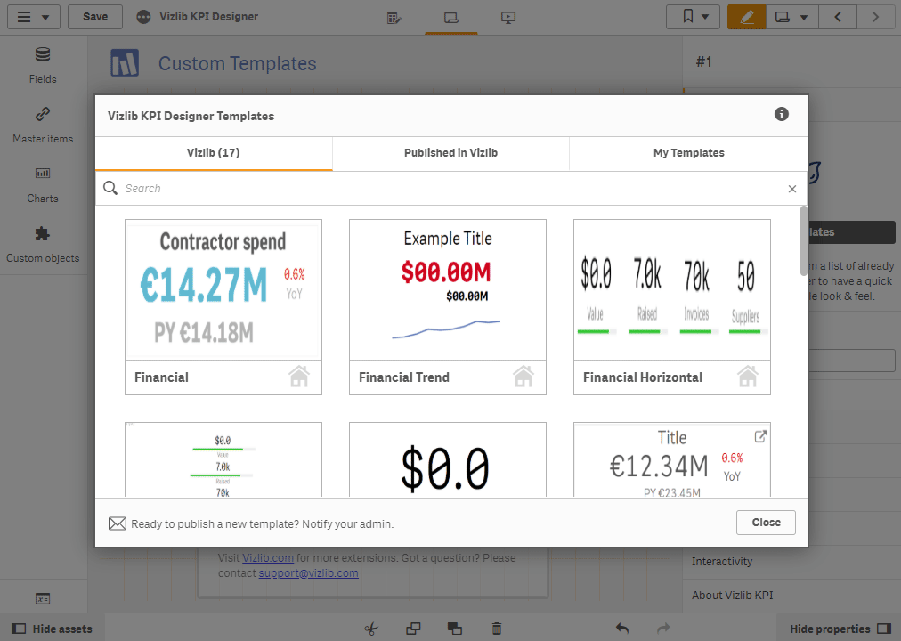
Vizlib Templates for the Vizlib KPI Designer
Vizlib Templates is a capability that can help your data users create, save and share custom KPI designs quickly. The new feature speeds up the development process as you can select and apply previously designed and saved pixel-perfect templates. Since you can share approved template designs with your team, it also enables your company to generate a consistent, professional look across all your Qlik Sense apps. You can find learn more in our Vizlib KPI Designer Guide or take a look at the full documentation here.
Vizlib Templates for Vizlib KPI Designer
Remember, in data visualisation, less is always more!
