Dashboarding: How to design an effective E-commerce dashboard in Qlik Sense
Today’s new normal in the retail sector is a major shift from the landscape of a year ago. The US recently recorded a 110% year-over-year increase in e-commerce orders, Forbes affirms.
Now more than ever, having the right dashboards is an essential element for every e-commerce business. And the key to unlocking the infinite potential of their dashboards lies squarely in the design!
An effective dashboard should be similar to a well-designed homepage. Just as you would easily navigate through a website, a dashboard should be clear, interactive and use high-level data points as a launchpad for exploration into the finer details.
Every click, every view, every transaction should leave a digital footprint accumulating in a treasure trove of data, ready for analysis, and to generate business value. From hitting sales or operational targets to identifying new opportunities, e-commerce is an industry with the most to gain by harnessing the full potential of dashboards.
In this article, we’ll walk you through a few dashboard best practices to ensure your dev power translates into streamlined operations, happier customers and improved returns.
Five E-commerce dashboard best practices
1. Pick the right tools
Without the right tools, any job can become unnecessarily complicated. Ever tried gaming using an entry-level laptop? It’s no fun, right?
And that’s why the first step in effective e-commerce dashboarding is investing in the right analytics software.
Not all BI products offer the same features and capabilities. Leading solutions, however, make sure they provide a smooth user experience. One that requires zero coding skills or IT wizardry, and can be used by everyone in your department or team.
If you’re keen to save on dev time and effort, and empower more users to benefit from powerful dashboards, take a look at the highly customisable visualisation capabilities in Vizlib Library.
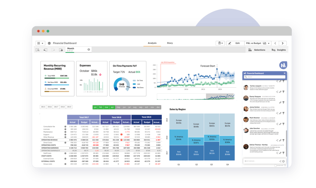
Vizlib Library capabilities
2. Streamline the e-commerce data pipeline
Consolidating data from a variety of sources, such as e-commerce platforms, spreadsheets and internal databases, into one central location makes data easily accessible to the whole team.
And when everything they need is on one dashboard, you’re effectively streamlining the path from input to insights. You’re also freeing up valuable time and effort to focus on what’s important.
Your dashboard should enable BI managers and leaders to track and analyse actionable data in real-time: to quickly identify what’s working and find solutions for any bottlenecks through data-driven decision-making. For example, prioritising channels that drive the most conversions or boost a marketing campaign that is landing the most customers.
If you’re interested in streamlining your data analysis in Qlik Sense, take a look at Vizlib’s new Writeback capability for Vizlib Qlik Sense. Not only can it help you save time, it can also help to reduce data inconsistencies. You can learn more about this analytics game-changer, if you register for our upcoming webinar.
3. Keep it simple
A dashboard should provide a snapshot of the business or a process at a glance, so it needs to be clutter-free and easily digestible to be effective.
One common error is dashboards that are overly complex and crowded. This can lead to confusion and missed opportunities.
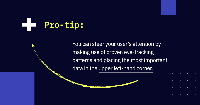
Draw the right attention
Carefully thought out colours and differentiated font sizing will help make trend lines pop and call attention to important titles and numbers.
Heatmaps, for example, are an ideal data visualisation for datasets where colours are easier to distinguish between than a large set of numbers.
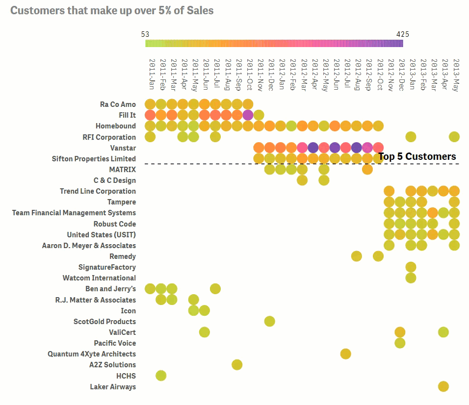
Vizlib Heatmap
Keep it uncluttered
When considering the layout, it’s equally important to limit the number and variety of components. Ideally, try to stick to 3-5 charts per dashboard.
We know it can be tough to limit the number of components when you have many relevant data points. One solution is to include additional context on-hover.
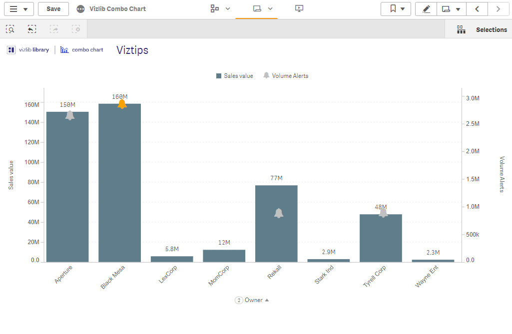
Vizlib Viztips
Software that provides tooltip functionality allows you to pack in supplemental information and added context without sacrificing dashboard real-estate. If you need to save more space on your Qlik Sense dashboards, check out our blog on handy ways to use Viztips.
Choose the right dataviz
Take care to select the right visualisations for your data. Always ensure that the visualisation choice expresses the facts accurately and in context. Tables, for example, can display large quantities of data. Yet, if the audience only needs to see a high-level view of the data, the table format may be overwhelming.
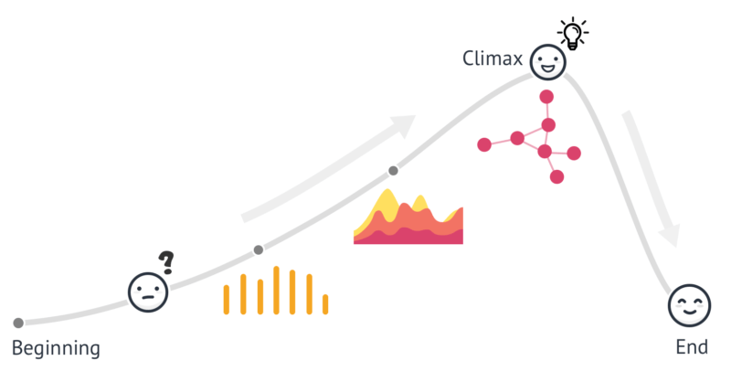
4. Tell a story
Data storytelling is about adding the components of storytelling to your data findings to capture your audience’s attention and direct their thinking and actions.
Your audience or end-user should progress through an information journey leading them from high-level questions to more detailed questions then finally to a specific action point.
If you can, try to introduce characters to your story, include humour (only if it’s funny to other people as well!), and make sure your story covers the key e-commerce data whats and whys.
5. Test, test, test
As your business needs evolve, so will your dashboards. A good check is to test your Qlik Sense dashboards regularly and ask, does it still work? Does it tell the story we want?
And, remember, the two biggest reasons why dashboards could fail:
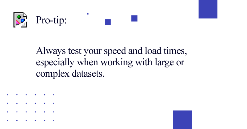
(1) Too slow, as too much filtering can slow download times, losing your audience.
(2) Using metrics your audience is unfamiliar with. Always keep a specific audience in mind when selecting which metrics to display and ask yourself, who will be using this dashboard, and what information will they need?
Keeping these best practices in mind, you should be well on your way to creating successful e-commerce dashboards that enable you and your team to keep pace with today’s e-commerce boom.
Getting Started with Vizlib
Need to supercharge your Qlik Sense apps? Try Vizlib. You can sign up for a free trial today – available for up to 5 users!